Designosaur
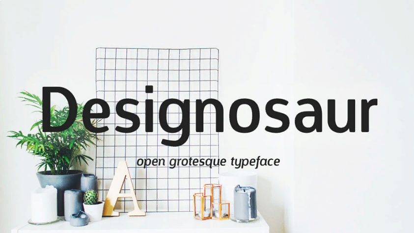
Designosaur by Sergiy Tkachenko is a clean sans serif with rounded details and a friendly, uncomplicated feel.
Discover useful things. Build your library. Share your finds.
Designosaur by Sergiy Tkachenko is a clean sans serif with rounded details and a friendly, uncomplicated feel.
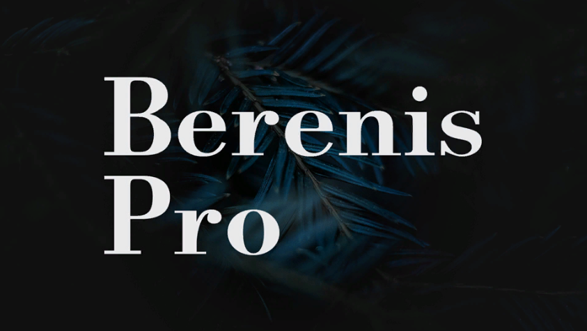
Berenis ADF Pro from Arkandis Digital Foundry is a book-oriented serif with traditional forms and a gentle contrast between strokes.
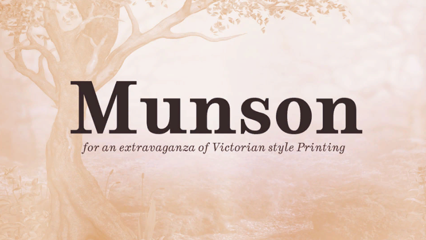
Munson by Paul James Miller is a Victorian-inspired slab serif with solid strokes and prominent serifs.
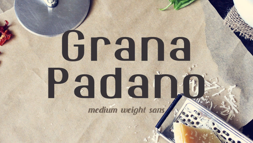
Grana Padano is a sans serif with a distinctive rhythm and slightly unconventional letter proportions.
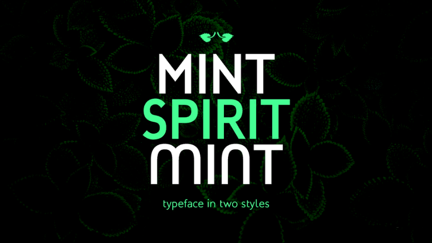
Mint Spirit is a contemporary family from Arkandis Digital Foundry, mixing rounded details with a steady, readable shape.
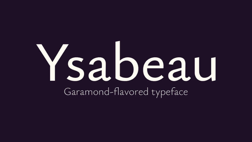
Ysabeau by Christian Thalmann is a humanist sans with proportions inspired by old-style book typography.
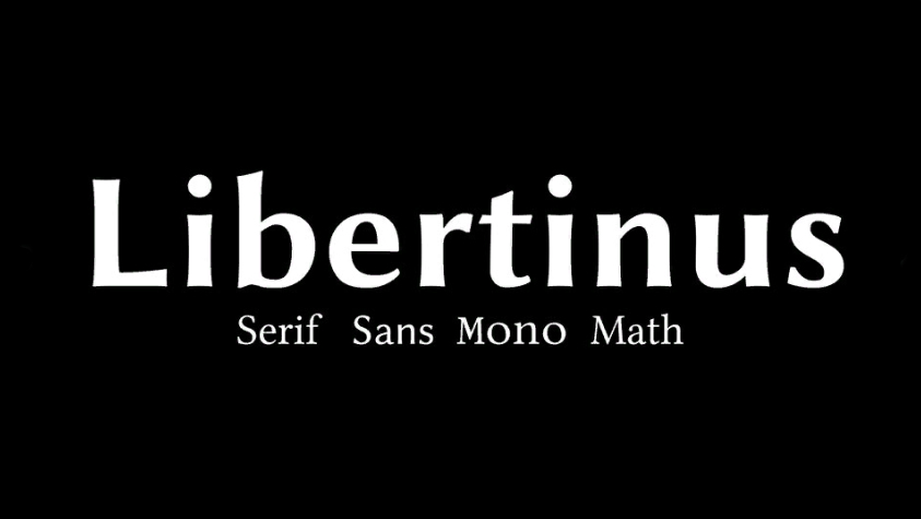
The Libertinus font collection for running text, display typography and mathematical notation.
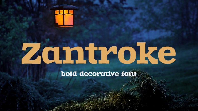
Zantroke by gluk is a decorative serif with heavy strokes and sharp contrasts that give words a strong silhouette.
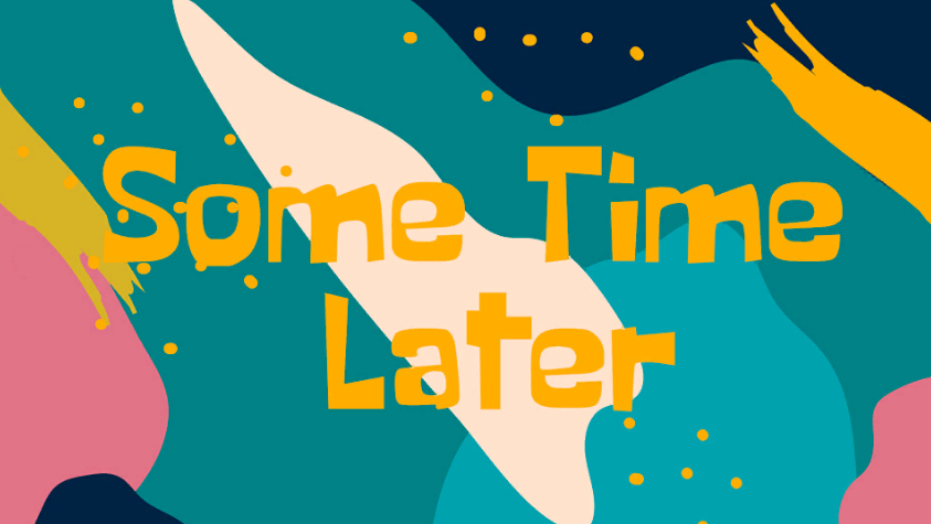
Some Time Later is a quirky display face with uneven, playful forms that carry a cartoon-like mood.
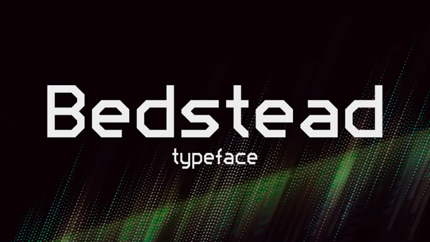
Bedstead recreates the blocky character shapes of classic teletext displays. Its letters have a recognisable screen-era rhythm.
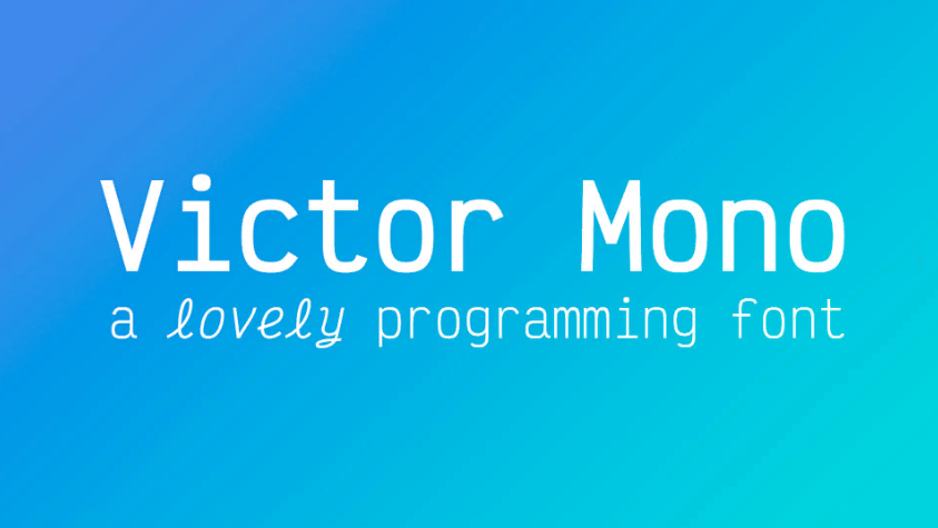
Victor Mono stands out among coding fonts for its distinctive italic letterforms, while the upright cuts remain crisp and functional.
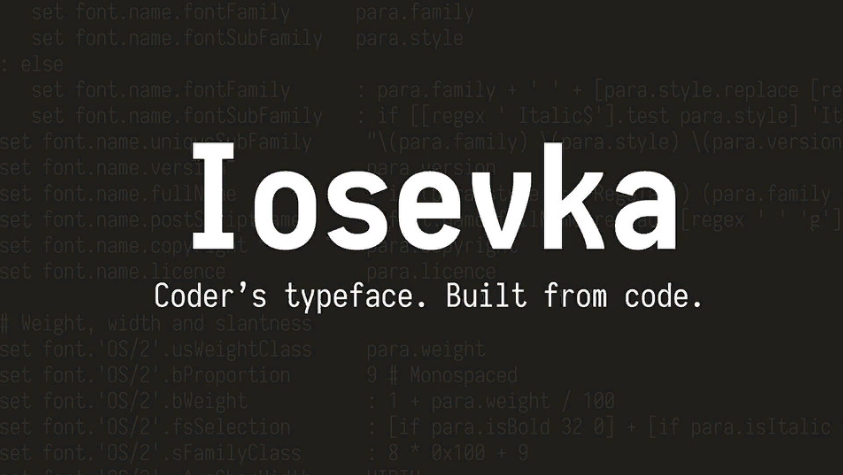
Iosevka by Belleve Invis is a narrow coding typeface, built to fit more characters into a line while keeping them distinct.
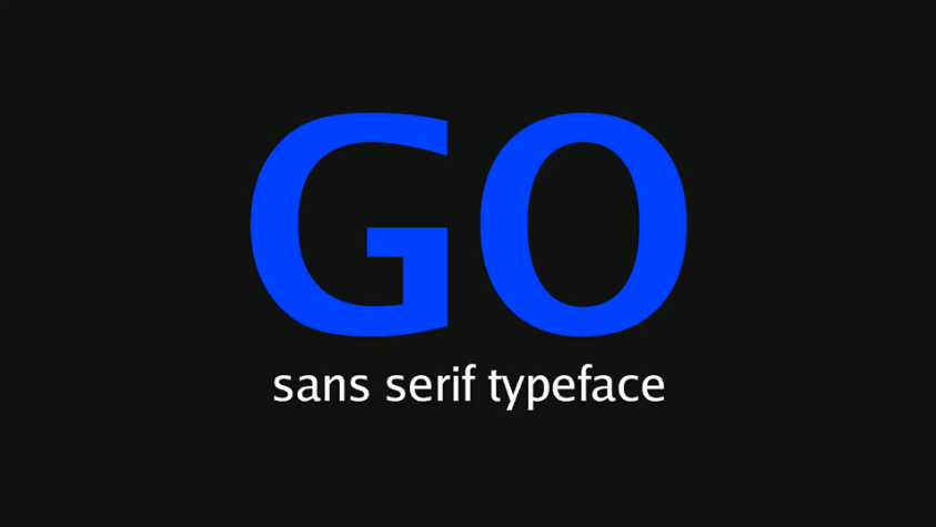
The proportional Go family by Bigelow & Holmes, with italics and small capitals.
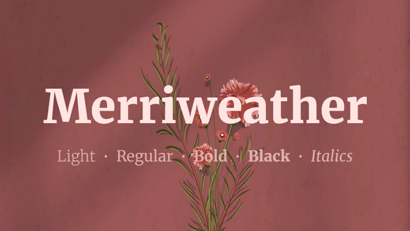
Merriweather by Eben Sorkin is a serif designed with screen reading in mind. Its substantial letterforms stay steady across long articles and editorial pages.
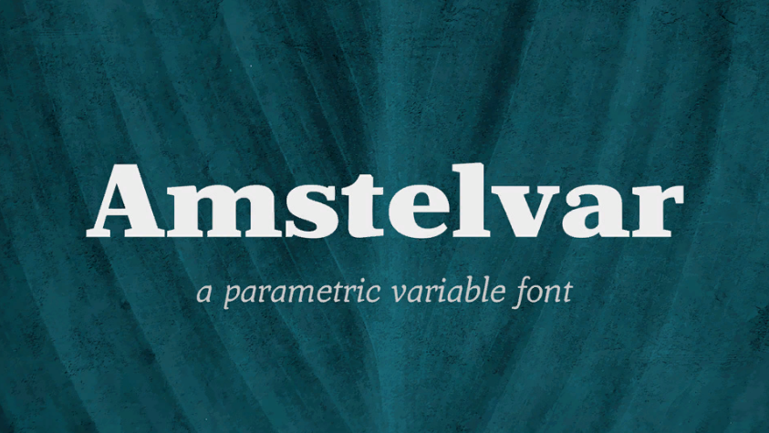
Amstelvar by David Berlow explores variable type design. Its adjustable axes make the same serif family feel different at small and large sizes.
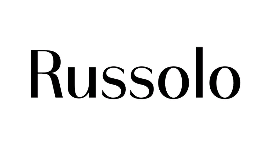
Russolo is a geometric variable sans with contrasting thick and thin strokes.
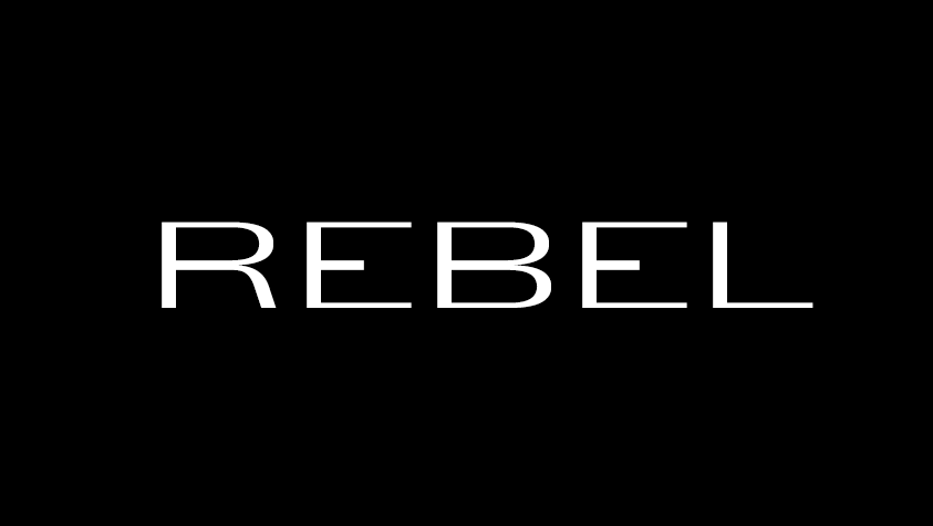
RebelTypeDog by Andrii Kurylo is a thin geometric display face with elongated, unconventional letters.
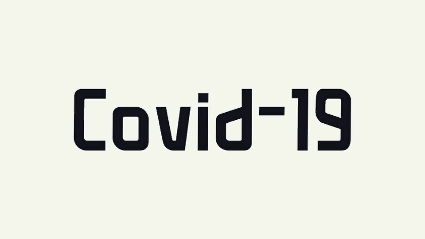
Covid19 by Peter Wiegel is a display font with squared-off, technical-looking letter shapes.
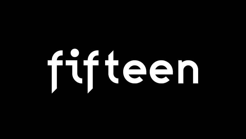
Fifteen is David van Gemeren's typeface designed around source-code legibility and carefully considered metrics.
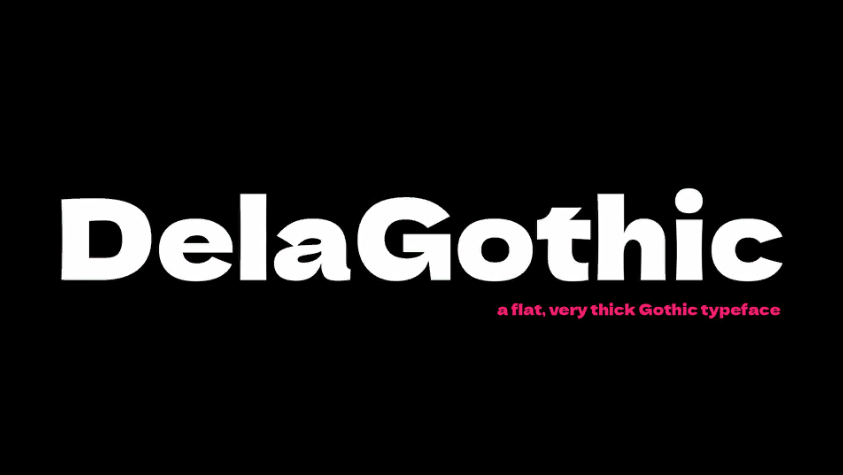
Dela Gothic is a dense, heavy display sans with broad letter shapes and a strong presence.
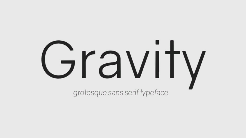
Gravity by Vincenzo Vuono is a geometric sans serif with smooth rounds and a broad range of light-to-heavy cuts.
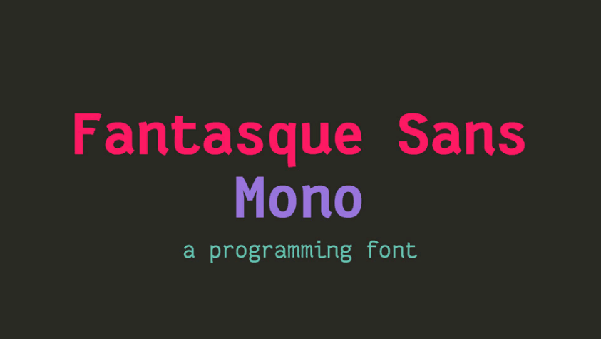
Fantasque Sans Mono by Jany Belluz is a coding font with a touch of handwriting in its curves and letterforms.
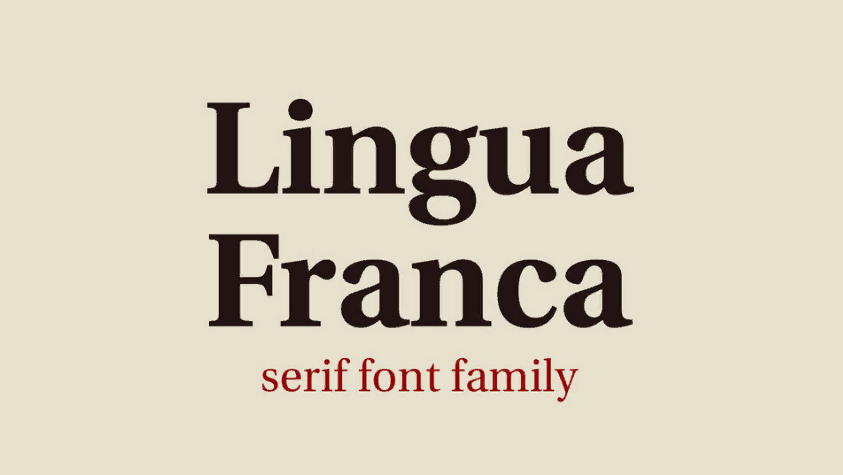
Lingua Franca is a text serif related to the Heuristica and Utopia line of typefaces, with a clear editorial texture.
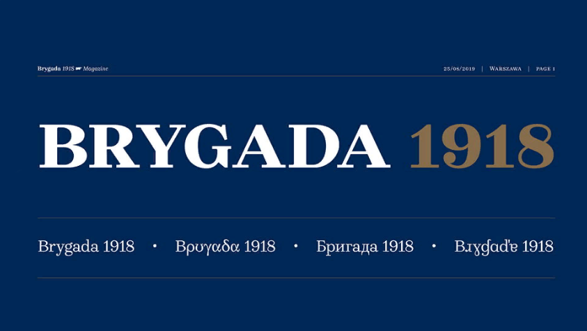
Brygada 1918 is a revived Polish serif associated with the centenary of the country's independence. Its historical character is preserved in a practical digital family.