The NFB Logo: Georges Beaupré’s Human Eye Symbol
Created in 1968, the National Film Board of Canada symbol brings a person and an eye into one concise form. A look at its history and applications.
Read article
Exploring inspiring projects, creative minds, AI, trends, and everything shaping modern visual culture.
Created in 1968, the National Film Board of Canada symbol brings a person and an eye into one concise form. A look at its history and applications.
Read article
Sustana’s S-shaped symbol brings a curl of paper to mind. COLLINS developed that form into an identity whose rounded lines appear on boxes, clothing and large surfaces. The most interesting relationship is between the compact mark, the light lettering and the visible texture of the material.

The Wool Pot’s logo is easy to read as a sheep. A moment later, its face becomes a plant pot and its woolly outline suggests a flower. Seachange built an identity around this simple shift, connecting the product’s material with its purpose.
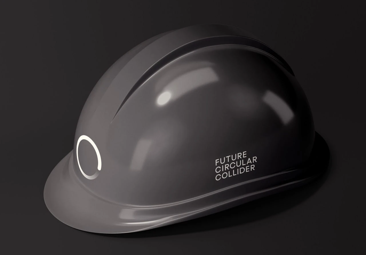
Colliders accelerate particles to near the speed of light and make them collide to study the structure of matter. For CERN’s proposed new collider, the Future Circular Collider, Bleed created a logo in which a simple circle turns into a wave.
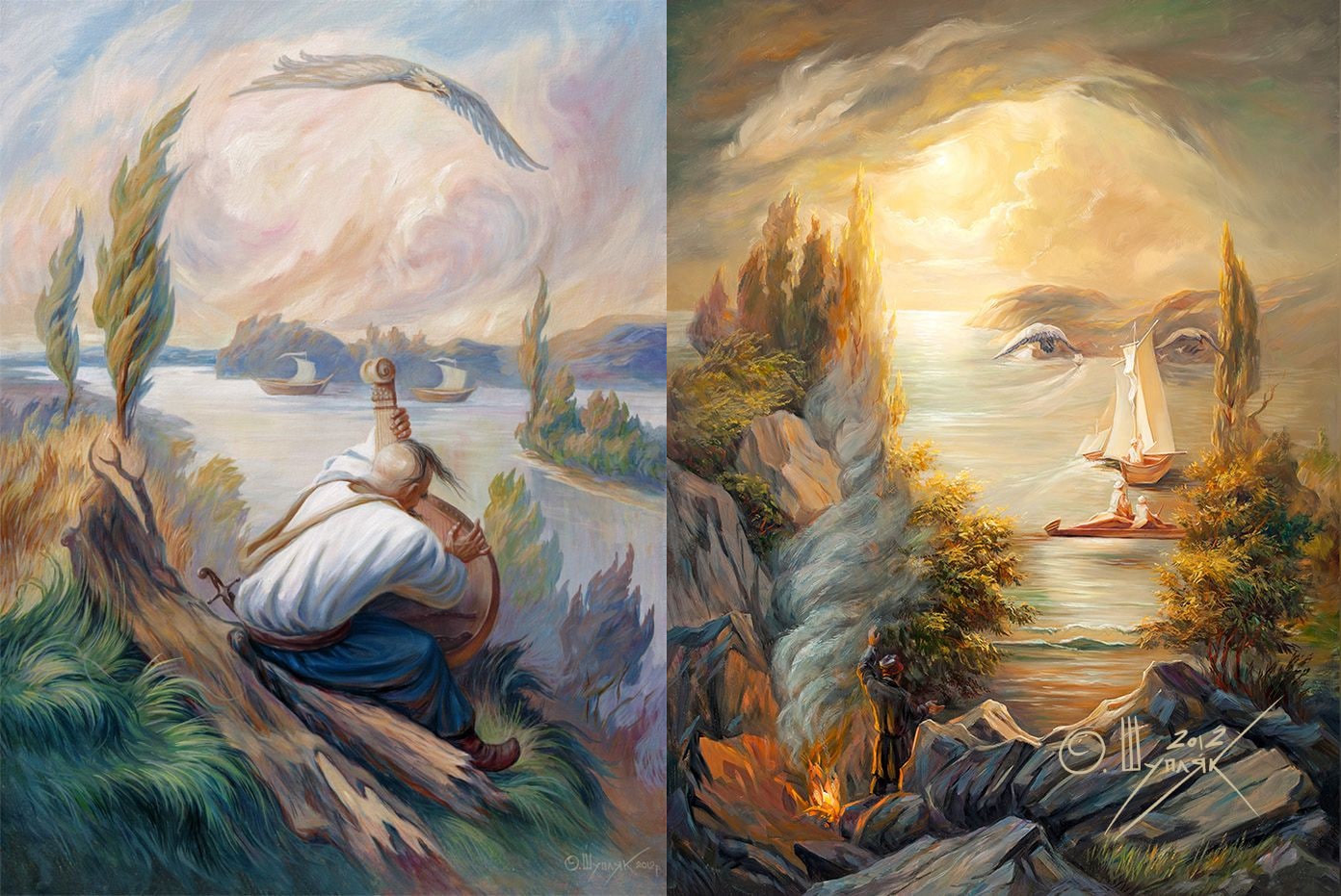
At first you see cottages, boats and trees. Then they come together as a face, and the landscape becomes difficult to see in quite the same way. Ukrainian artist Oleg Shupliak calls these works dvovzory: images in which several scenes coexist, inviting the eye to move between them.
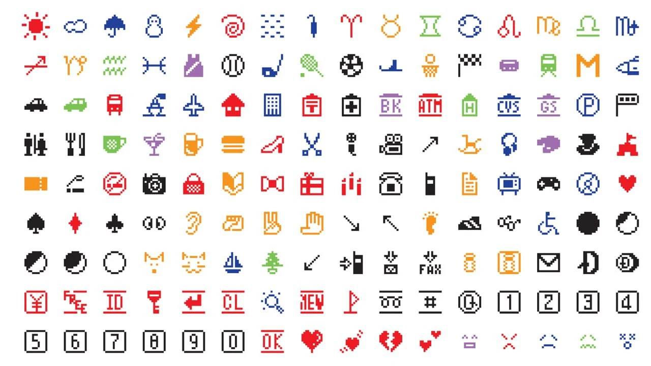
A sun, an umbrella, a train, a heart. Familiar things take shape in a handful of coloured pixels in Shigetaka Kurita’s emoji set. These 176 symbols appeared on NTT DOCOMO phones in 1999 and later became part of the collection at New York’s MoMA.
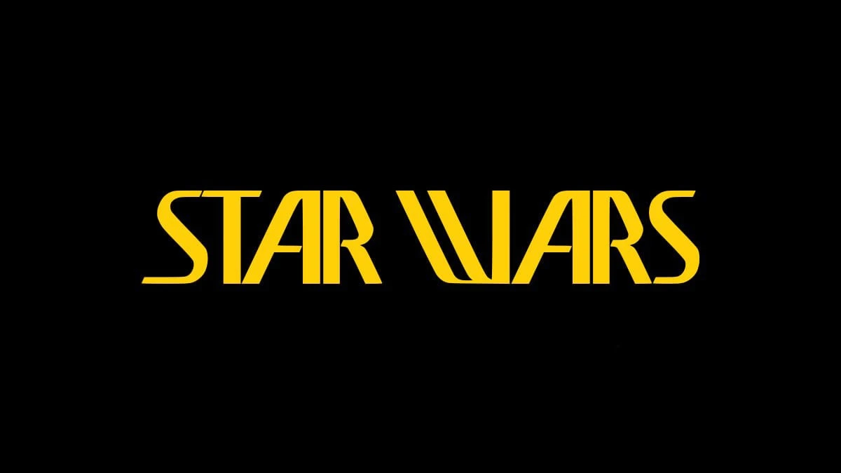
Tall letters, long diagonals and a title set on a single line. This early Star Wars logo offers a glimpse of the identity before the familiar heavy, outlined lettering.
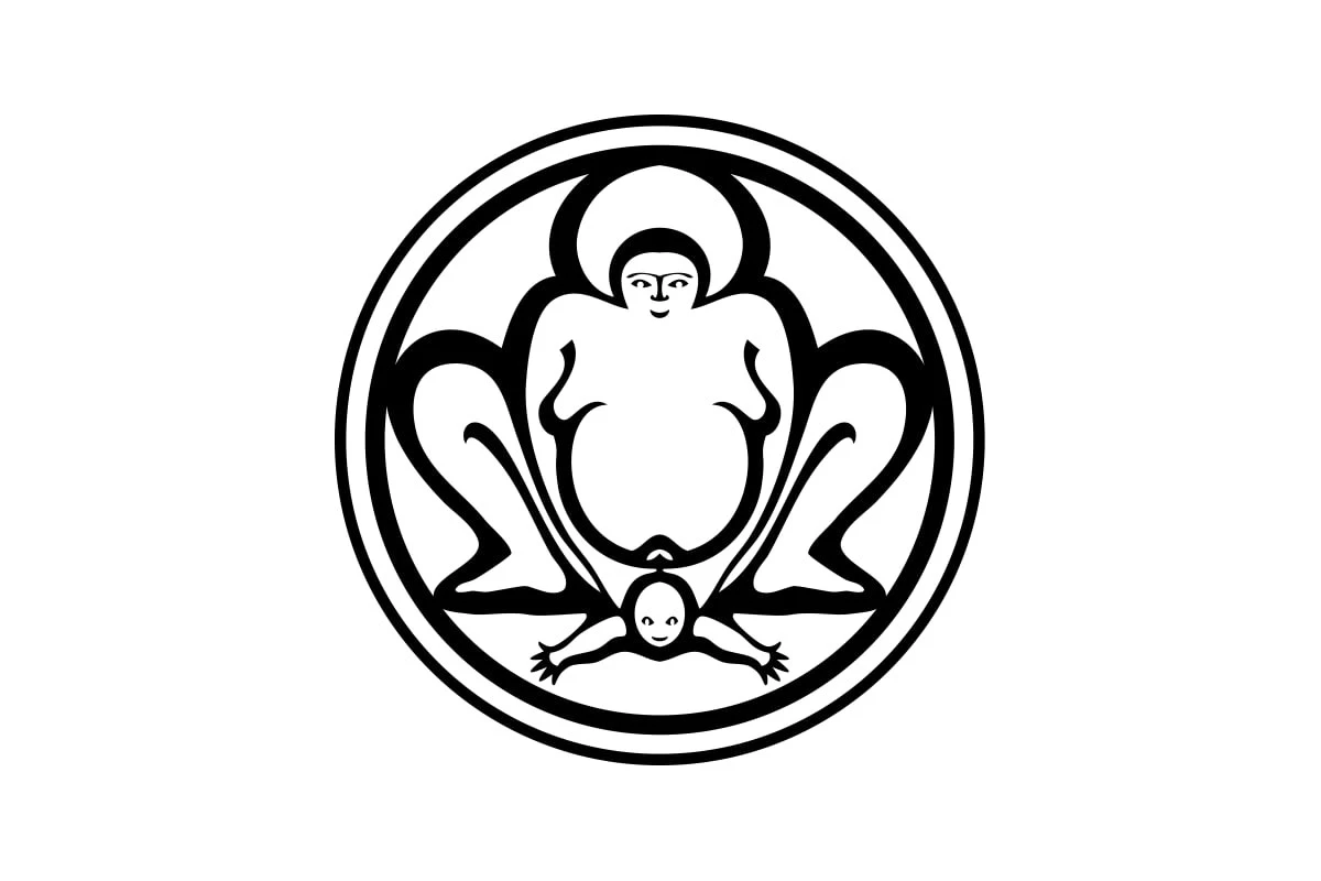
Take a look at the logo of Bumi Sehat’s clinic in Bali. Do babies really arrive arms first, or is that a sumo wrestler? 😅 The subject is clear, but the figures’ proportions and poses leave room for unexpected associations.
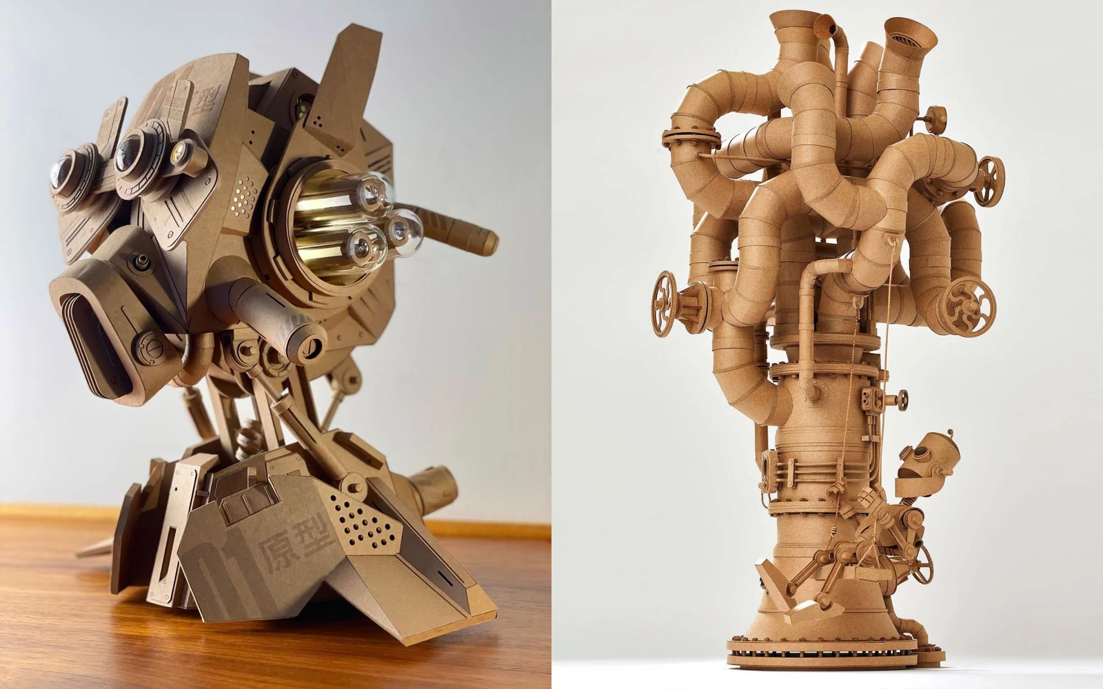
Greg Olijnyk builds fantastic cardboard sculptures by hand, from mechanical creatures to illuminated towers. We explore the details of his work and an approach rooted in his graphic design experience.
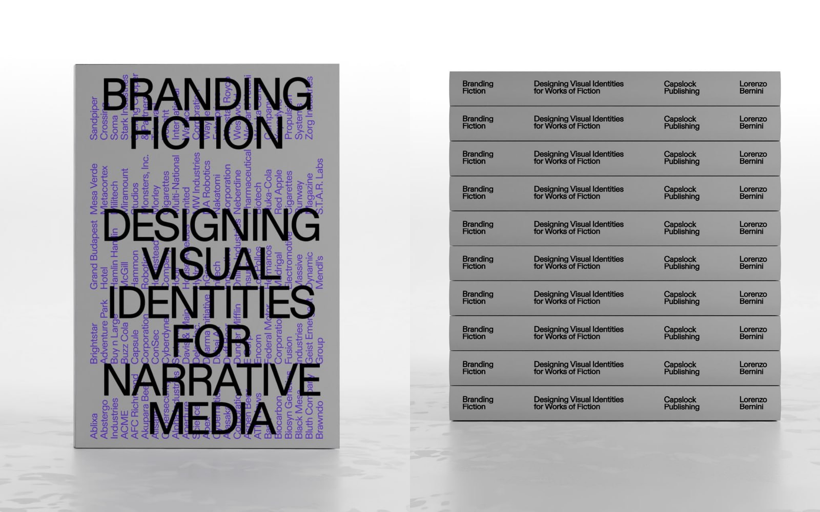
Lorenzo Bernini’s book explores the visual identities of companies in films, television and video games, and the details that make their worlds feel familiar.
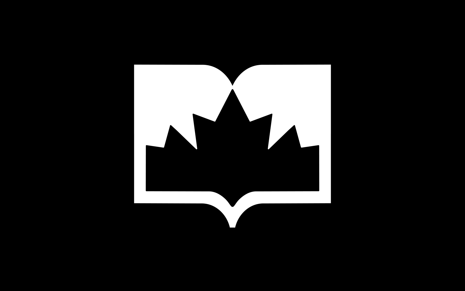
A maple leaf emerges from the negative space of an open book. For Learn Canadian, ARK Agency brought two familiar symbols together, then used the space inside the mark to frame photographs.
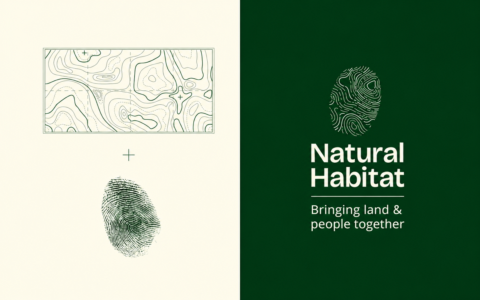
WMH&I combined a fingerprint with the contours of the land for Natural Habitat, then took the idea beyond the logo to clothing, maps and even insect shelters.