

The Wool Pot makes wool pots for growing plants. Project partner Exquisite Wool Traders describes them as an alternative to plastic seedling pots. This gives the design a specific subject: showing the connection between wool and gardening without overloading the symbol with explanation.
One Symbol with Several Readings
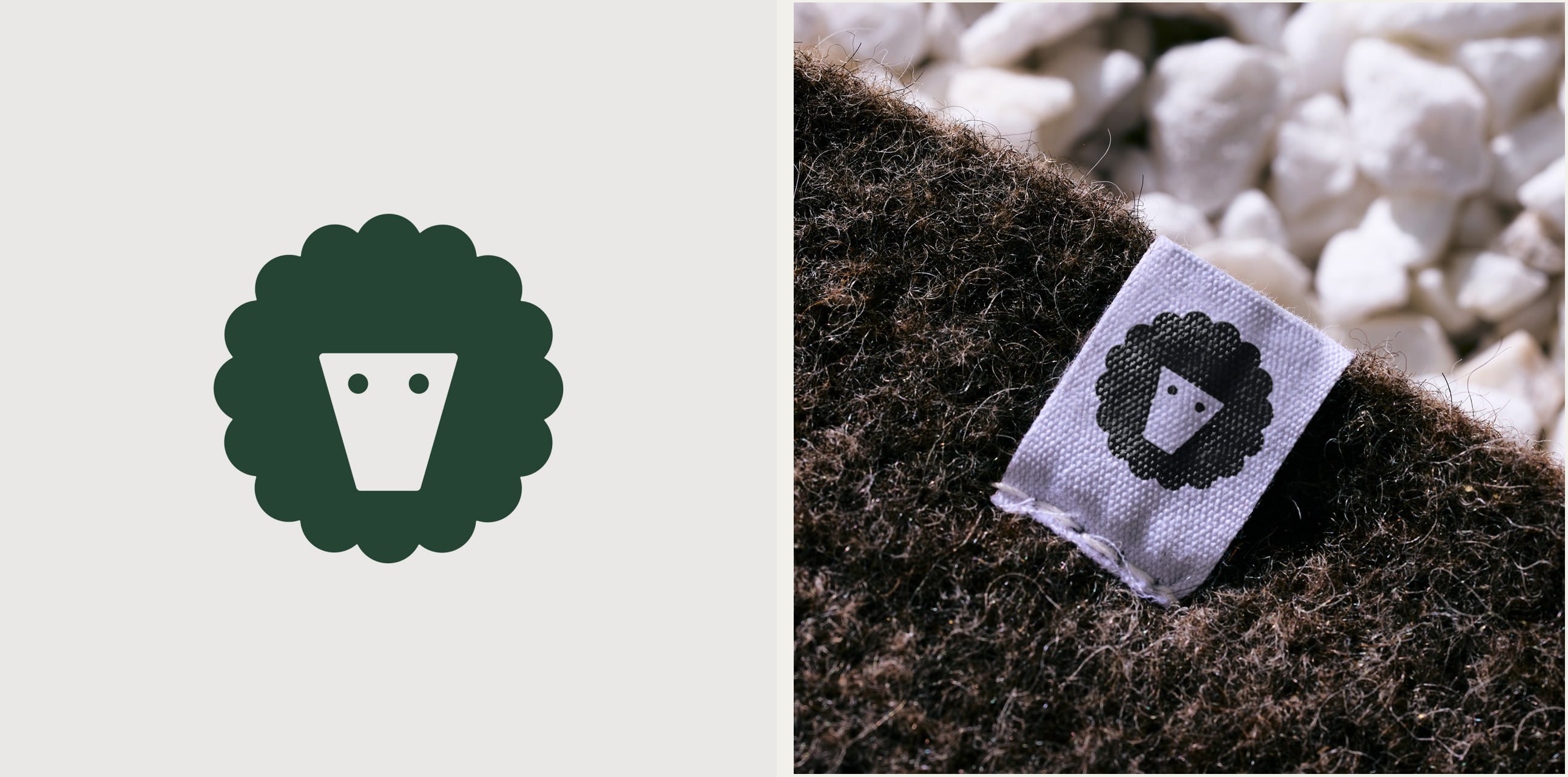
In its account for Design Assembly, Seachange connects the sheep’s face with the shape of a plant pot, the two dot eyes with seeds, and the outer outline with a flower. These images fit into one compact composition. A few large shapes are enough to make each reading possible.
The light and dark versions reverse the relationship between figure and background while preserving the character. The fabric label reveals the practical benefit: the eyes and face remain distinct against the rough texture of the wool. There is no fine hatching or delicate linework that might disappear in reproduction.
An Outline That Holds the Identity Together
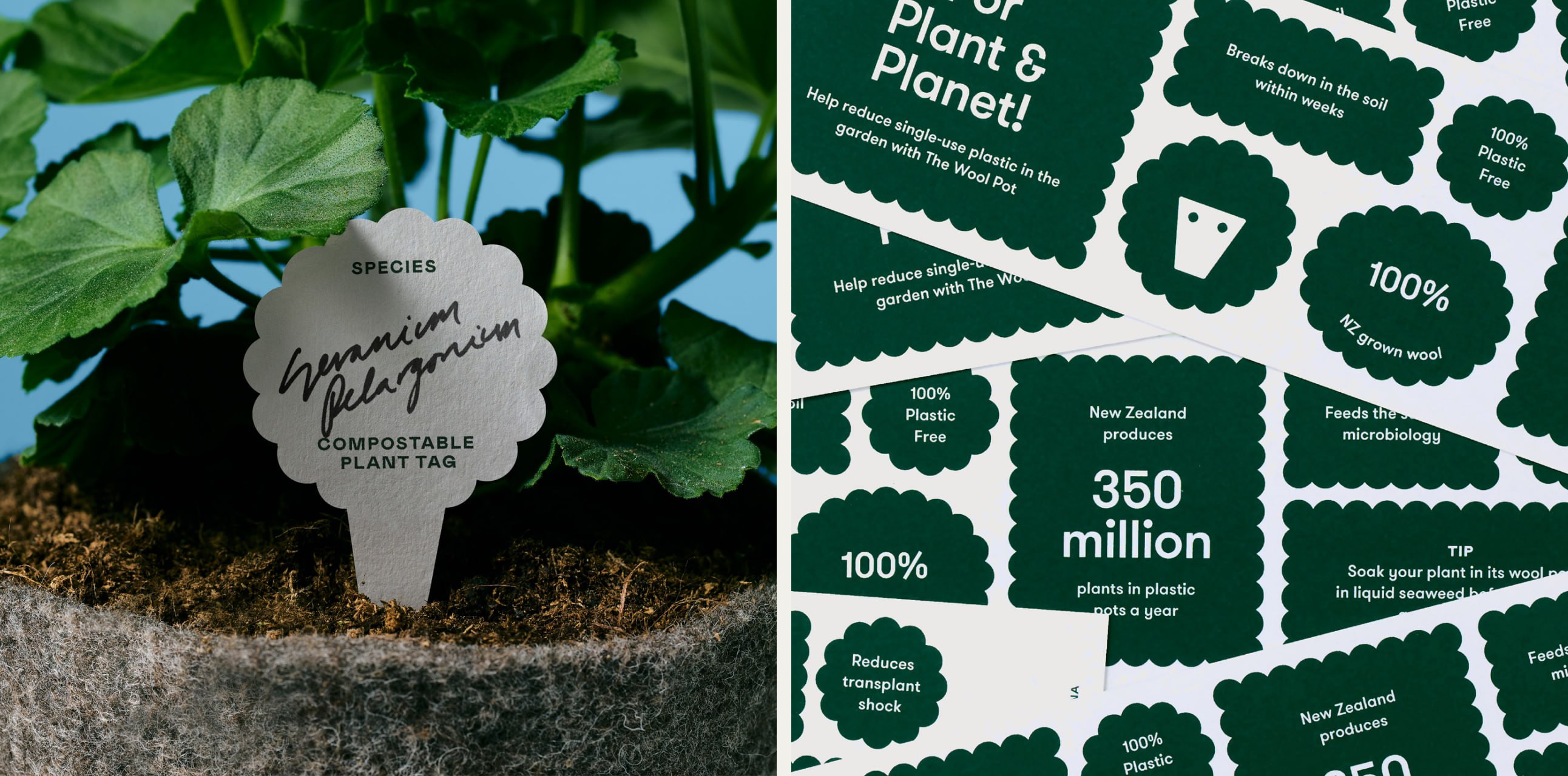
The scalloped edge extends beyond the logo. It becomes the shape of a plant marker and a border for short messages. Rectangular information panels repeat the same rhythm of rounded lobes. Even a fragment of the graphics without the brand name has a familiar appearance.
Dark green sits alongside pale backgrounds, straightforward lettering and paper textures. On the plant marker, the printed text leaves room for a handwritten plant name. This small detail suits an object used in a garden, allowing the identity to work alongside everyday notes.
Packaging That Leaves Room for the Material
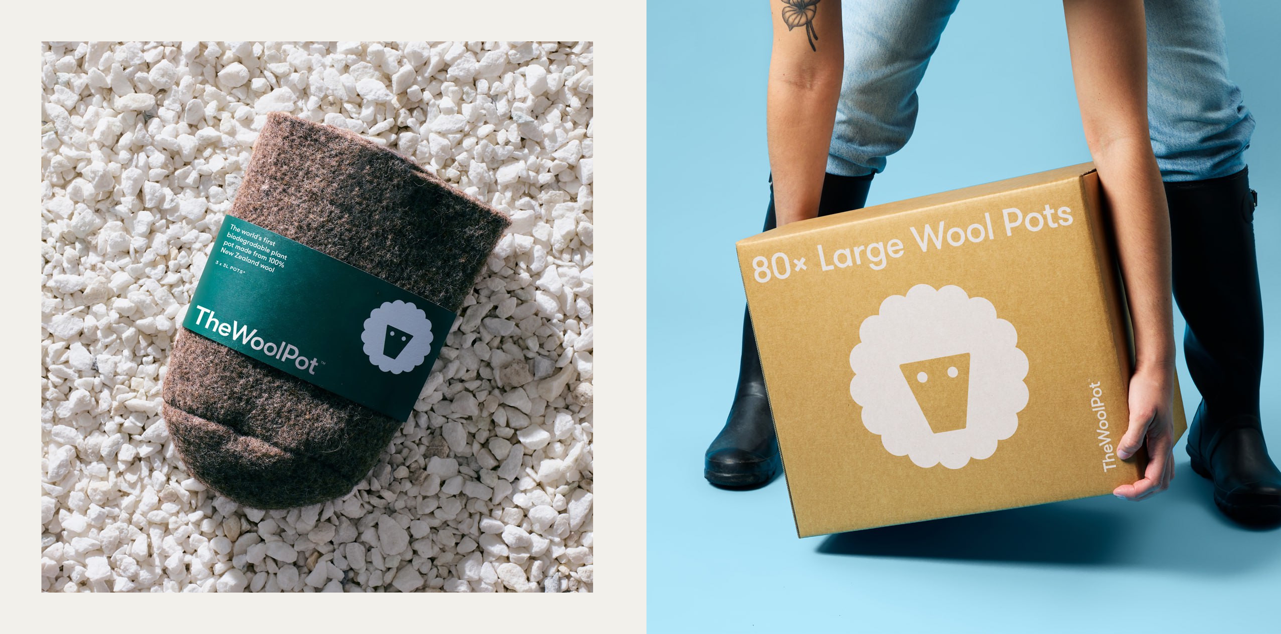
The paper band wraps around only part of the pot, leaving the wool clearly visible. Its smooth green surface, name and symbol contrast with the uneven material beneath. A large cardboard box needs only the white logo and a few lines of text. The materials remain an important part of the overall impression.
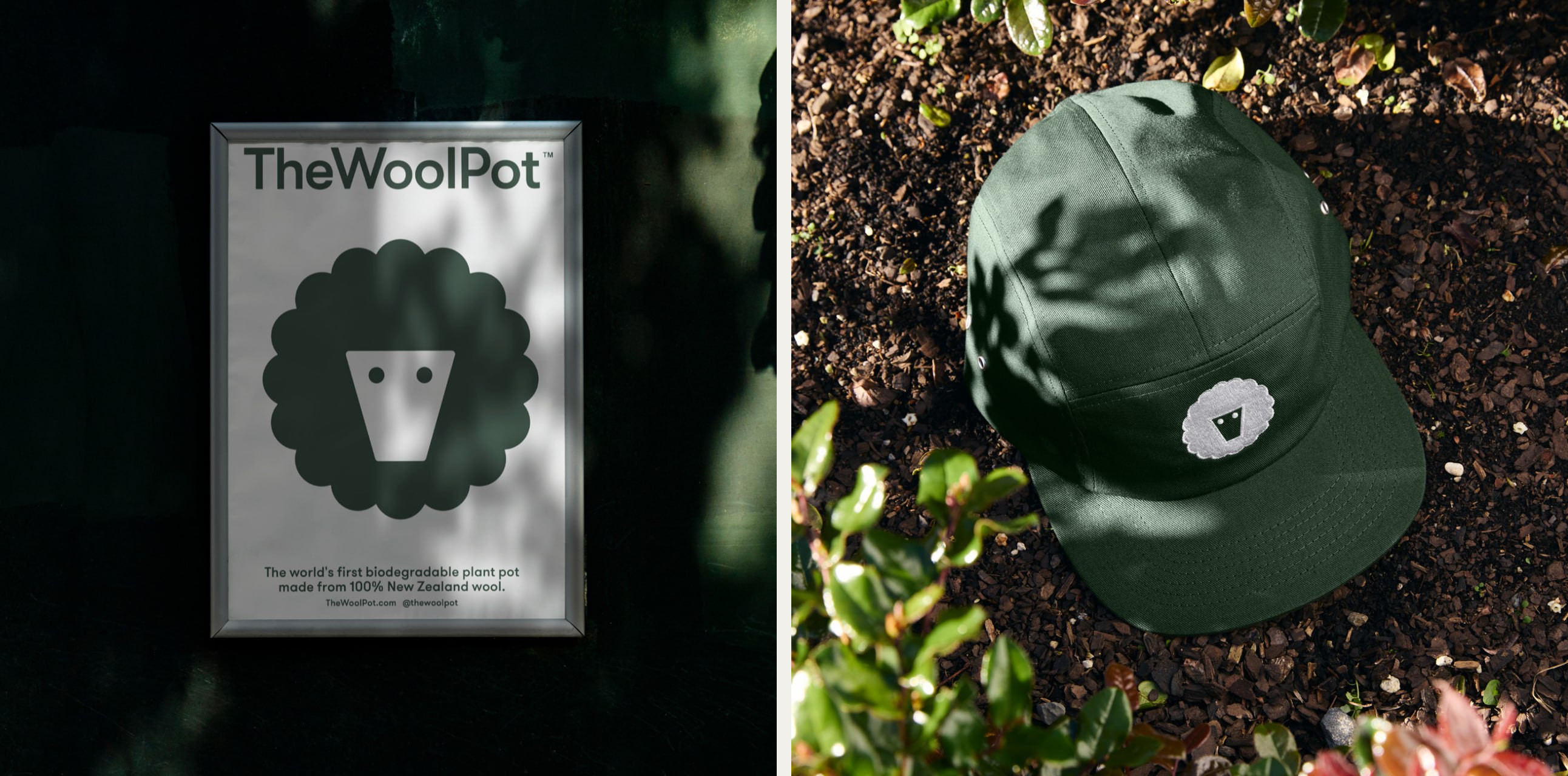
On the poster, the symbol fills most of the central area; on the cap, it becomes a small patch. Comparing these applications shows how much the design relies on its silhouette. Leaf shadows, fabric folds and a change of scale leave the basic shape intact.
The official 2023 Best Design Awards entry credits Seachange with the identity and names Tim Donaldson and Amanda Gaskin as creative directors. The most interesting aspect runs from the logo through to the packaging: one distinctive outline provides enough variation for different uses while keeping a clear connection to the product.
Sources: Seachange’s project account for Design Assembly: The Wool Pot · Exquisite Wool Traders: Our Projects, The Wool Pot · Best Design Awards: The Wool Pot, Seachange, 2023



No comments yet. Start the conversation.