
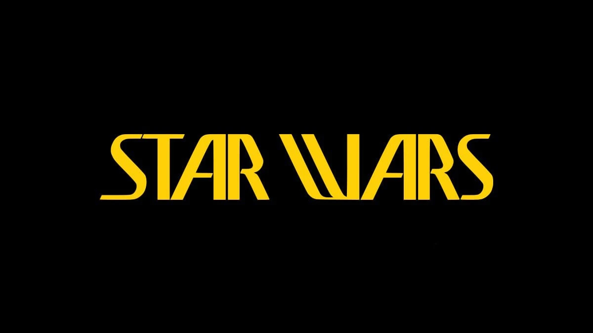
Lucasfilm’s archive credits this early wordmark to John Van Hamersveld. It appeared on stationery, patches, a 1976 poster and promotional T-shirts.
Ralph McQuarrie created another part of the early identity: the figure-and-planet illustration for a triangular emblem, completed in June 1975. The emblem later combined his artwork with Van Hamersveld’s lettering, so the illustration and the wordmark have distinct design credits.
The wide W is particularly striking, its long diagonal strokes curving into the base of the letter. The rounded S at either end softens the sharp geometry of the A and R. In this image, solid yellow lettering and generous black space make these shapes easy to study. The single-line composition has a very different rhythm from the familiar stacked logo.
McQuarrie also helped shape the film’s visual world. The Academy of Motion Picture Arts and Sciences holds early concepts featuring R2-D2, C-3PO and a confrontation with Darth Vader. These works show how the characters’ appearance developed before filming.
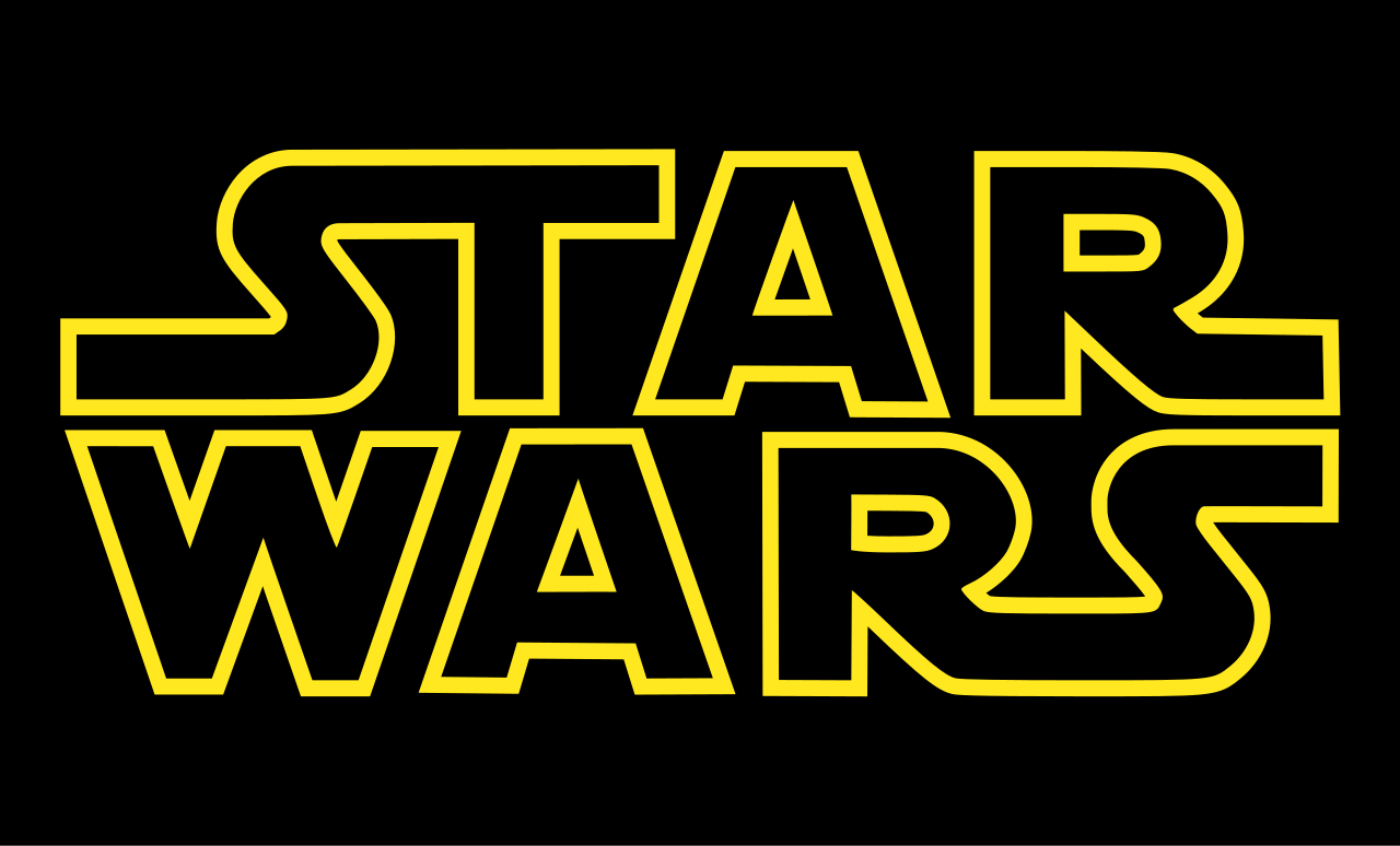
The familiar outlined logo has its own history: Suzy Rice designed it, Joe Johnston refined it before its use in the film, and title designer Dan Perri adapted it for the screen. The early version shown here preserves one of the directions explored along the way.
Sources: Lucasfilm: History in Objects: Early Star Wars Logo T-Shirt · Academy of Motion Picture Arts and Sciences: Myth-making: STAR WARS and the Art of Advertising · Art of the Title: Star Wars (1977), interview with title designer Dan Perri


No comments yet. Start the conversation.