Deslove Journal

Logos

Marks, symbols and the stories behind them. A closer look at the ideas and details that shape logos.

All articles

8 articles
Sustana’s white spiral S-shaped symbol centred on a black background.

Sustana’s Identity: Paper Curled into an S

Sustana’s S-shaped symbol brings a curl of paper to mind. COLLINS developed that form into an identity whose rounded lines appear on boxes, clothing and large surfaces. The most interesting relationship is between the compact mark, the light lettering and the visible texture of the material.


Deslove editorial team 3 min read
The white The Wool Pot symbol, combining a sheep’s head with a pot-shaped face, on a dark green background.

The Wool Pot Identity: A Sheep, a Pot and a Flower

The Wool Pot’s logo is easy to read as a sheep. A moment later, its face becomes a plant pot and its woolly outline suggests a flower. Seachange built an identity around this simple shift, connecting the product’s material with its purpose.

Deslove editorial team 3 min read
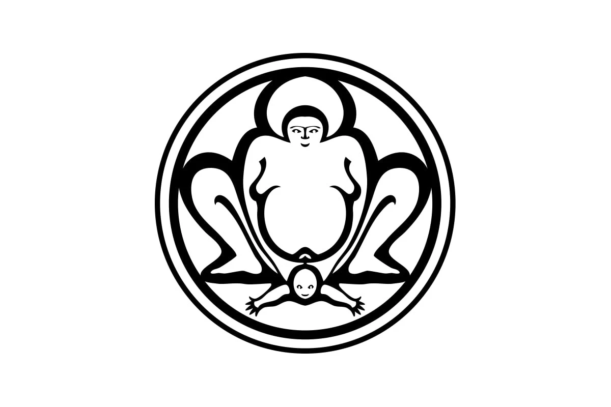
The black-and-white circular Bumi Sehat logo, with a female figure and a baby with outstretched arms.

Bumi Sehat’s Logo: What Do You See First?

Take a look at the logo of Bumi Sehat’s clinic in Bali. Do babies really arrive arms first, or is that a sumo wrestler? 😅 The subject is clear, but the figures’ proportions and poses leave room for unexpected associations.

Deslove editorial team 2 min read