
WMH&I / Natural Habitat
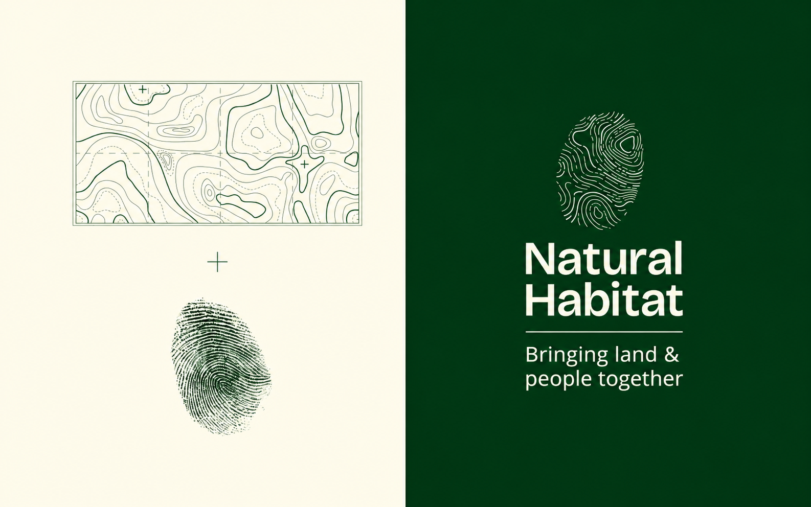
A fingerprint or a topographic map? Turns out, it's both.
British design studio WMH&I has created a new visual identity for Natural Habitat, a UK charity helping people reconnect with nature.
At the heart of the logo is a fingerprint, but its lines follow the contours of the land. The idea is simple: every person has a unique fingerprint, just as every landscape has its own distinctive shapes.
And it's not just one fixed logo. Each location can have its own version, shaped by the local terrain. A different landscape, a different fingerprint.
But the cleverest part is seeing how the identity works in real life.
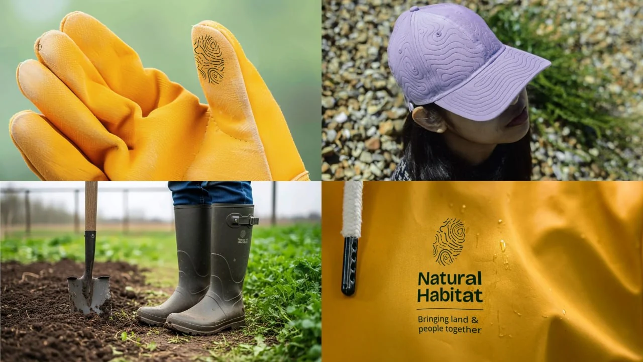
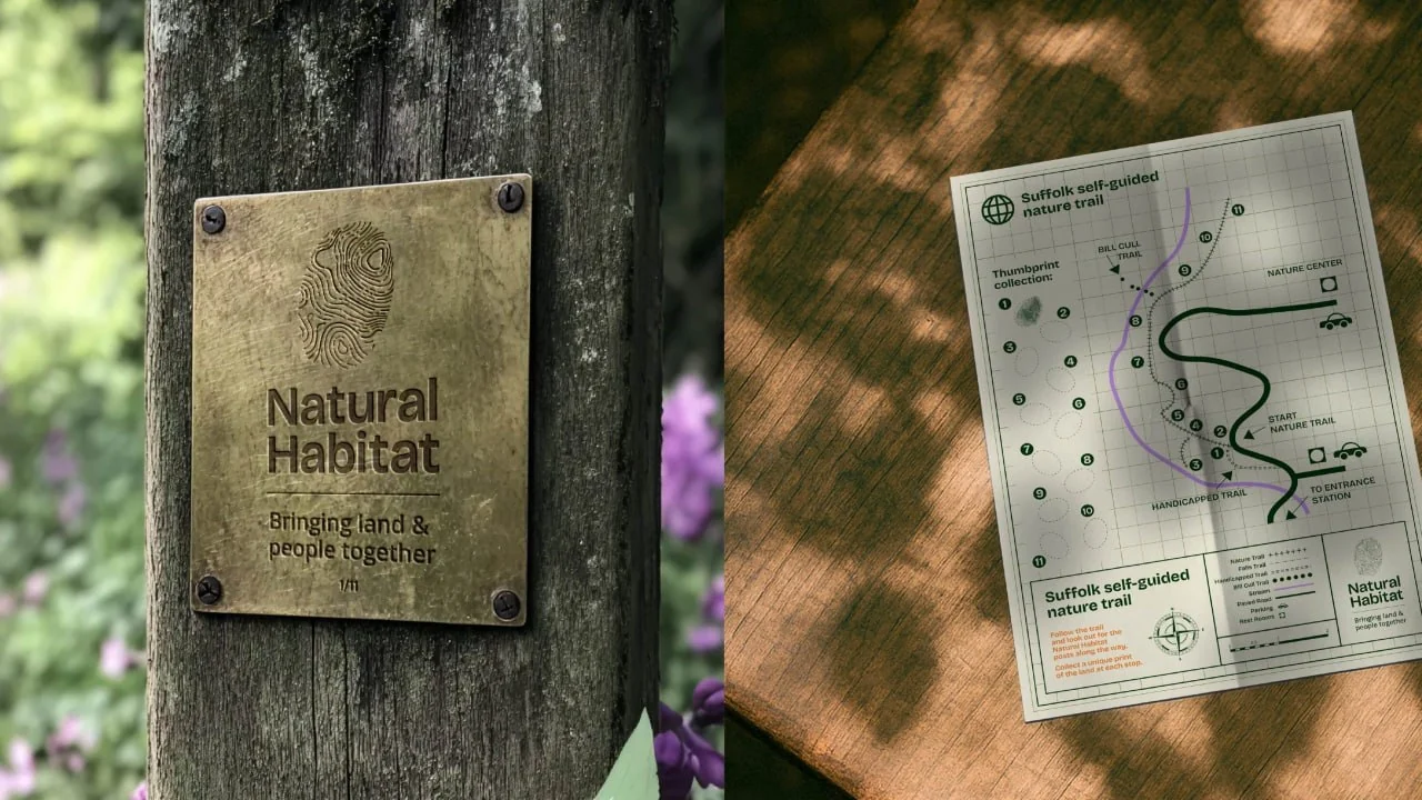
On work gloves, the fingerprint sits right on the thumb. On a cap, the contour lines become an embroidered pattern. And on printed maps, they become part of the wayfinding system.
WMH&I / Natural Habitat
WMH&I / Natural Habitat
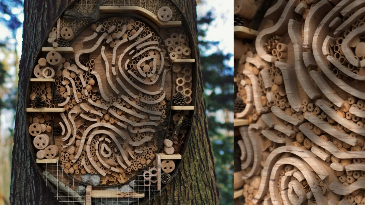
There's even a wooden structure based on the symbol that doubles as a shelter for insects. Not something you see in most branding projects, right?
WMH&I / Natural Habitat
The colours are worth mentioning too. Instead of relying entirely on the usual environmental green, the identity brings in yellow, orange, lilac and other shades inspired by nature and the changing seasons.
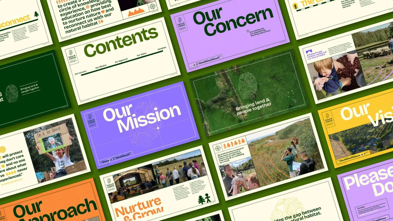
WMH&I / Natural Habitat
What I like most is that the designers could have simply drawn another tree or leaf. Instead, they found a much more interesting symbol that looks great and actually says something about the organisation.
Nature is much closer to us than we tend to think.
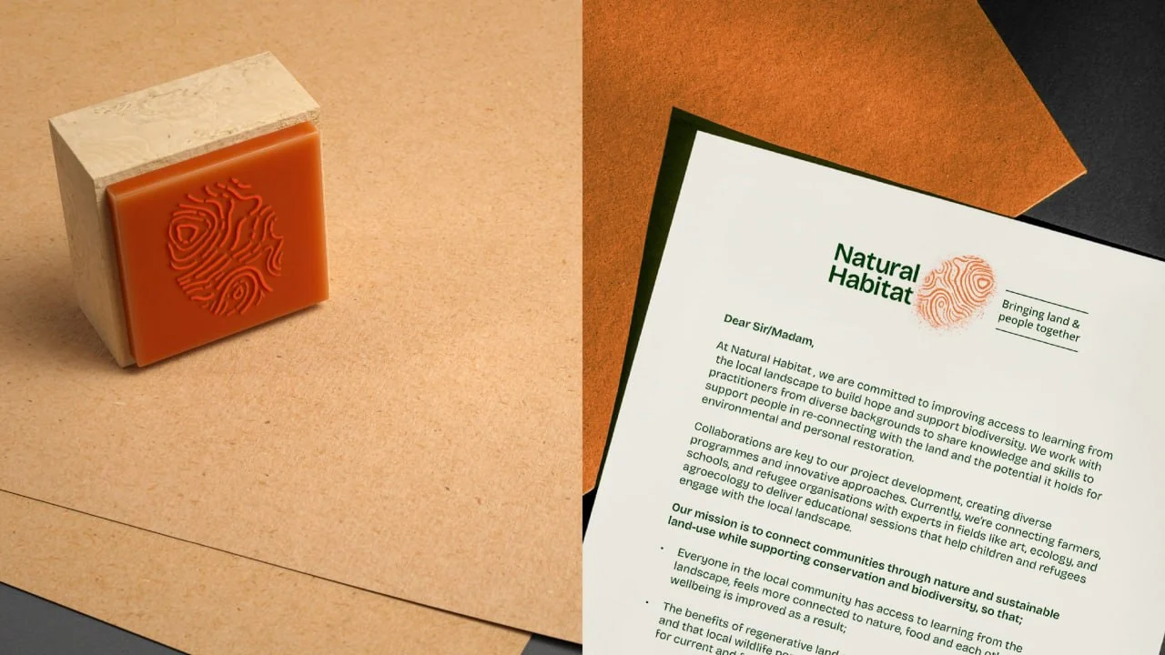
WMH&I / Natural Habitat
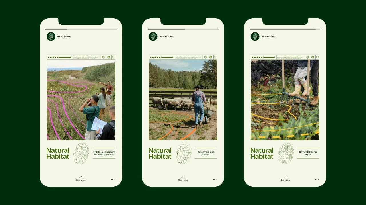
WMH&I / Natural Habitat
Design: WMH&I · Project: Natural Habitat


No comments yet. Start the conversation.