
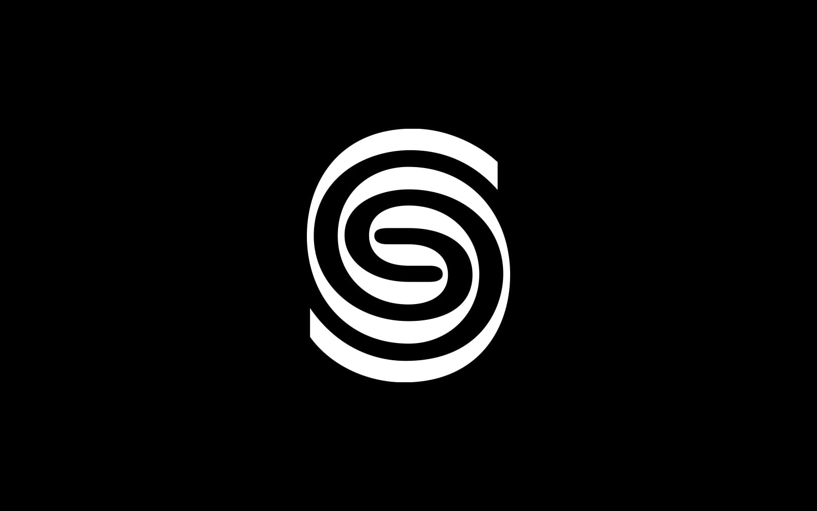
Sustana works across paper recovery and recycling, recycled fibre production and papermaking. On 16 January 2024, the company announced that Sustana Fiber, Rolland and Hanna Paper would come together under one brand. The identity therefore represents several connected stages of working with the material.
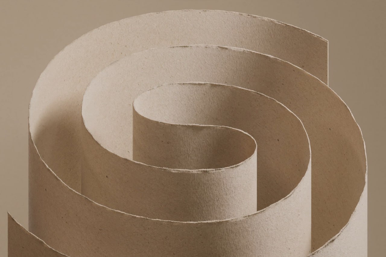
An S made from curled paper
COLLINS describes the mark through the spiral, a form found in nature that also recalls a paper roll. The image of a curled paper strip makes that connection particularly clear. Its bends form an S, while the open ends suggest that the line could continue.
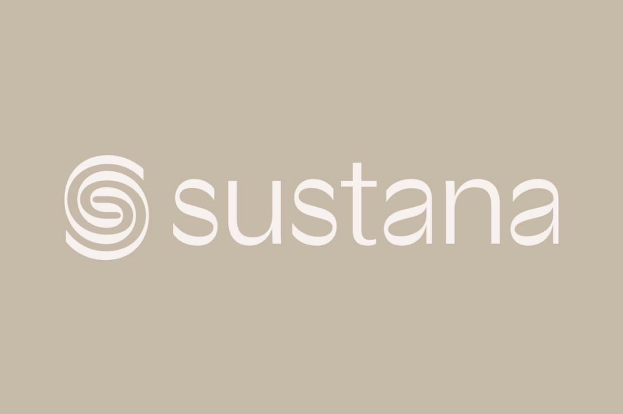
The flat symbol retains an alternation of broad and narrow sections. This gives it a distinctive rhythm that remains visible in a single colour. Beside it, the name is set in lowercase letters. There is plenty of breathing room between the dense mark and the quieter wordmark.
A typeface with changing stroke weight
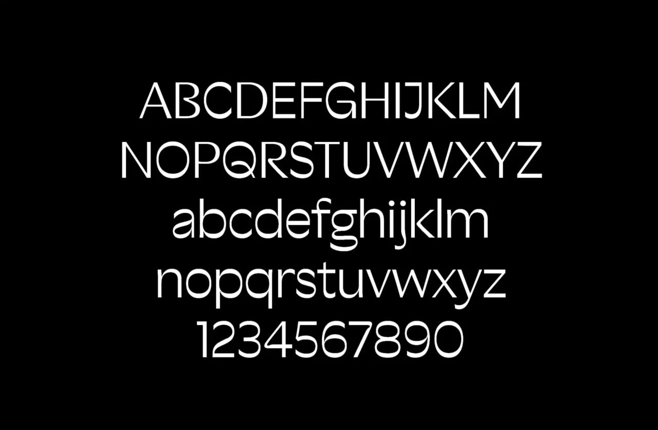
The bespoke Sustana typeface was created with Sharp Type. The supplied alphabet shows rounded shapes and changes in stroke weight. B, Q, R and the lowercase a are worth a closer look: these details give character to lettering that initially seems quite simple.
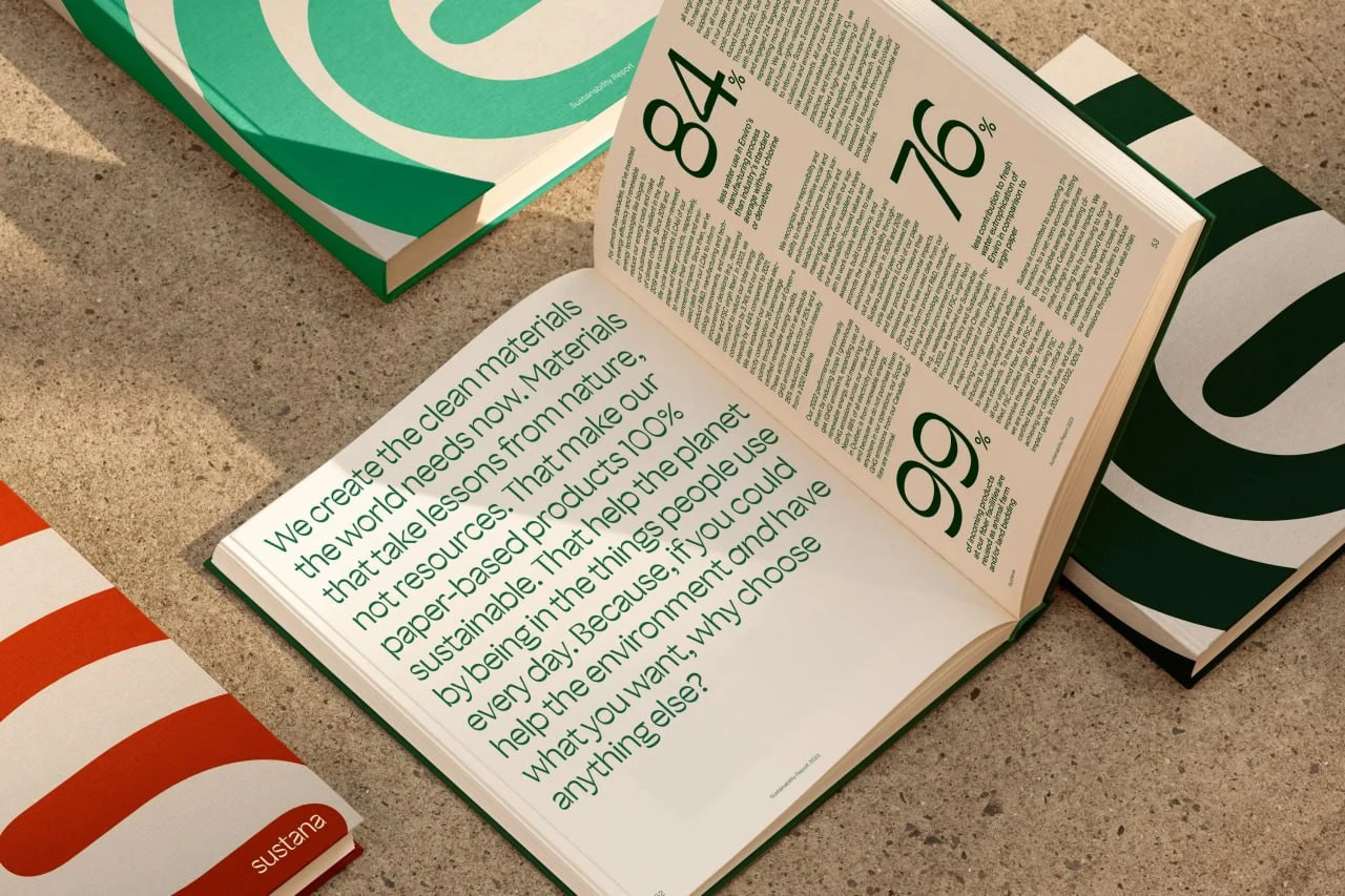
In the brochure, the typeface appears in both large display text and longer passages. Oversized numerals, short headings and generous margins help separate the information. Green and warm paper tones support the material qualities of the imagery, while cropped sections of the mark give the covers a graphic rhythm.
From a work jacket to a wall
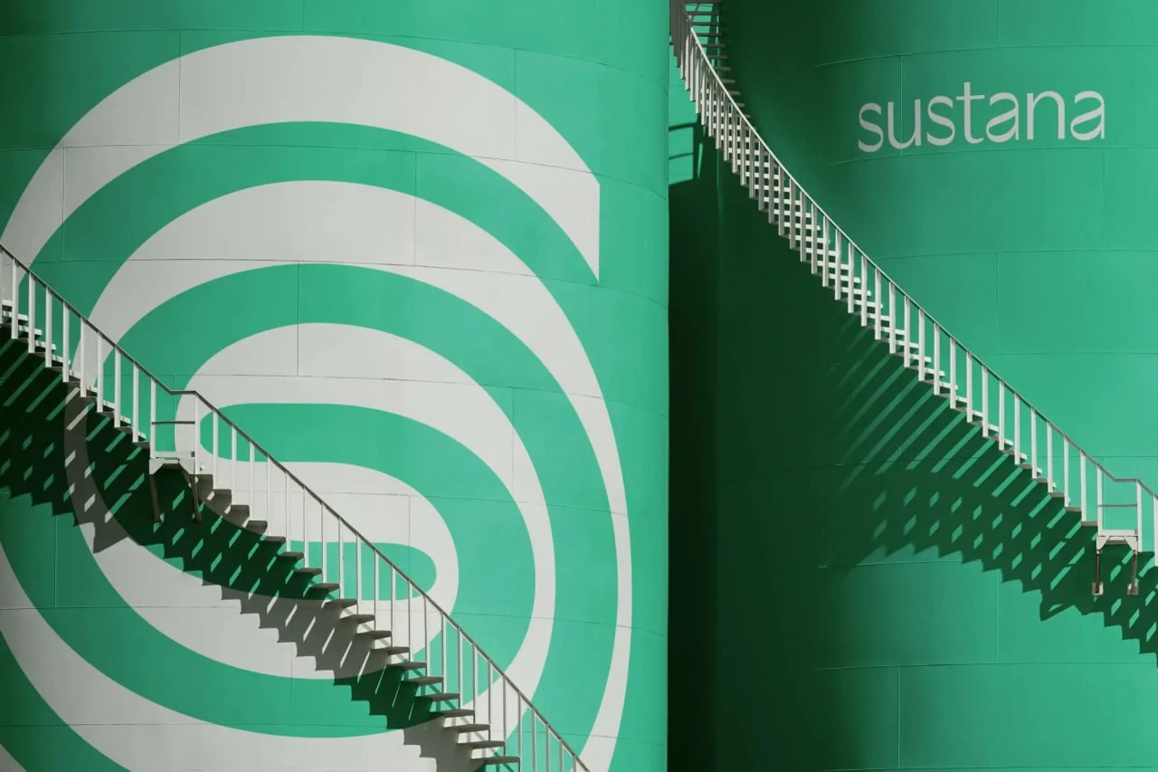
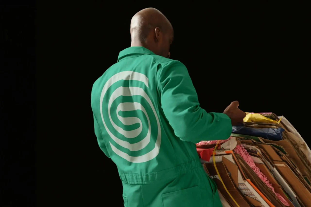
On the green jacket, the white symbol occupies most of the back. In the staircase image, the same form grows to the scale of a wall. Both applications rely on the overall silhouette: it is recognisable before the smaller lettering beside it can be read.
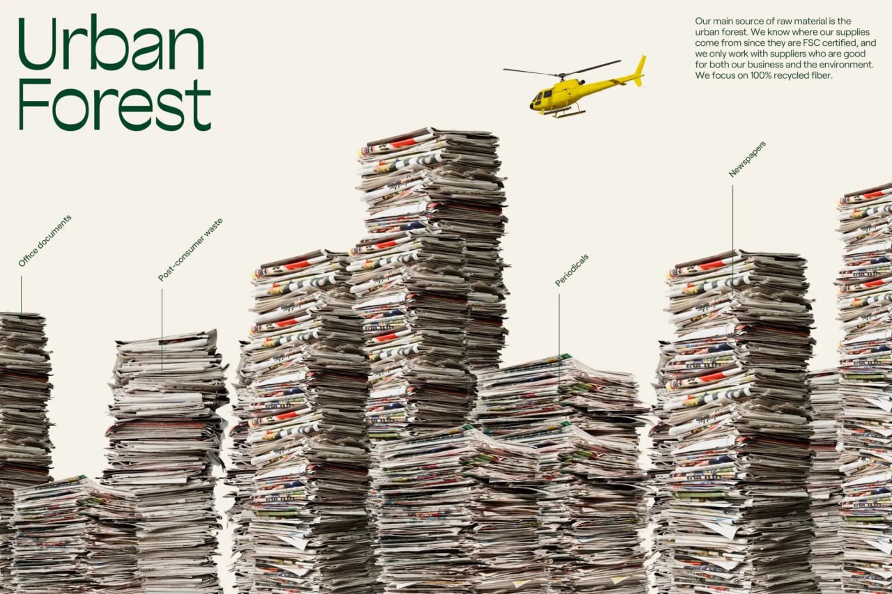
The Urban Forest composition takes a different approach. Stacks of newspapers and magazines form a dense landscape of varying heights. Labels identify types of recovered paper, while a small yellow helicopter adds to the play on scale. Familiar objects make the subject of recycling easy to grasp.
On the boxes, the enlarged mark wraps around adjoining faces while the name remains small. Here, the same motif works as both a logo and a large pattern. Type, colour and paper texture connect these differently scaled elements.
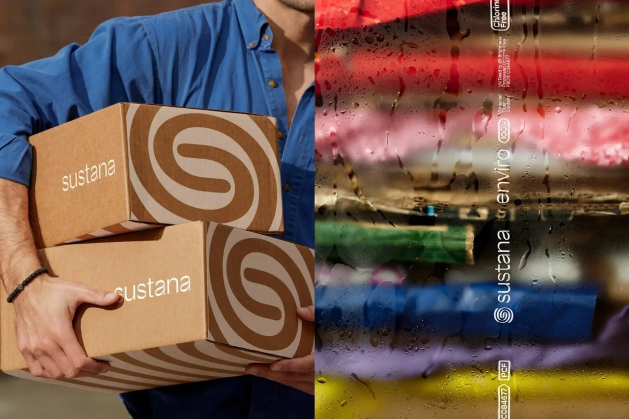
Identity: COLLINS for Sustana. The project also credits Sharp Type for the typeface, Mari Juliano for photography, Nicole Louie for styling and Pedro Veneziano for 3D.
Sources: COLLINS: Sustana · Sustana Advances as a Clean Materials Company · Sustana: Real change starts from within

No comments yet. Start the conversation.