

Learn Canadian promotes Canada as a study destination for international students. Led by the Canadian Bureau for International Education (CBIE) and supported by the education sector, the initiative was introduced in November 2025. ARK Agency created its logo and visual identity.
In their case study, the designers describe an education that shapes how people see the world. The layouts support that idea with images of people and places beyond the classroom.
The book forms the mark’s outer silhouette, with a maple leaf emerging from the negative space inside. Look at the cutout’s lower edge: it follows the curves of the pages, while the upper edge takes on the leaf’s sharp points. That shift between curves and angles brings the two images together.
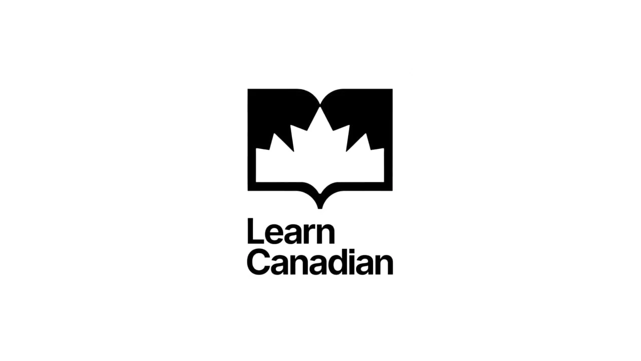
The black-and-white versions make that relationship easy to examine. There is no need for separate colours to distinguish the two images. The solid shape describes the book; the cutout supplies the leaf. A single shared edge does both jobs.

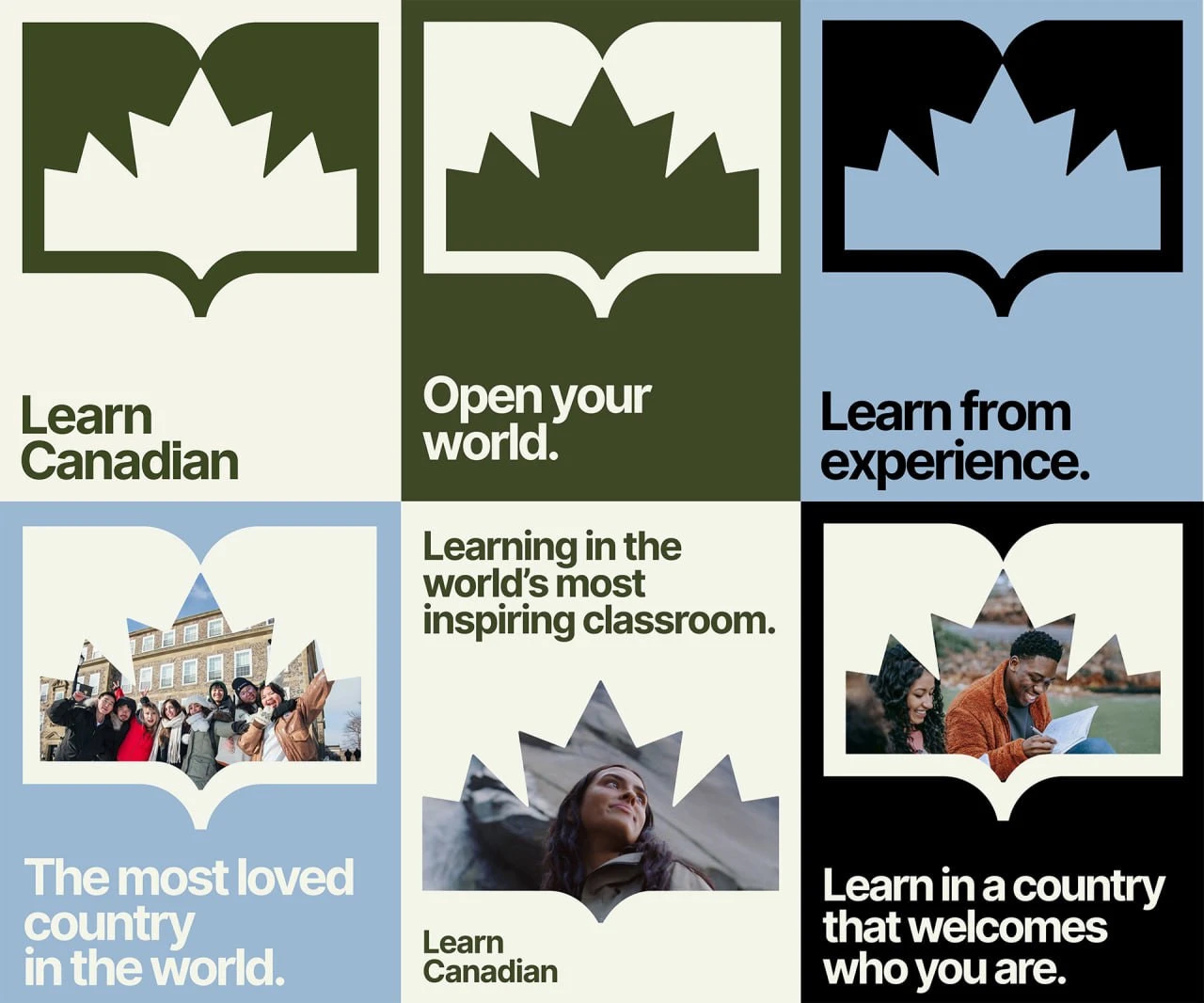
That same edge becomes a way to frame photography. In the identity examples, the enlarged mark holds portraits and group shots. Some layouts retain the full book outline; others use just the shaped cutout. The compositions change while keeping a visible connection to the logo.
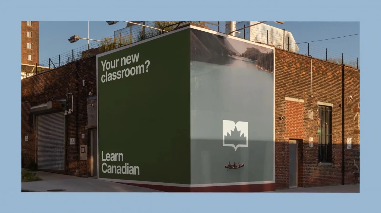
Landscapes are part of the picture, too. An outdoor advertising mockup places the question “Your new classroom?” beside a lake and a canoe. The white mark sits over the photograph, letting the scene show through its open centre. It carries the logo’s negative-space idea into a larger format.
Identity design: ARK Agency. Project: Learn Canadian for CBIE.
Learn Canadian case study, entered by ARK Agency at D&AD · About Learn Canadian · CBIE launch announcement, 3 November 2025



No comments yet. Start the conversation.