
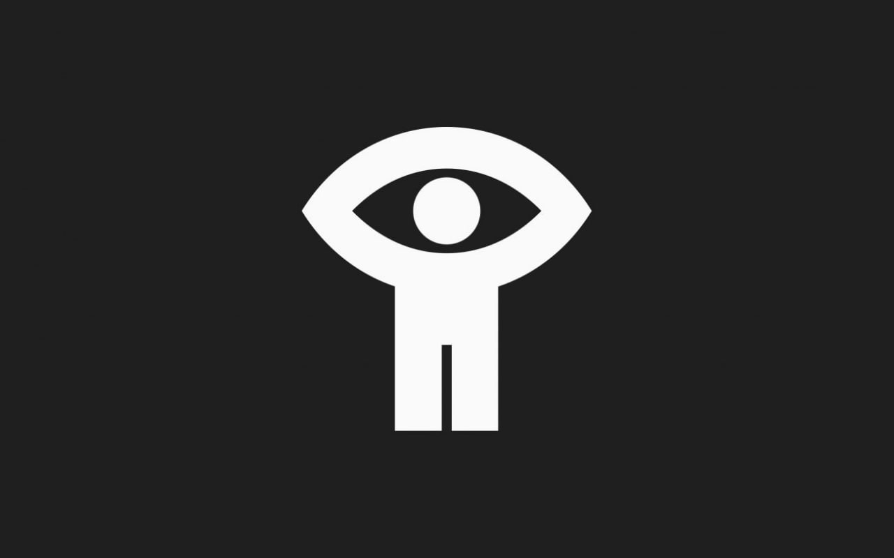
The symbol holds two images at once. Its central circle reads as a human head and as a pupil, while the raised arms and upper curve form an eye. The lower section brings the composition back to a standing figure. With very few shapes, the design connects a person, an act of looking and the moving image.
According to the NFB’s published history, an internal competition attracted 53 entries, assessed anonymously by number. Entry 52, by publicity department creative director Georges Beaupré, won. Proposals from two outside design firms had previously been rejected. The institution found its enduring symbol among its own staff.
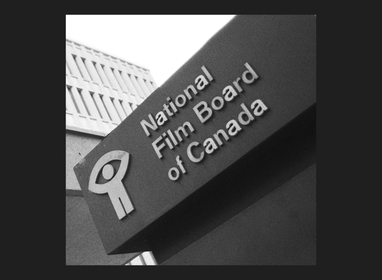
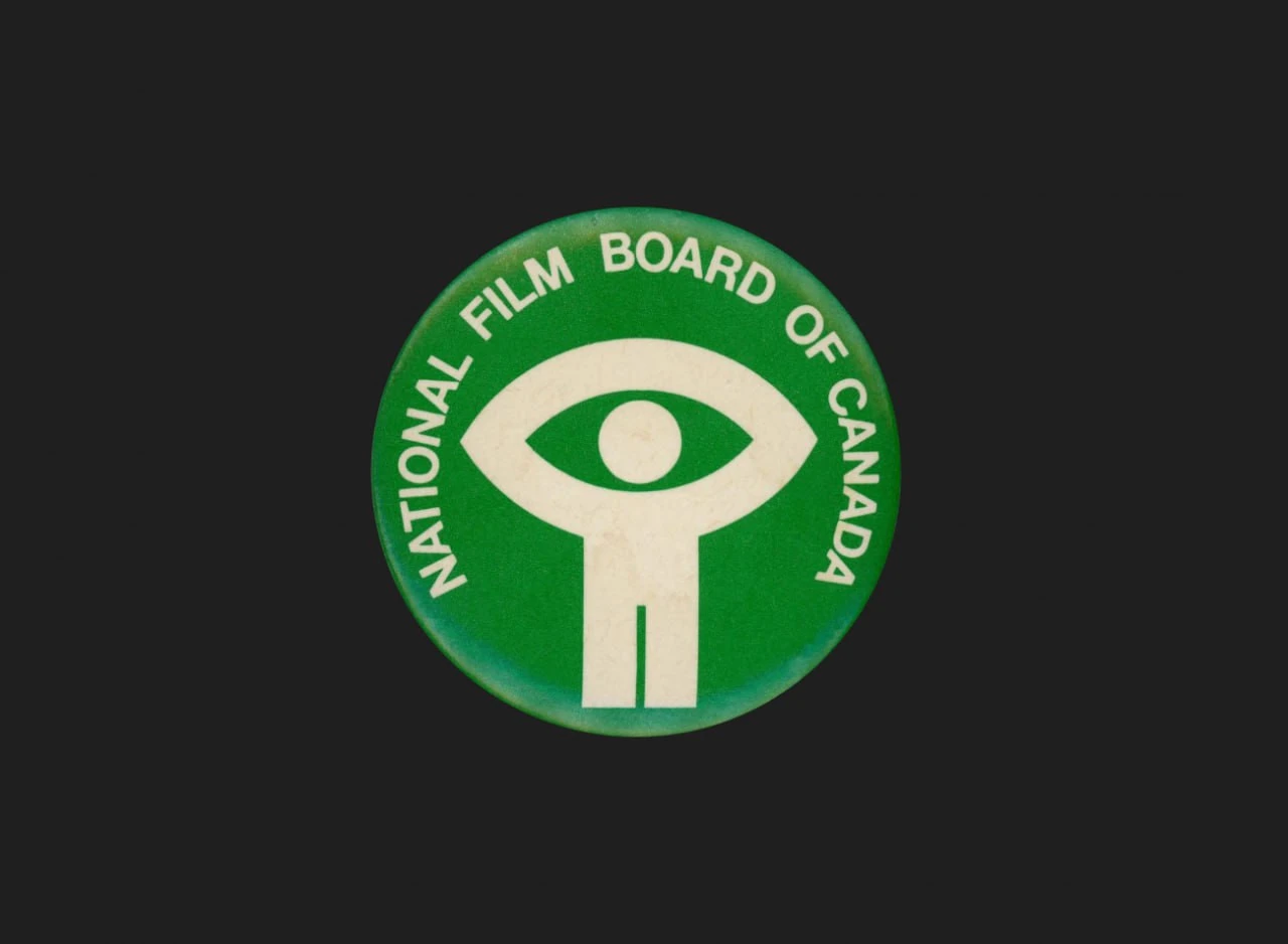
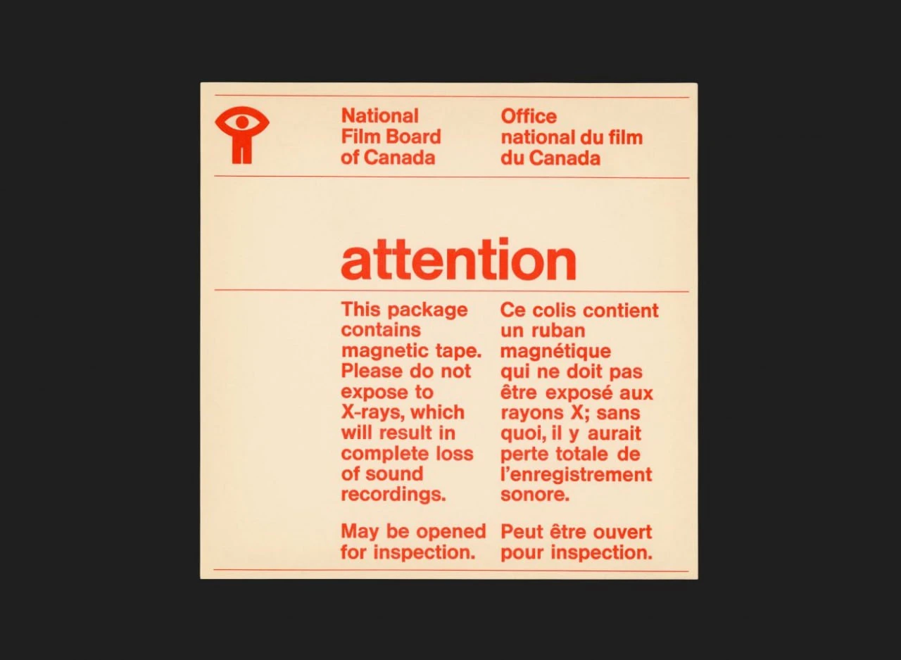
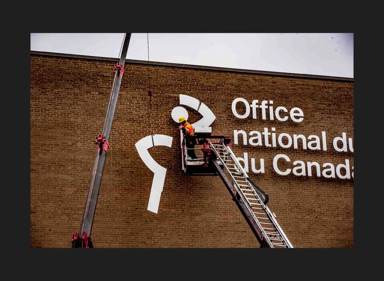
These images make a useful study of scale. On a building, the mark reads as a bold silhouette. On a green badge, it anchors a circular composition. On a warning label, it sits quietly beside practical bilingual information. Each application gives the same compact shape a different role without asking it to carry every part of the message.
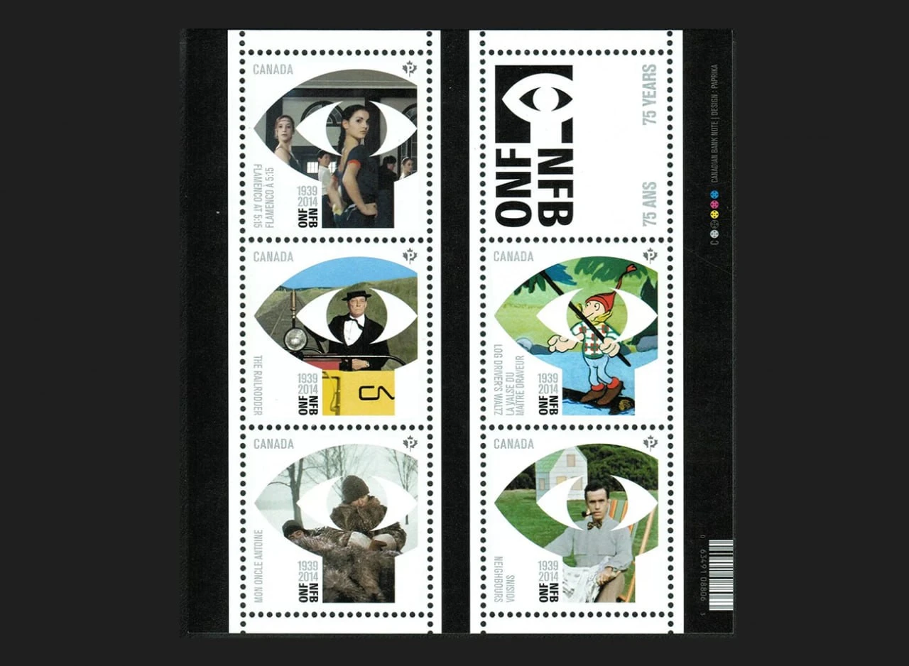
Canada Post issued its NFB 75th-anniversary stamps on May 2, 2014, with design by Paprika. The pictured stamps offer another reading of the eye motif: a frame for film imagery. The shape provides a recognizable structure while the scenes inside bring different characters, colours and moods into the composition.
The identity has not remained completely unchanged. The NFB records updates in 1993, 2002 and 2015, involving its framing, typography and colour. Continuity of the central idea is a more accurate description than an untouched identity.
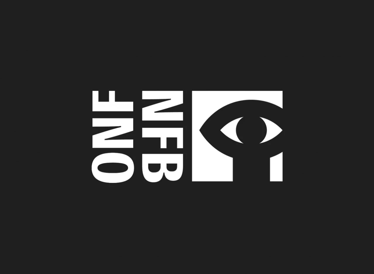
For designers, the interest lies in the balance between simplicity and personality. Symmetry gives the composition stability, while the figure keeps it from feeling purely geometric. It remains legible as a standalone symbol and can also sit within a bilingual signature. Looking across these examples, the distinction becomes clear: a strong mark provides a point of recognition, while its surrounding layout can respond to a particular object, message or setting.
The Little-Known History of the NFB logo · National Film Board of Canada, TM13 · Details, May 2014 · National Film Board of Canada Labels, CM76



No comments yet. Start the conversation.