
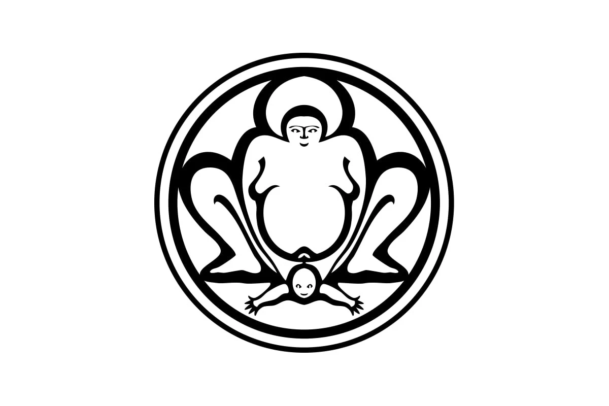
Bumi Sehat is a nonprofit organisation founded in Indonesia in 1995. Its first clinic is in the village of Nyuh Kuning, near Ubud, Bali. The foundation provides care during pregnancy, birth and the postnatal period, which makes the choice of subject for its emblem easy to understand.
A large female figure occupies the centre, with a baby below her, arms outstretched. The double circle, near-symmetrical arrangement and thick black lines bring everything together in a compact, striking mark. Its overall silhouette is easy to recognise, although individual details take a closer look.
The larger figure’s pose and rounded shapes bring a sumo wrestler to mind. Seen without the name, the forms leave room for that reading too. The baby’s small face, widely spread arms and the much larger body above create an unusual sense of scale. The eye may linger on these details before the whole scene comes together.
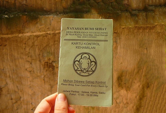
In the photograph of a prenatal check-up card, the logo sits among text as part of an everyday document. The context immediately identifies the organisation behind it. At this smaller printed size, the outer circle, overall pose and dark lines against the pale paper keep the mark recognisable. Fine facial features recede into the background.
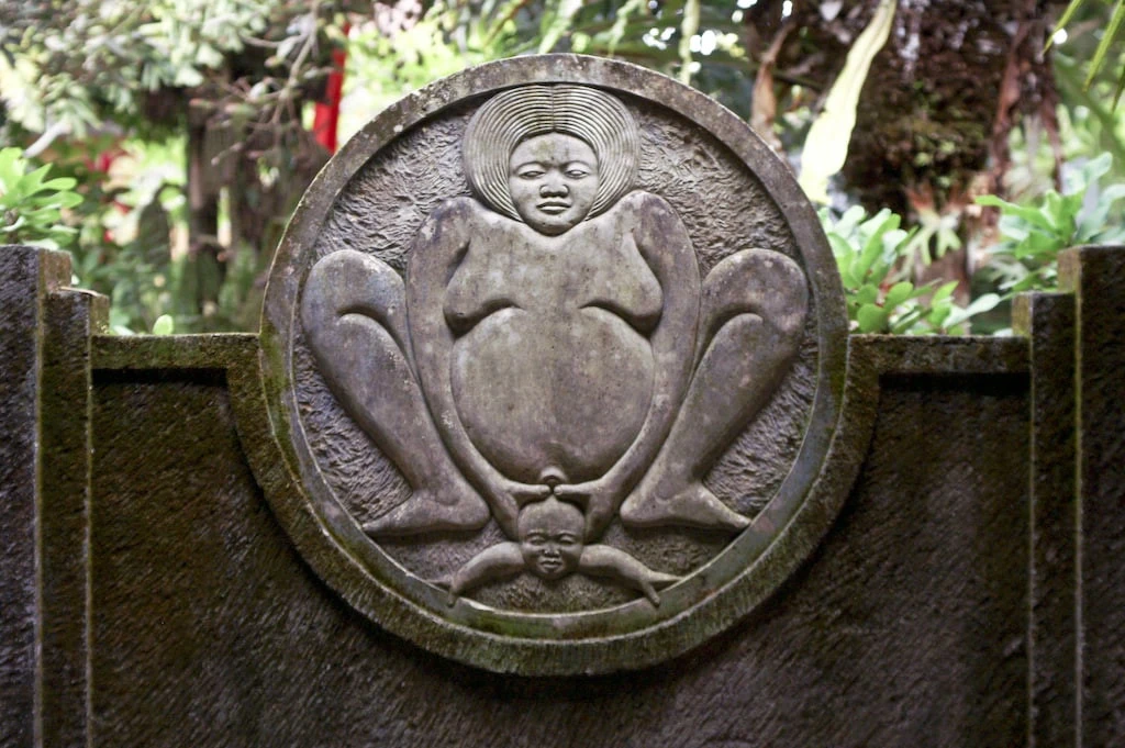
The other photograph shows a stone relief with a similar composition. Texture and shadows give the figures depth, while the flat black-and-white mark places more emphasis on outlines. The comparison is interesting: a similar pose makes a different impression in stone and in graphic form. Visual resemblance alone, however, is not enough to establish the logo’s origins.
Do you see a birth scene straight away, or does a completely different image come to mind first?
Sources: Bumi Sehat Foundation; Bumi Sehat Bali.



No comments yet. Start the conversation.