Merriweather
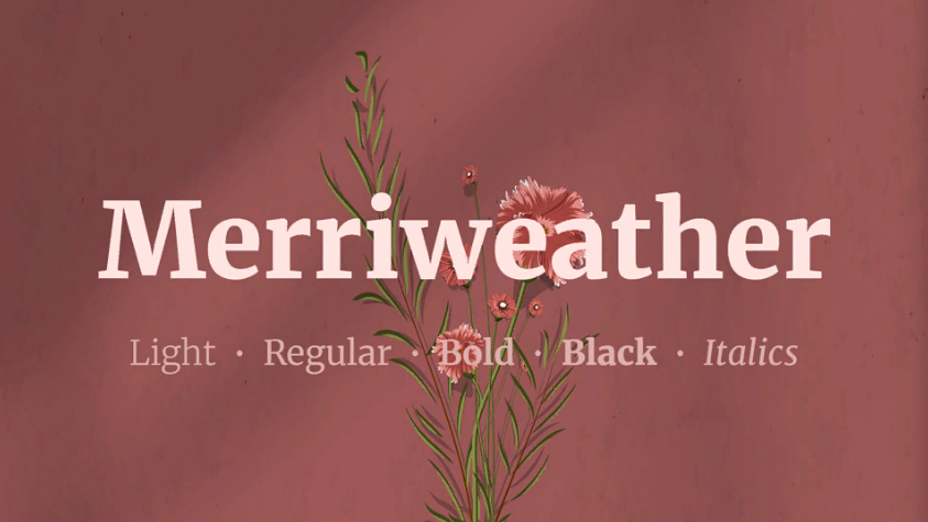
Merriweather by Eben Sorkin is a serif designed with screen reading in mind. Its substantial letterforms stay steady across long articles and editorial pages.
Discover useful things. Build your library. Share your finds.
Merriweather by Eben Sorkin is a serif designed with screen reading in mind. Its substantial letterforms stay steady across long articles and editorial pages.
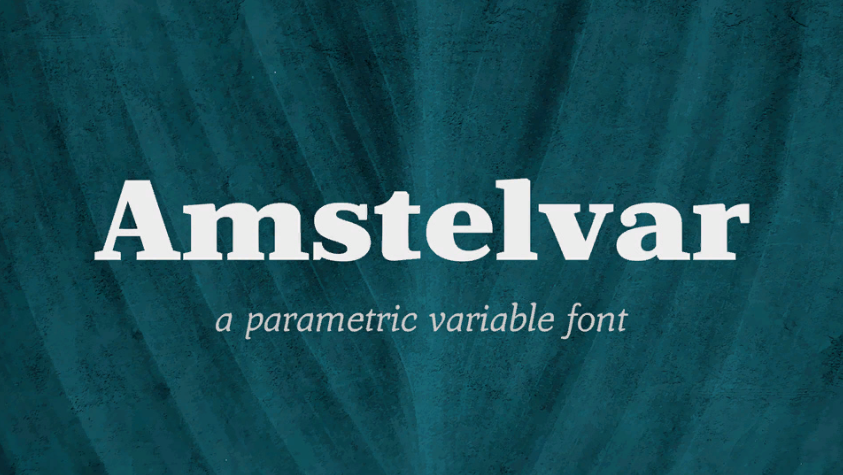
Amstelvar by David Berlow explores variable type design. Its adjustable axes make the same serif family feel different at small and large sizes.
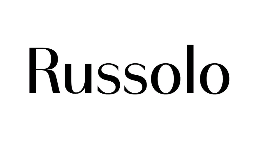
Russolo is a geometric variable sans with contrasting thick and thin strokes.
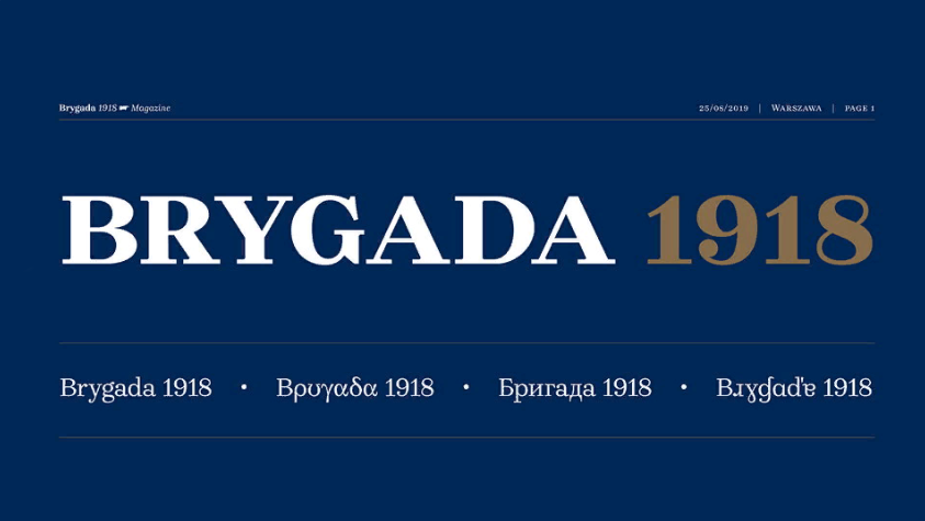
Brygada 1918 is a revived Polish serif associated with the centenary of the country's independence. Its historical character is preserved in a practical digital family.
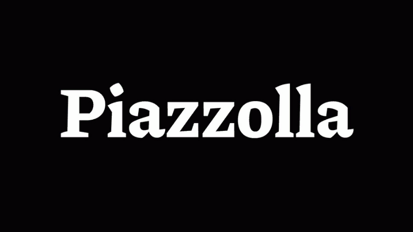
Piazzolla is a serif family with pronounced contrast and lively, carefully drawn details.
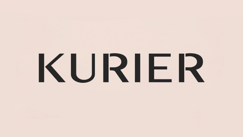
Kurier is a sans-serif family for precise typesetting, with several widths and weights.
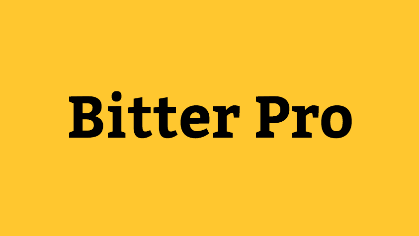
A sturdy slab serif built for comfortable screen reading, supplied in 18 weights and italic styles.
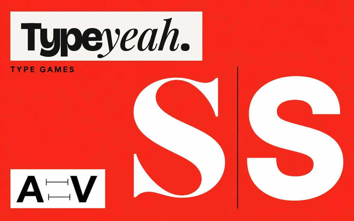
Four browser mini-games for practicing kerning, recognizing typefaces and serifs, and playing with the text baseline.