
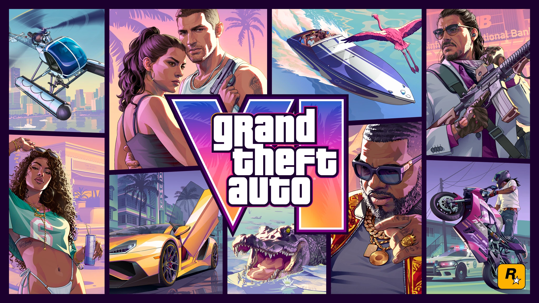
GTA has long been more than just a video game series. Even people who have never played Grand Theft Auto recognise its visual style. The unmistakable white logo, bold character illustrations and covers divided into panels are often enough. That aesthetic has spread to memes, posters and fan art. Over nearly 30 years, Rockstar has created a cultural phenomenon with a visual language that is hard to mistake for anything else.
But the most interesting part is how it all came together. A typeface inspired by an American television game show became the foundation of an iconic logo. A cover redesigned under intense time pressure established a visual tradition that lasted for decades. Artists shaped a recognisable illustration style, while fictional companies inside the games received their own logos, advertising and brand identities. This is the story of how those decisions helped Rockstar build one of gaming's most recognisable visual worlds.
01. The GTA logo: how three words became more memorable than many symbols
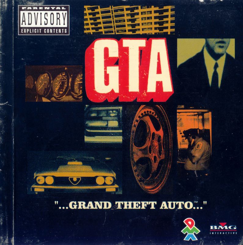
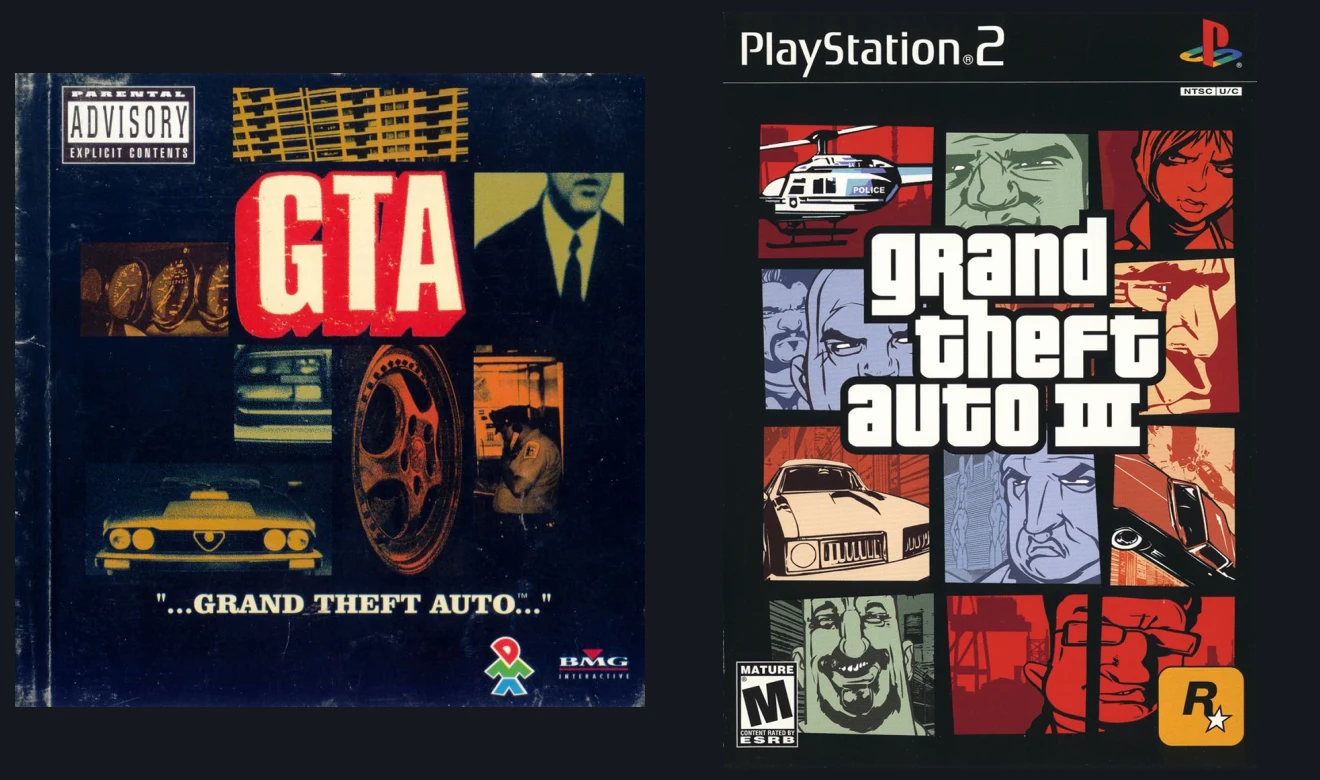
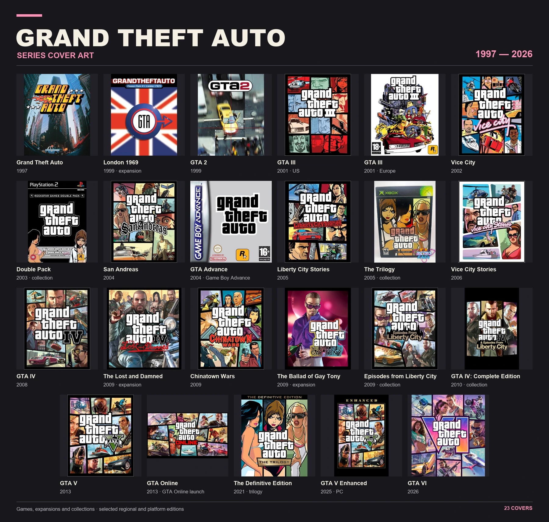
The first Grand Theft Auto was developed by DMA Design and released in 1997. Its box art did not feature the now-familiar three white lines. Early editions combined oversized GTA initials, vehicle photography, dark backgrounds and visual cues from crime-movie posters. The immediate job was to make a new game stand out on a shelf. Those covers had energy, but they had not yet become a consistent visual system.
1999: GTA 2 was another attempt to find the right form
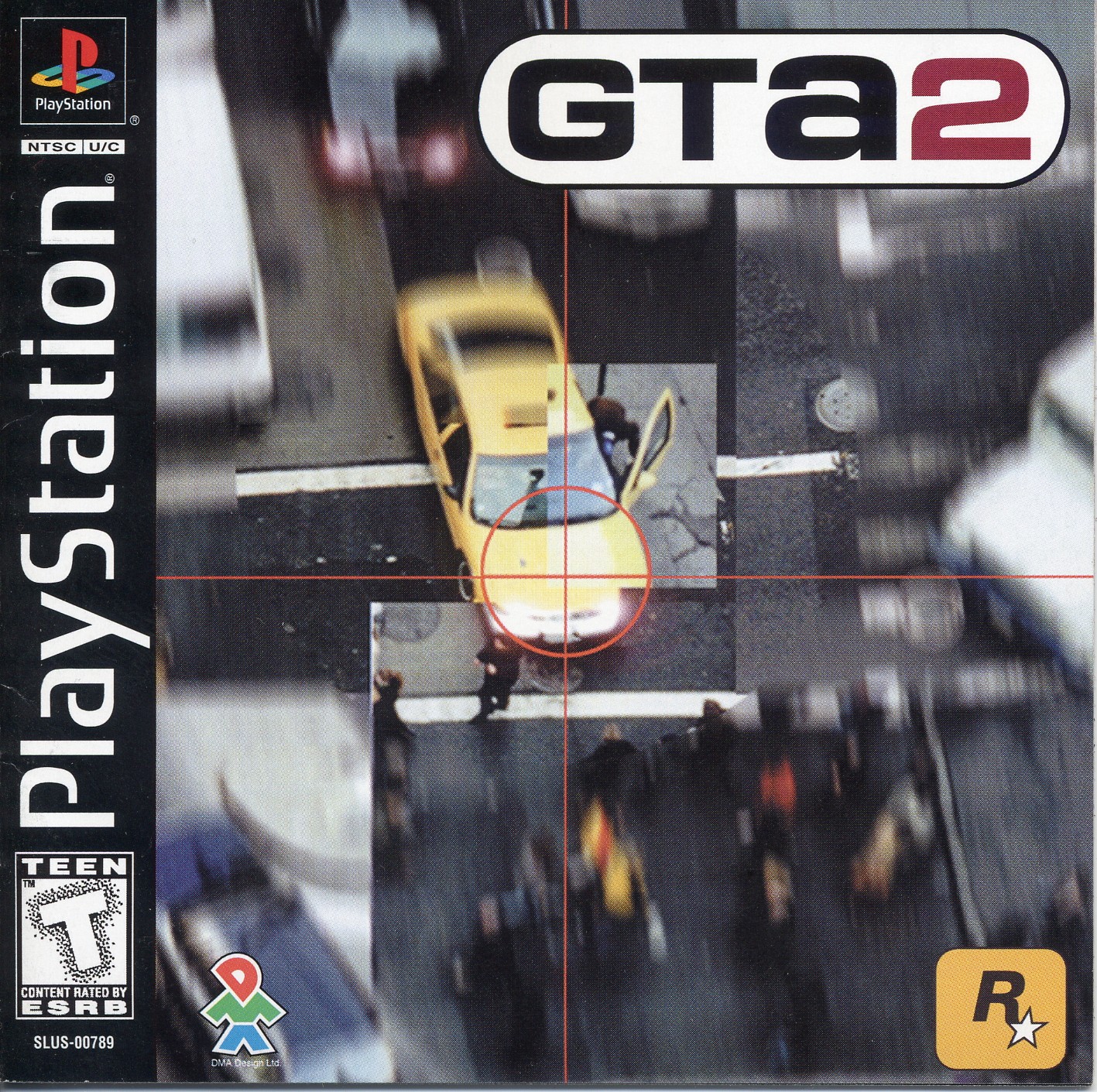
GTA 2 moved toward a compact name-and-number badge. On one edition it sits inside a rounded white capsule, above an overhead photograph of a car. The result is almost a traffic sign: quick to read, visually contained and easy to place on a package. Even so, the first two games had not established a design rule that could survive decades of different stories and settings.
2001: the familiar grand theft auto word block arrives
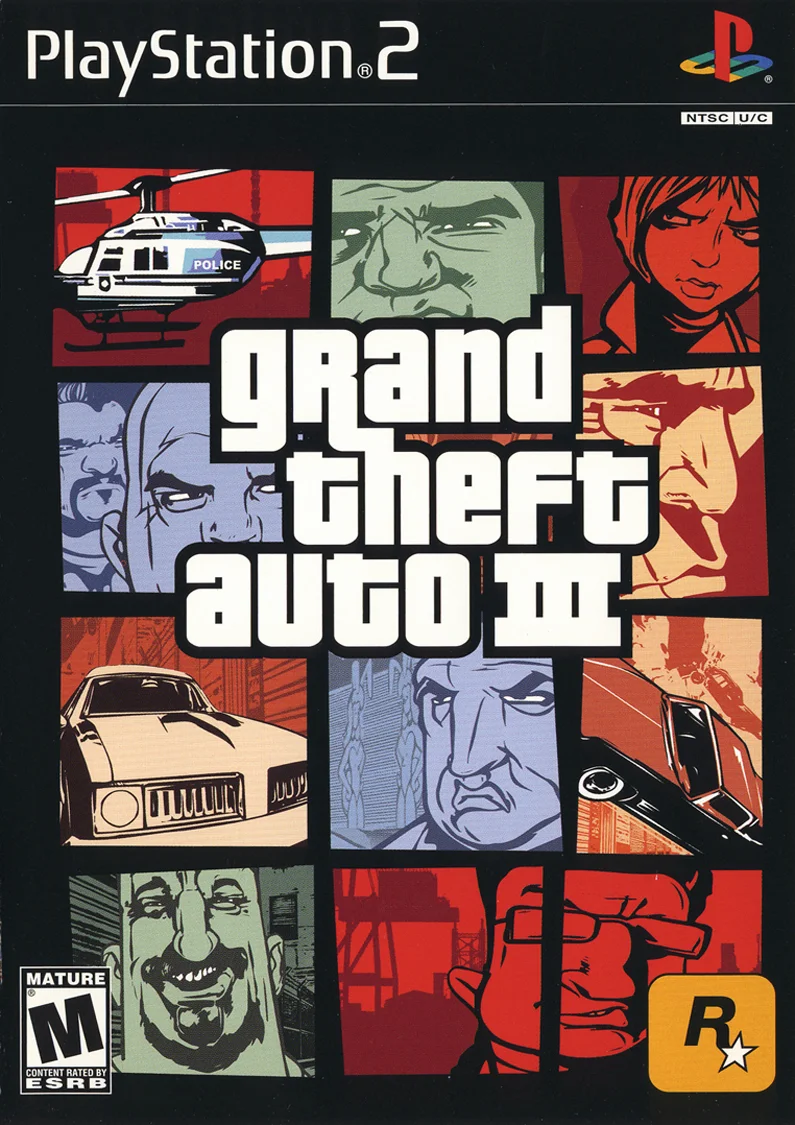
GTA III (2001) changed the direction. Instead of relying on initials, its designers brought back all three words and arranged them into a tight, almost square block. Heavy white letters gained black outlines, allowing the title to remain legible over a red car, pale sky or crowded illustration. The breakthrough was not only the shape of the type. Three separate lines made a long game title behave almost like one emblem.
Pricedown: a typeface with television roots
GTA III's lettering draws on Pricedown, a typeface by Canadian designer Raymond Larabie. In his own history of the font, he dates its release to November 30, 1997. It was his reinterpretation of Pinto Flare, a display face from the early 1970s associated with the American television show The Price Is Right. In other words, one of gaming's most recognizable title treatments has roots in the visual language of televised prices and promotions.

That connection comes with a surprising footnote. When Rockstar's New York team selected the free font, Larabie was working as an art director at Rockstar Toronto. According to him, his colleagues did not know the typeface had been drawn by someone inside the same company. Still, Larabie designed the typeface, not the final GTA III logo composition. The distinction matters: a font supplies letterforms, while a wordmark is a specific arrangement with its own spacing, scale, outlines and colour.
Pricedown has a distinctive silhouette: thick squarish forms, rounded corners and occasional extended strokes. That much personality could easily overwhelm a composition. Rockstar instead uses it with discipline. The letters are usually light, the outline dark, and the stacked arrangement consistent. At thumbnail size, the title remains readable; on a billboard, it anchors everything around it. That flexibility has mattered more than any trendy decorative flourish that might date after a few years.
How numbers and subtitles change the mood
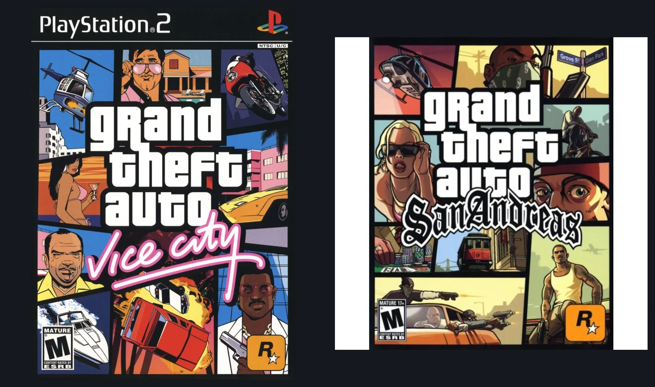
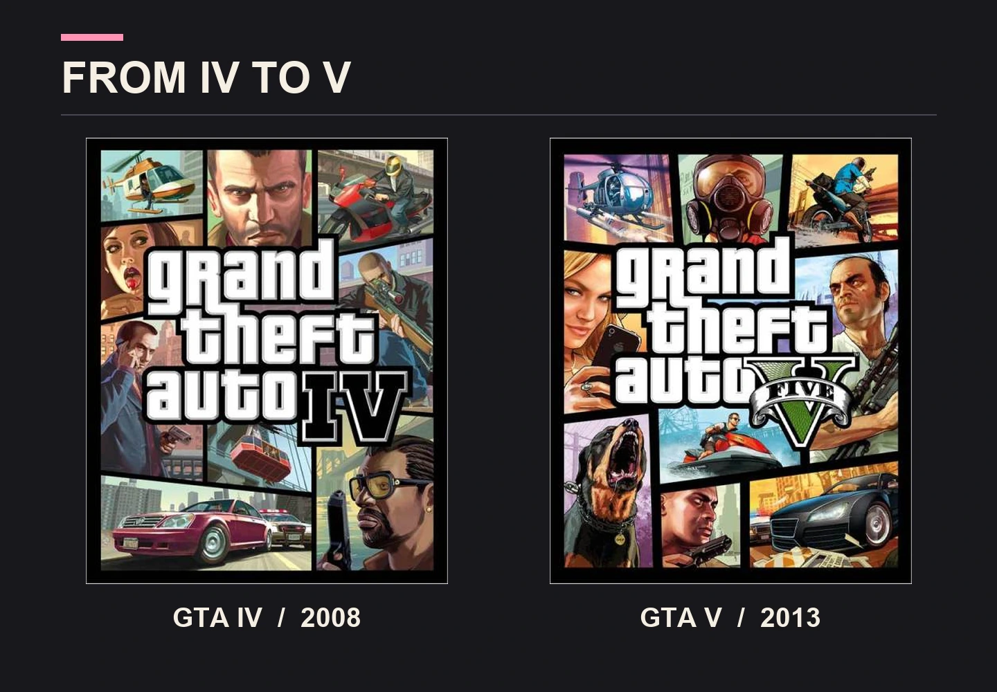
Each major instalment adds a small but powerful detail around the constant title. Vice City gained a pink handwritten subtitle reminiscent of a neon sign. San Andreas adopted blackletter styling tied to street lettering. GTA IV uses a restrained, nearly monochrome Roman numeral, while GTA V has a green ribboned V reminiscent of engraved US currency. These are not random typographic experiments. They tell players something about each game's setting and mood before they read any description.
The evolution of GTA's logo, in one image
This timeline makes the turning point easy to spot. In 1997, GTA's title was still loud and fiery, with stars and dramatic lettering; GTA 2 experimented with a compact badge. Then GTA III introduced the stacked white wordmark that has survived decades of change. Vice City added pink neon-style script, San Andreas brought blackletter lettering, GTA V used a green banknote-inspired numeral, and GTA VI turned a large gradient VI into part of the composition. Even spin-offs found their own personality without losing the connection to the parent identity.
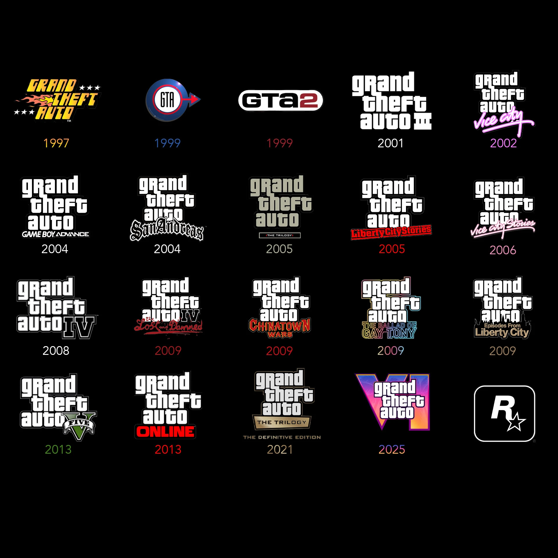
This is a simple principle of durable identity design. Once the main element is familiar, it does not need to be redrawn for every launch. The central structure can stay recognisable while secondary elements take greater creative freedom. In GTA those variables include numerals, subtitles, illustrations and colour palettes. Games that look very different in tone still feel related, rather than like unrelated projects from the same publisher.
02. GTA illustrators: why the characters read at a glance
The games themselves moved through different engines, character models and lighting technologies. GTA promotional illustration developed according to a different logic. It is not simply an attempt to reproduce a screenshot. The artist chooses a pose, strengthens a silhouette, removes distracting details and makes a character understandable at a glance. Danger, humour and an entire era can be communicated without an explanatory paragraph.
One of the defining contributors was British illustrator Stephen Bliss. He joined Rockstar Games in 2001 and remained there until 2016. His portfolio includes covers, posters, magazine illustrations and outdoor campaigns. In a Back Market interview published on November 16, 2026, Bliss discussed his affection for Marvel and DC comics, movie posters and the 1979 film The Warriors.
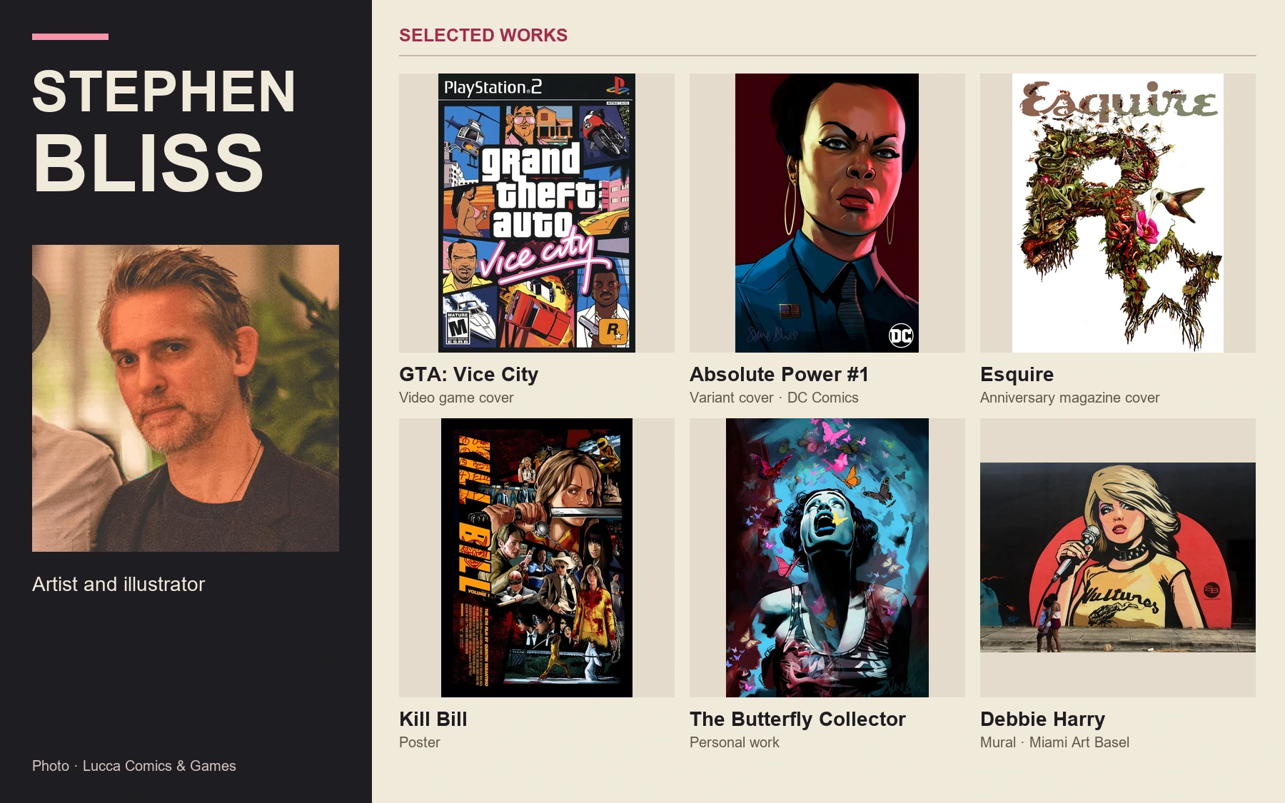
Strong outlines, bold shadows and readable poses
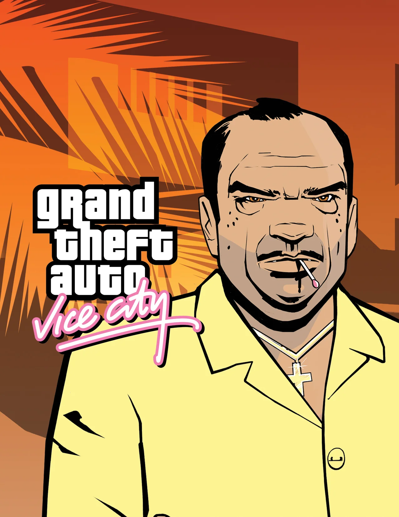
Look at the contours in the early Vice City posters. Eyes, noses and jaws often rely on a handful of decisive lines, while clothing and hair are built from broad areas of colour. Shadows are not always blended through dozens of tones; they describe volume directly. The result remains legible on a large screen, a poster or a small game box. The technique has much in common with classic comic-book artwork.
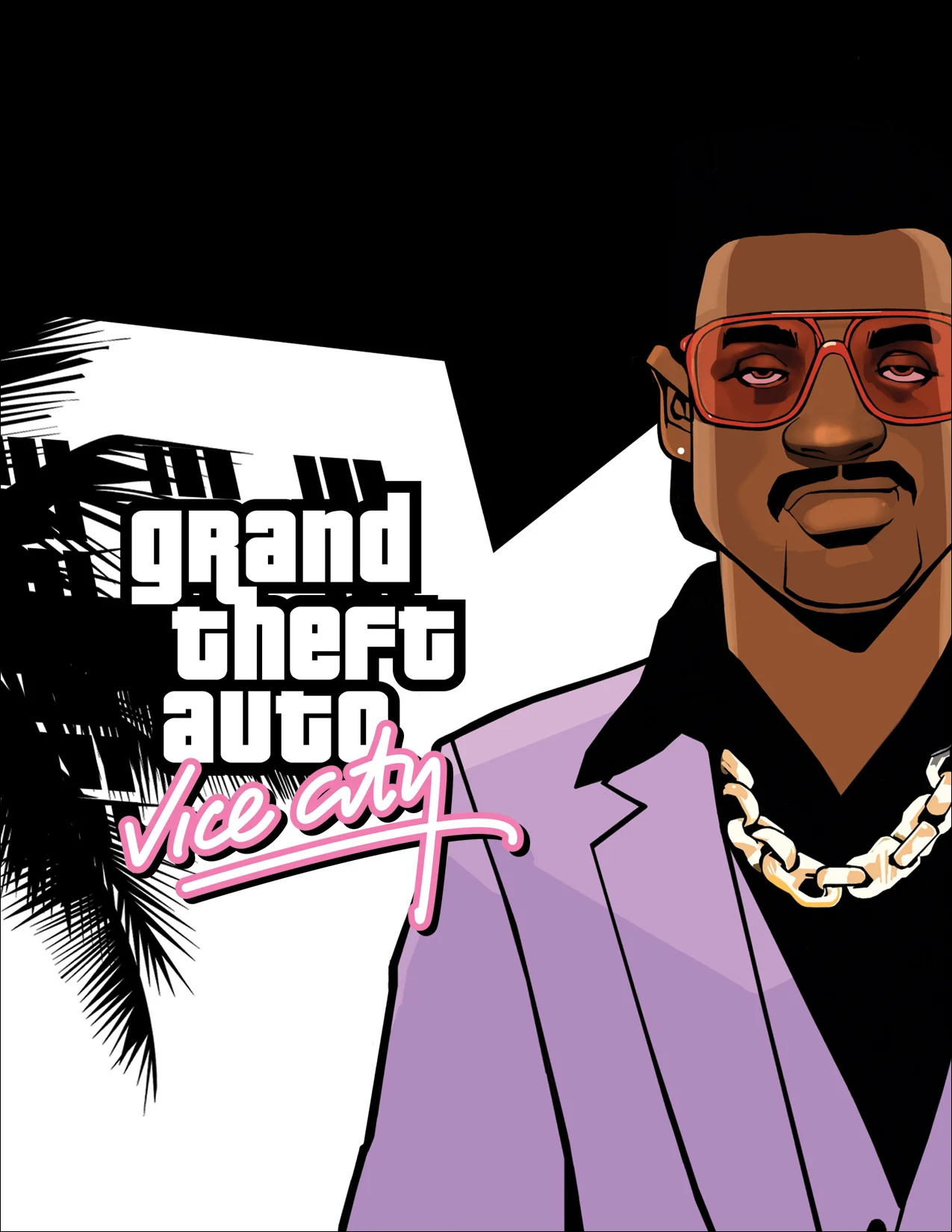
In the Lance Vance poster, the purple jacket dominates much of the frame while red glasses form a second colour accent. Diaz is handled differently: a yellow shirt pushes against a dark orange background, keeping his face unmistakable. The characters feel different, but both images are built around a controlled silhouette. Colour here does not simply decorate a background; it helps establish the person's character.
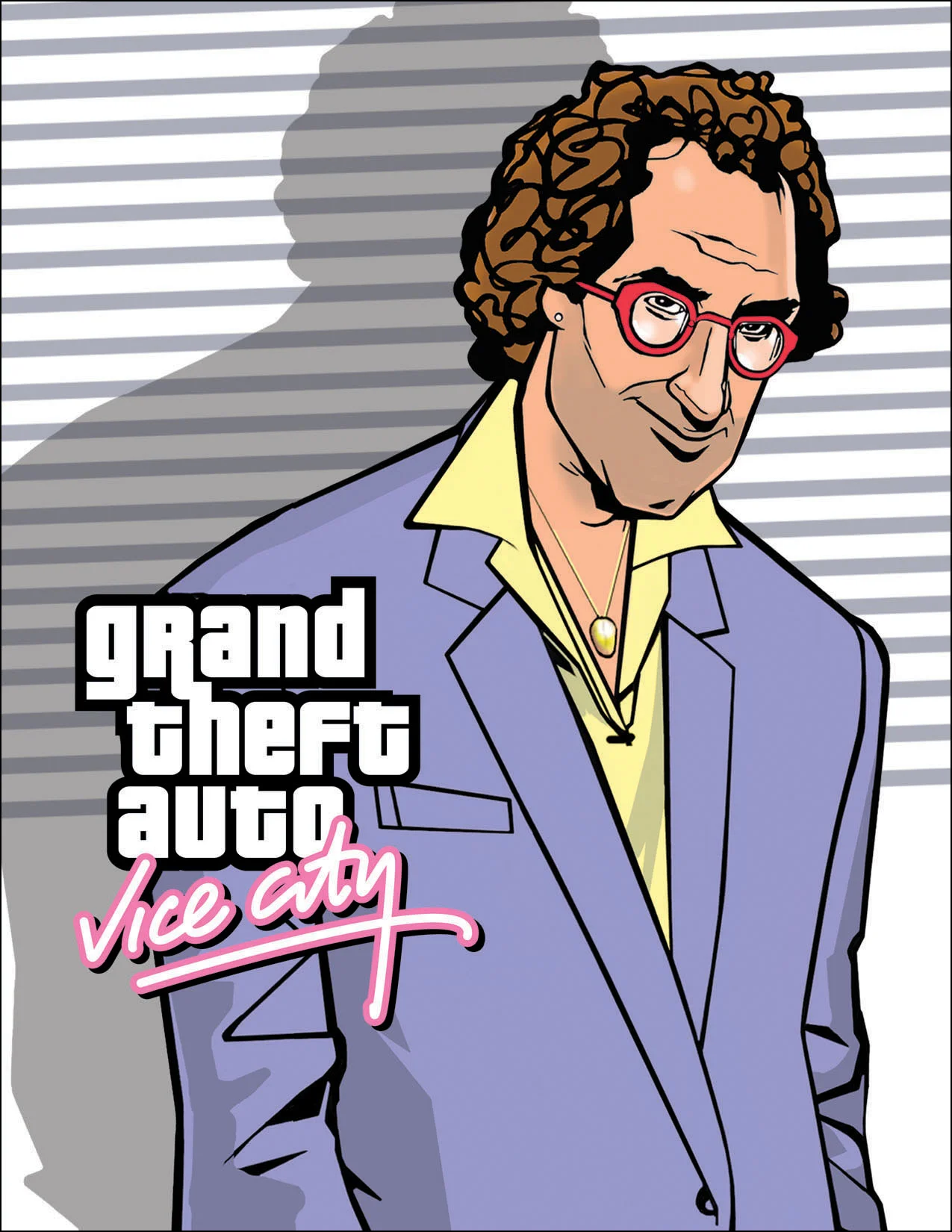
The artwork does not have to resemble a screenshot
An isolated GTA III character portrait may use flat blue clothing, dense black outlines and an expression that becomes memorable immediately. Compare that with the Vlad illustration for GTA IV. Here the lighting is more nuanced, the face has greater volume and the fabric feels more physical. In a 2008 interview, Bliss described how the covers had gradually become more painterly while remaining identifiable as GTA.
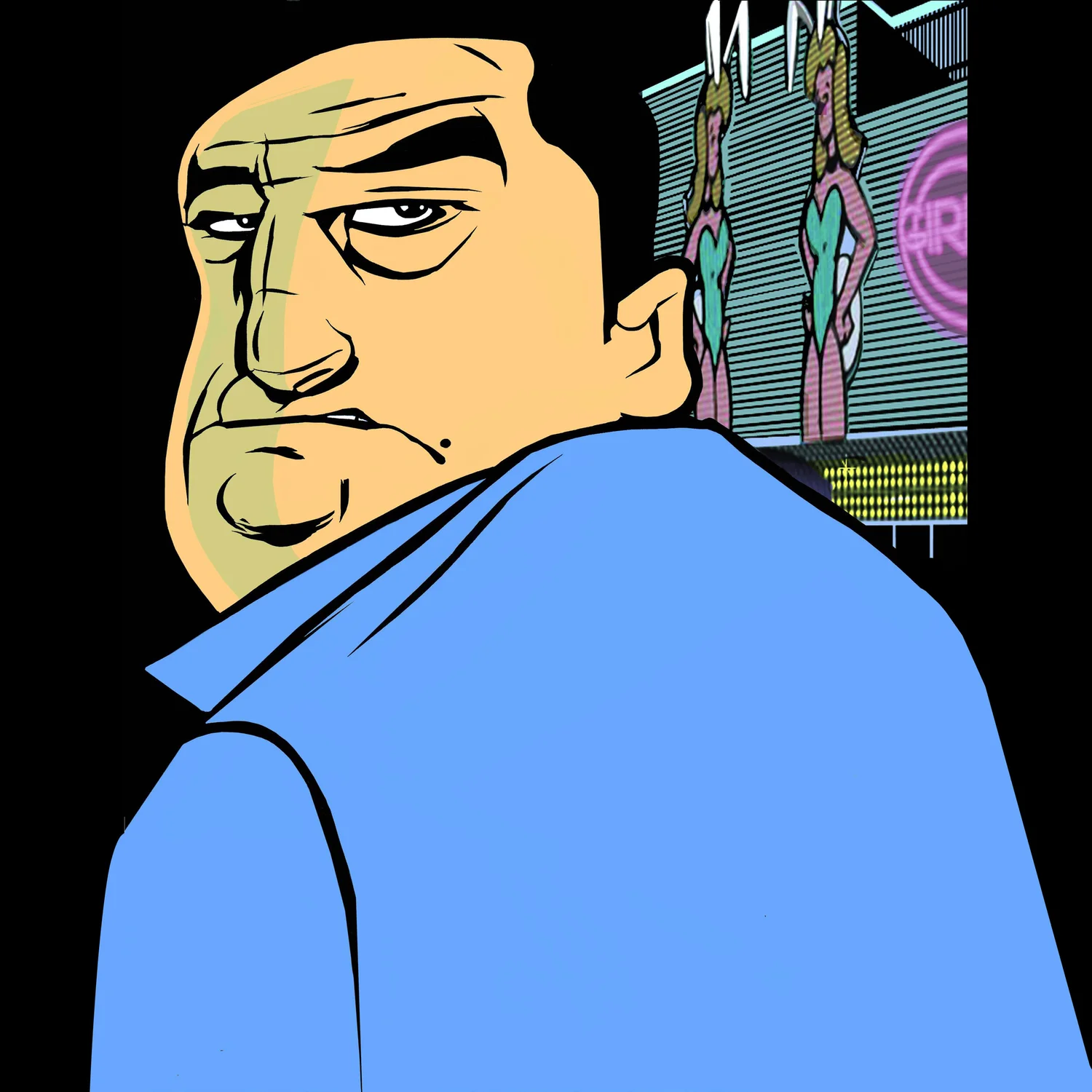
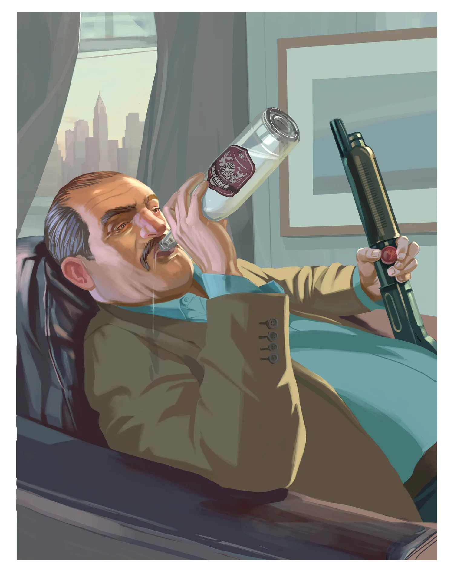
This does not make one method better than the other. Flat colours and clear contours suit Vice City's exaggerated 1980s atmosphere. A heavier, more painterly approach suits the tougher streets of GTA IV's Liberty City. The enduring ingredient is the dramatic pose and a clear compositional focus. Rockstar allowed the art direction to evolve without losing the expressive energy people already associated with the series.
A team, not a single illustrator
It would be misleading to attribute every GTA illustration to Stephen Bliss. Other Rockstar artists contributed to the visual language, including Steven Olds, Anthony MacBain and Roxie Viscara, whom Bliss specifically credited in his recent interview. San Andreas introduced a different colour atmosphere: dusty light, haze, olive greens and browns replaced much of Vice City's glossy neon.
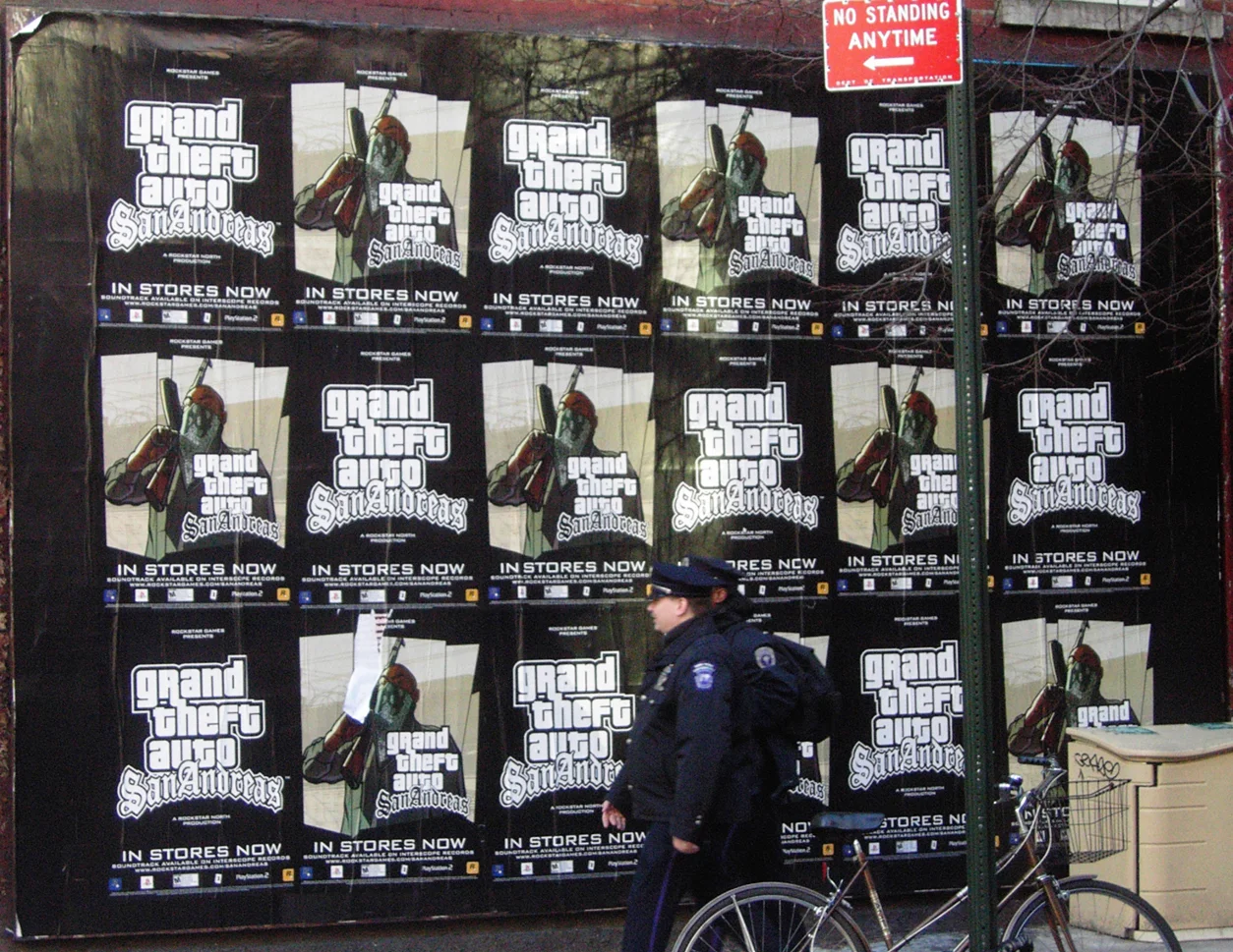
Archive photographs of San Andreas advertising show why that clarity matters. Street posters are not studied like paintings in a gallery. People pass them at an angle, often with only a second to spare. A large title, high-contrast portrait and distinctive colour field make an impression before anyone has time to read the game name. At that scale, the illustration becomes communication design.
03. The legendary covers: why Rockstar keeps returning to the same layout
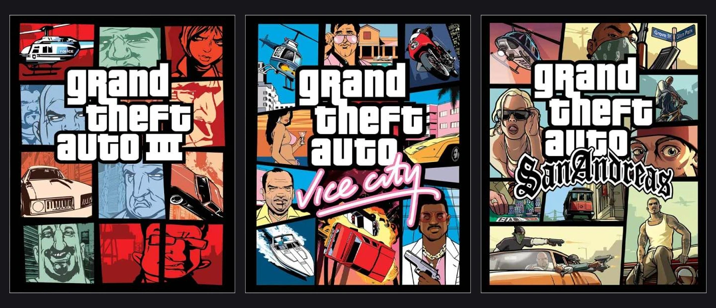
Put several GTA covers next to one another. Most have a large central title surrounded by separate rectangular scenes: a face, a car, a skyline, a chase or an aircraft. Thick dark lines divide the panels. The collage looks chaotic only at first. It follows a strict hierarchy: the title comes first, the strongest images come next, and smaller stories are left for a closer look.
How the GTA III grid came into being
The panel grid has a specific origin. After the September 11 attacks in 2001, Rockstar decided to change the American GTA III cover. According to Stephen Bliss, he took less violent elements of an earlier collage and rearranged them into rectangular frames inspired by comics. That does not mean every country received identical packaging: the European GTA III release had a different design.
The dividers turned out to be remarkably useful. Inside each rectangle, the art team could change a character, vehicle, colour or background without rebuilding the whole cover. One scene could be blue, another orange and a third nearly black. Strong borders keep those visual languages from collapsing into one another. The title sits over the composition like a main sign for the city that contains all these smaller stories.
Vice City (2002): neon, Art Deco and the glossy eighties
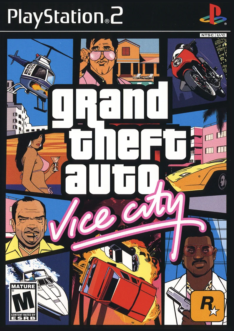
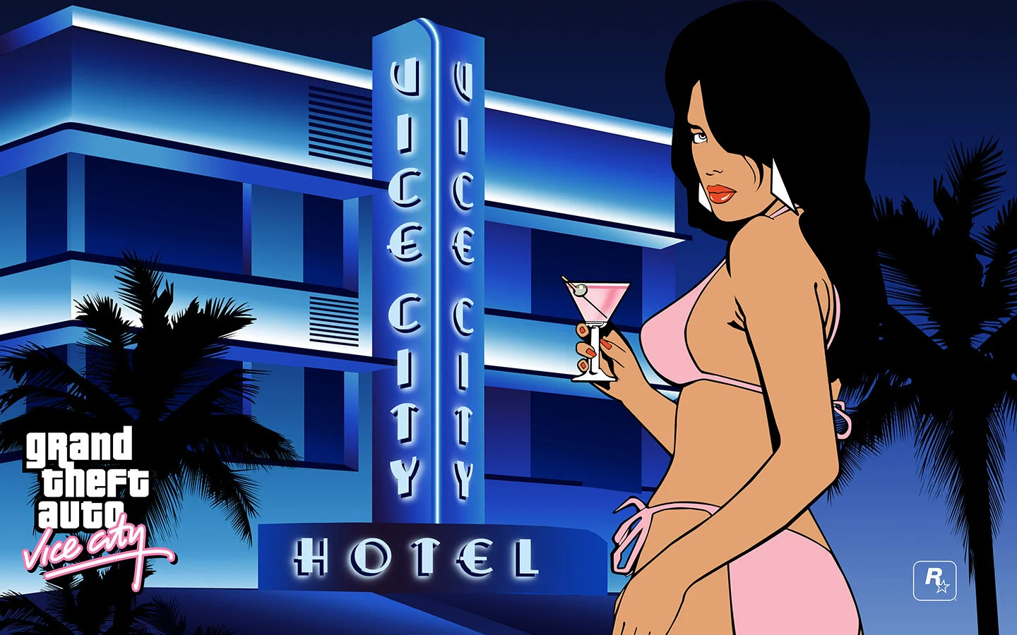
Vice City retained the collage yet transformed almost everything around it. Pink script, blue hotel facades, palm trees, glamorous cars, boats and brightly dressed characters establish the city before gameplay begins. In the large poster of a woman outside the Ocean View hotel, the artist leaves broad areas of deep blue. There is no complicated chase in sight, but the Vice City atmosphere is immediately recognisable.
San Andreas (2004): a cover that feels like a street album
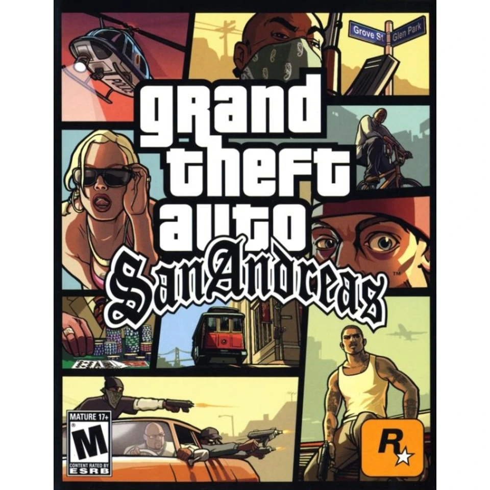
For San Andreas, the team kept the grid and changed its voice. Blackletter-style titling, streets, bicycles, vehicles, sharper contrast and dusty colours refer to early-1990s California and hip-hop culture. Vice City's soft neon glow is gone. Warm haze, roads, neighbourhoods and distinct character portraits take its place. The cover communicates a new environment without abandoning the structure that identifies the series.
GTA IV (2008): a darker view of Liberty City
GTA IV kept the panels but introduced a more painterly visual treatment. Portraits have more nuanced shading, and the colours feel less toy-like. The Roman IV is heavier and more restrained than Vice City's pink script. The illustrations lean toward the mood of a serious urban drama. Vehicles, danger and memorable characters are still present, but the tone is clearly different from previous instalments.
GTA V (2013): vibrant colours and a green V
GTA V brought strong sunlight back to Los Santos. Beaches, fast cars, characters, a dog and a helicopter inhabit separate panels, while the familiar white word block remains central. The ribboned green Roman V evokes banknotes and the pursuit of money threaded through the game's story. It is a useful compositional lesson: once a structure is familiar, a single new detail can introduce a whole instalment.
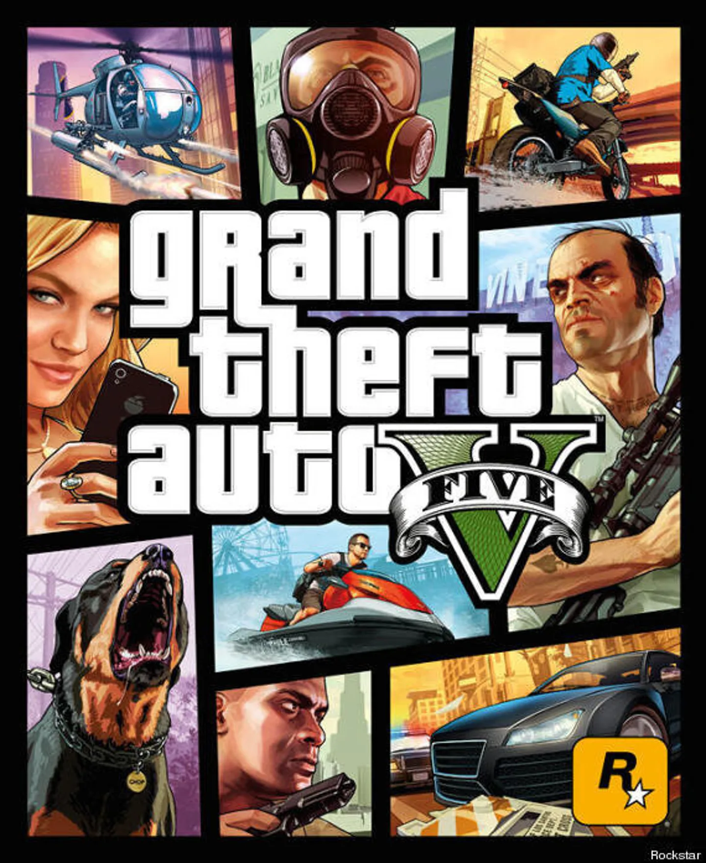
Across generations, GTA changes illustration techniques, colours and visual scale. Yet the cover keeps making roughly the same promise: this is a world full of situations, not a story confined to one scene. For a game built around exploring a city, a collage is a remarkably compact way to communicate possibility. Rockstar does not need a completely different layout every time because the existing one still describes what the game feels like.
04. Fictional brands: the design that makes GTA cities believable
GTA could have filled its streets with anonymous storefronts. Rockstar went much further: the fictional cities have their own sodas, restaurants, retailers, banks, social networks, radio stations and vehicle manufacturers. These are more than background props. When the same name appears on a billboard, vending machine and delivery vehicle, the player begins to believe that a company exists and has a marketing budget inside that world.
To make the illusion work, the artists use familiar branding tools: a name, logo, colour system, typography, packaging, slogan and repetition. The difference is in the messaging, which often twists commercial promises into satire. GTA is mocking more than individual companies. It exaggerates the language of advertising itself, where every product insists it is the best, tastiest or most essential thing a person could buy.
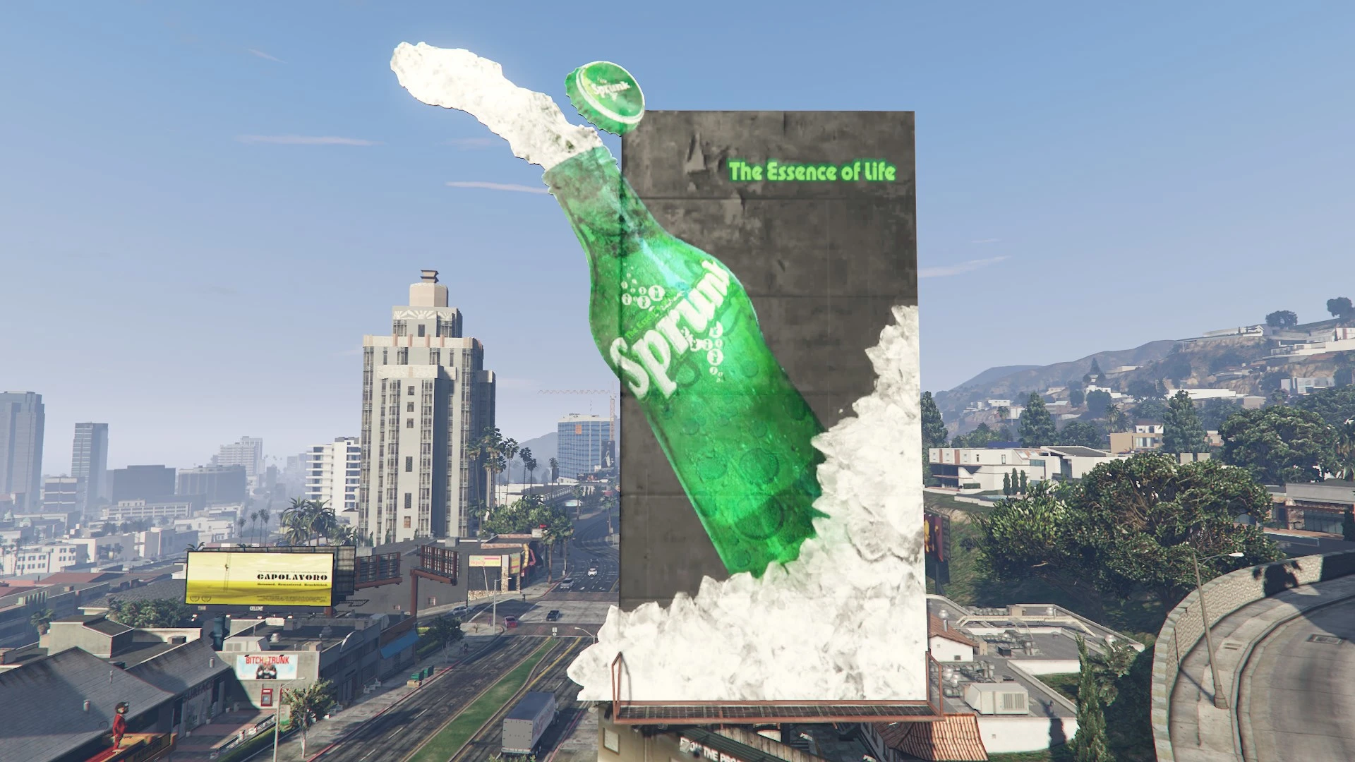
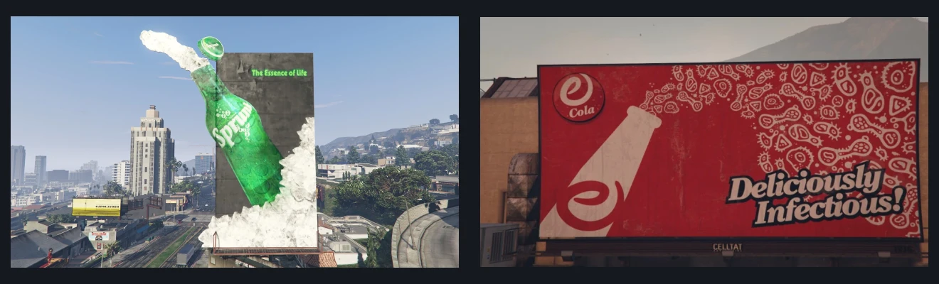
Sprunk: the green is almost enough
Sprunk is a soda brand that can often be identified without reading its name. Saturated green, a bright wordmark and energetic curves place it firmly in the lemon-lime soft-drink category. On billboards, vending machines and vehicles, the colour makes the first impression. Only afterward does the player register the lettering and smaller copy. That is exactly the problem a real identity system must solve across distances and formats.
eCola: familiar advertising with an uncomfortable slogan
eCola occupies the opposite visual territory: red, white, flowing lettering and familiar soft-drink advertising devices. At a glance it could be an everyday supermarket campaign. Then its slogan, “Deliciously Infectious!”, breaks the illusion. The design promises refreshment while the copy says something that no sensible real-world beverage brand would want associated with its product.
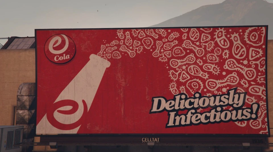
The pair works especially well together. Green versus red is a simple visual conflict that recalls competition between real-world soda brands. Rockstar has also used their rivalry in GTA Online community activities. For a designer, the essential mechanism is more basic: two recognisable palettes can suggest a long-running commercial battle without a narrator explaining it.
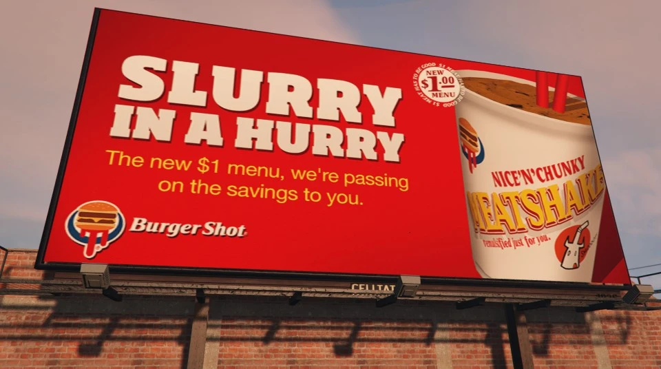
Burger Shot: a fast-food identity made for quick recognition
Burger Shot speaks the visual language of American burger chains: warm saturated colours, a large sign, food photography and relentless promotional offers. In a real city, a sign like that must communicate its category before a driver has time to read the name. GTA pushes the same conventions into comedy, with oversized portions, exaggerated claims and advertising that tries far too hard.
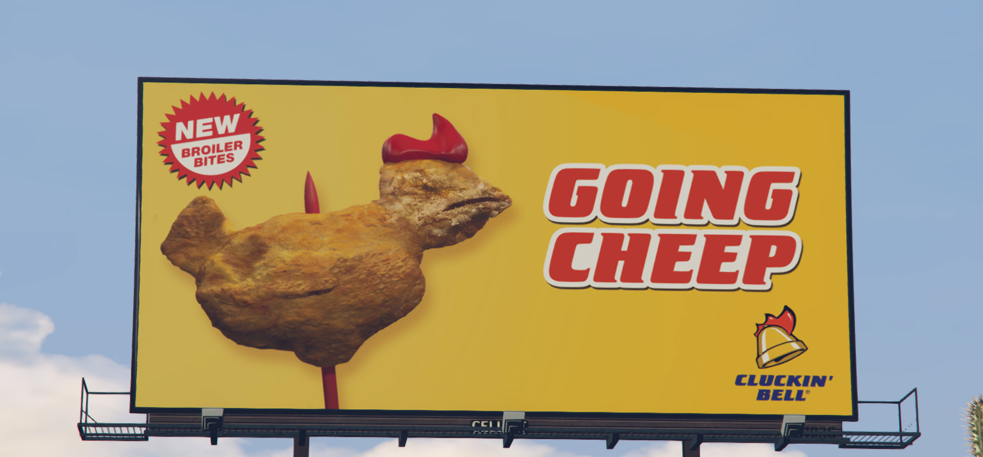
Cluckin’ Bell: the joke is already in the sign
Cluckin' Bell builds its joke into its name by combining chicken and bell imagery. Warm yellow and red colours borrow from fast-food advertising, while menus and slogans revolve around cheap chicken meals. One GTA V billboard treats a piece of fried chicken almost like a novelty display object. Even if the player misses the words, the business category is immediately clear.
Ammu-Nation: a gun shop dressed like a patriotic brand
Ammu-Nation uses a large A, a star and red accents that recall American commercial and patriotic signs. The name itself plays on ammunition. Rockstar makes the satire obvious: weapons are sold with much the same cheerful marketing confidence as sodas and burgers. The joke works because the visual identity is convincing enough to belong to the city, rather than looking like an unrelated graphic gag.

Lifeinvader: a social network with a revealing name
Lifeinvader carries the same thinking into digital products. Red blocks, a simple symbol, office signage and the visual language of a technology company make it feel like a real service. Yet the name hints at how social networks invade private life. It is a typical GTA move: the imaginary brand convincingly imitates an industry while exposing the industry's least comfortable trait.
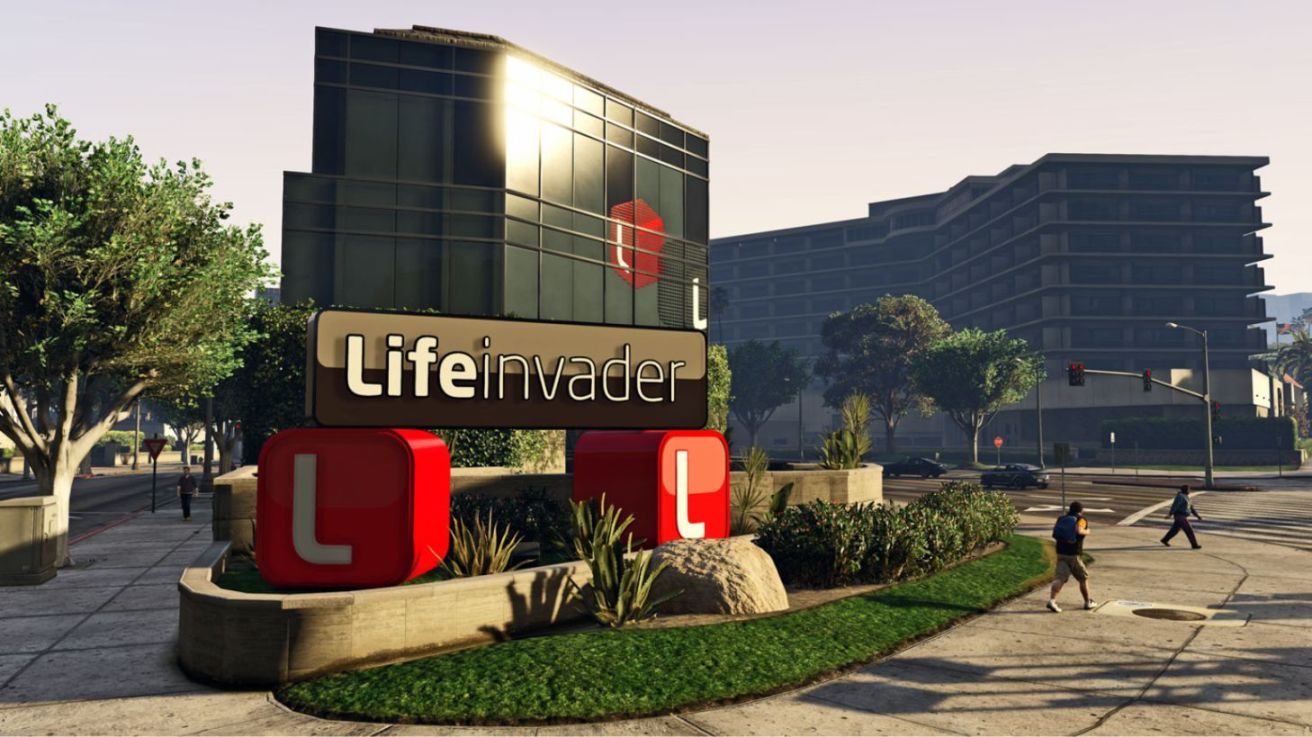
Taken together, these companies create a small fictional economy with its own brand identities. Each has a colour palette, tone of voice, advertising formats and recurring visual jokes. Players may not consciously analyse any of it, but repeated exposure makes the city feel coherent. That helps GTA seem like an inhabited place rather than a random collection of buildings connected by missions.
05. GTA VI: a familiar visual language in a new Leonida
The return to Vice City naturally invites comparisons with the 2002 game. Yet GTA VI's artwork does more than repeat old pink posters. Rockstar's new materials use saturated purples, turquoise, pink and warm orange. A romantic sunset can sit next to a tense robbery scene. That collision between the beauty of a holiday destination and its harder side is central to the mood of the series.
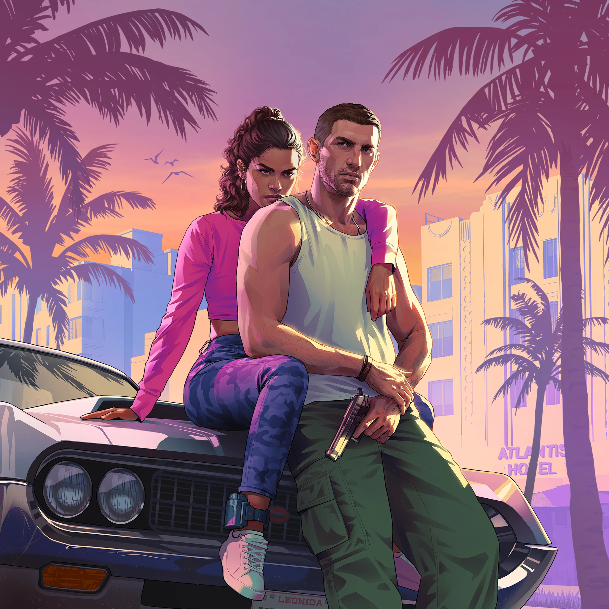
GTA VI's cover: the old framework with a new palette
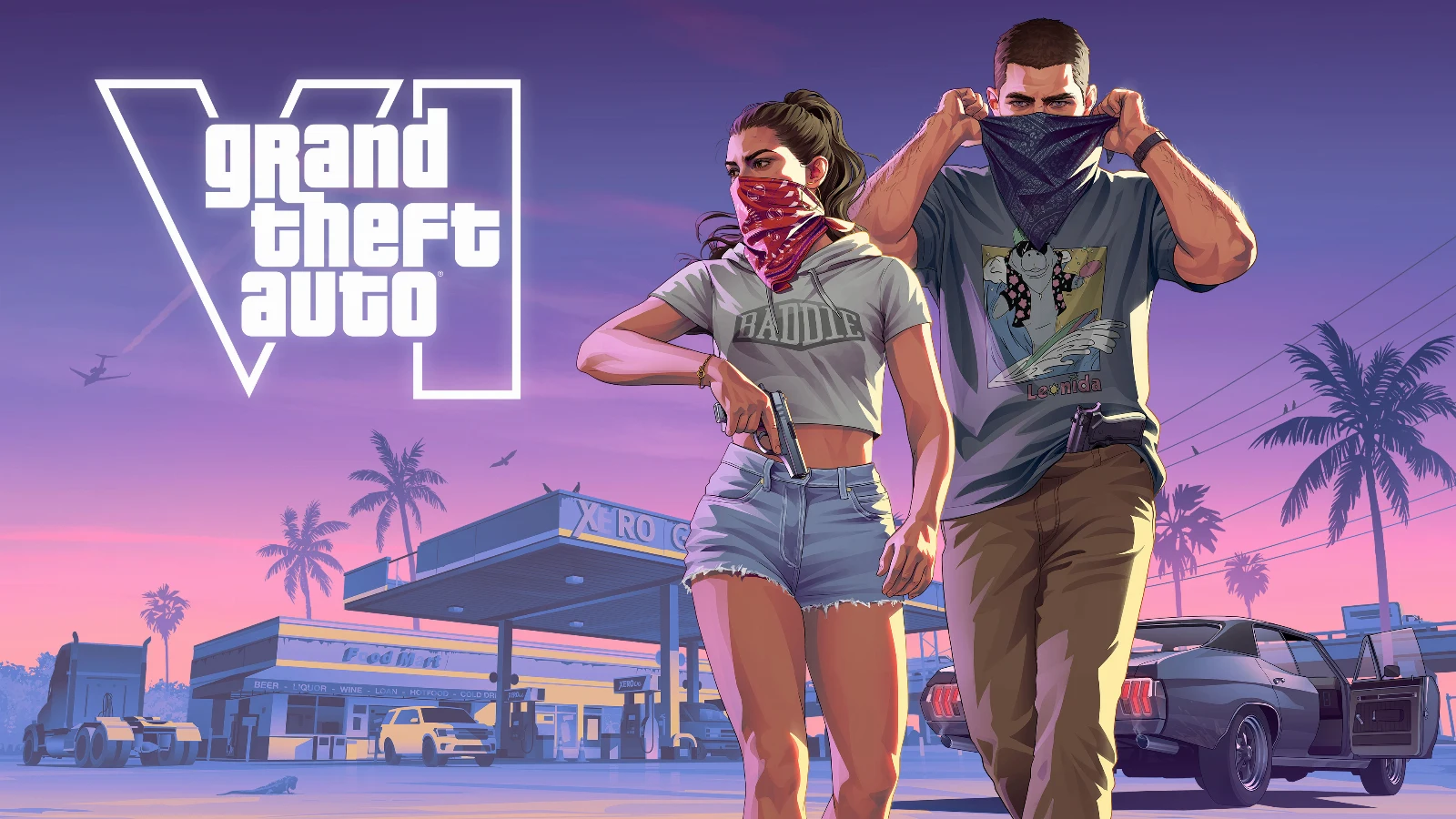
The official GTA VI cover again revolves around the white grand theft auto lettering. A large Roman VI, characters, urban scenes and familiar rectangular divisions surround it. This time, much of the imagery is unified by Vice City's evening palette: pink, deep purple and blue. The identity retains the logic Rockstar has refined for decades while announcing a different place and moment in the series.
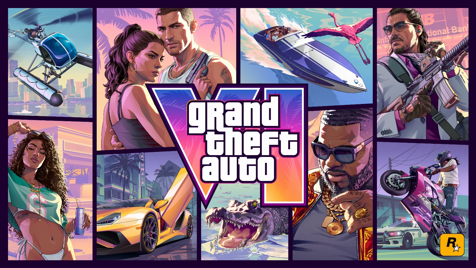
One illustration can set the mood of a whole city
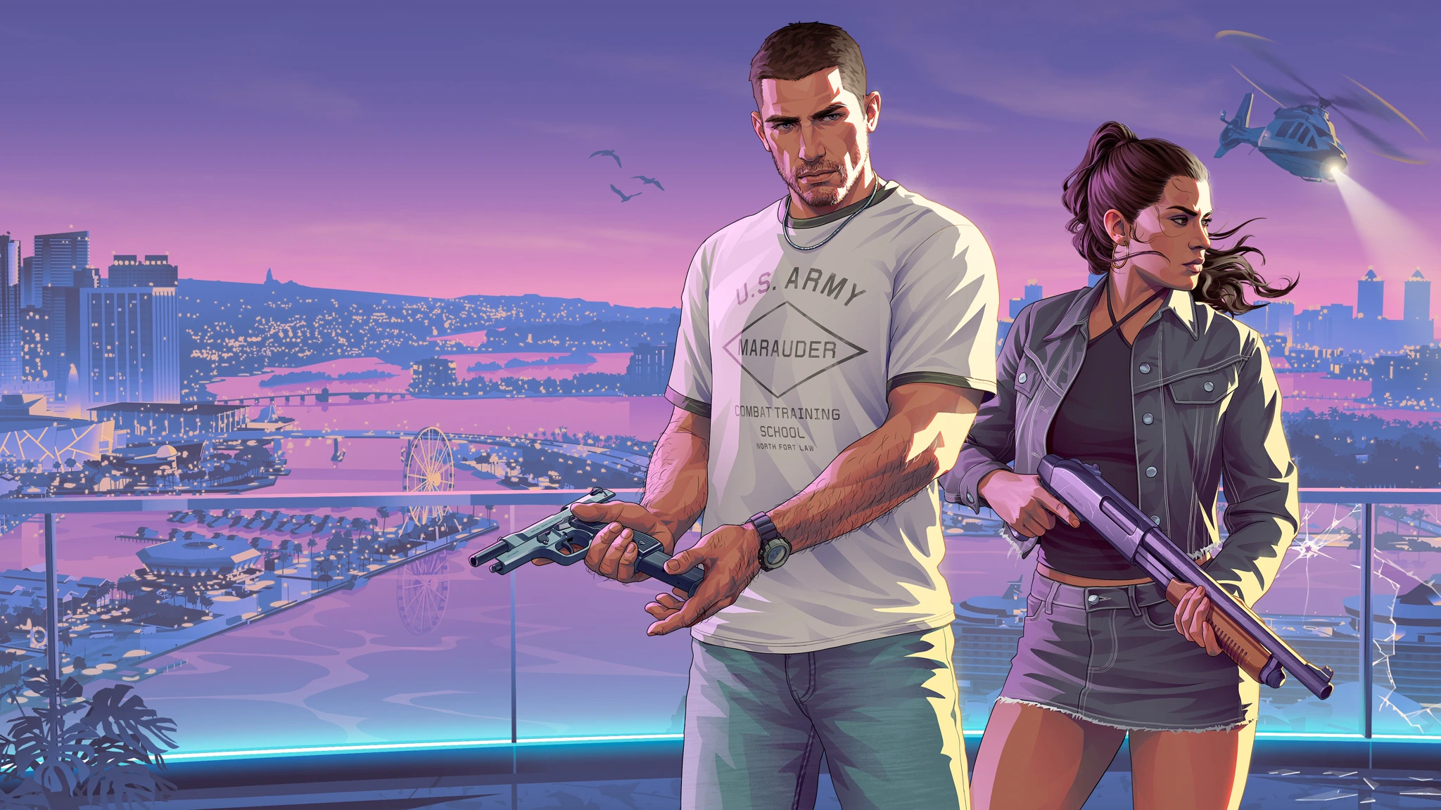
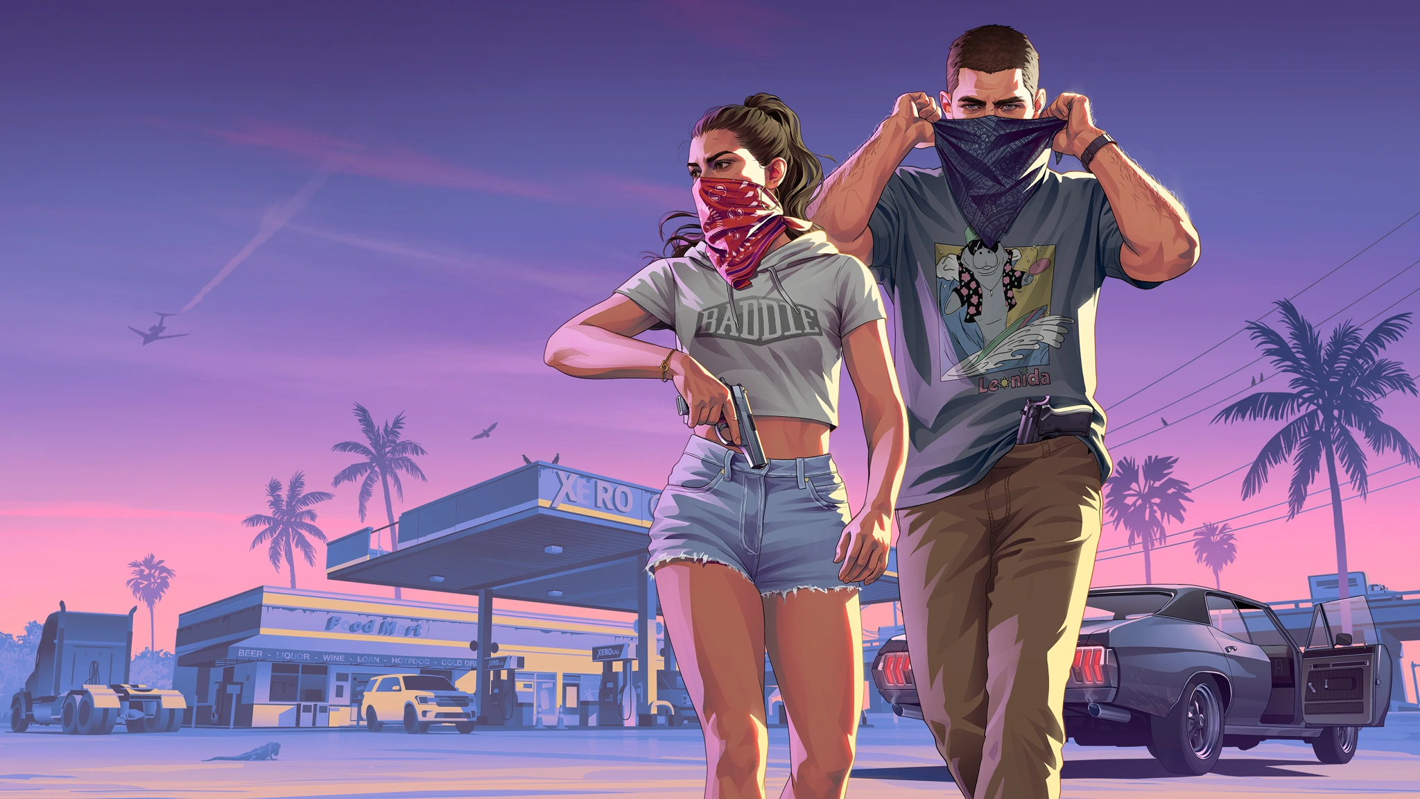
In another illustration, Jason and Lucia prepare for a robbery. Their dark silhouettes stand against a vivid evening sky, with a road, vehicles and palms behind them. The composition works more like a film poster than an ordinary screenshot: one image quickly communicates the characters, location and genre. The recognizable Rockstar stylisation survives even as the image becomes far more detailed than the early covers.
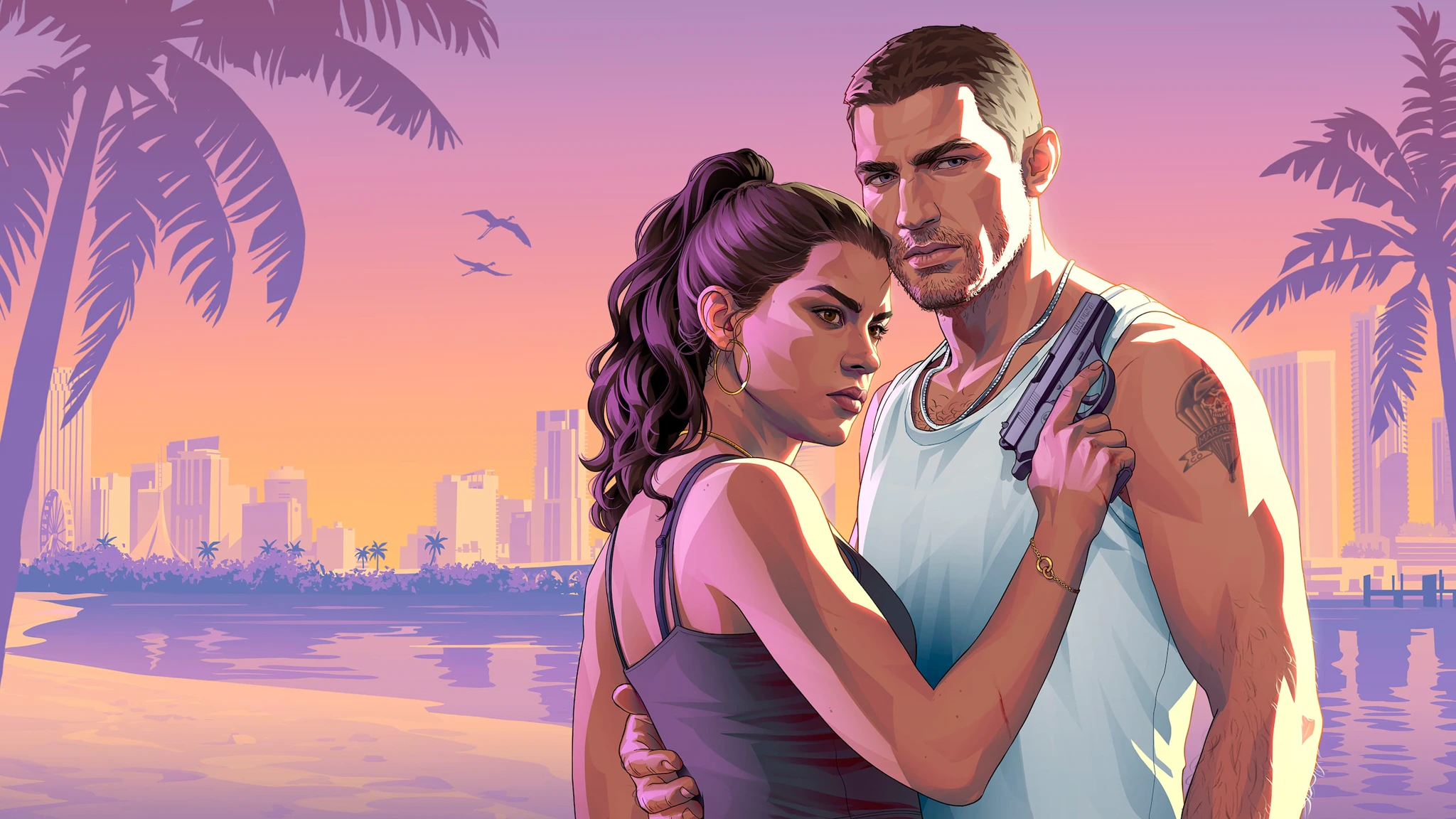
Rockstar's official collection also contains quieter scenes: Jason and Lucia near the beach, relaxed moments and distant city views. Those images matter to the story the marketing tells. GTA is selling more than chases and weapons; it is also inviting people to spend time in a place. Large areas of sky and water provide breathing room, balancing the more intense character-driven compositions.
Leonida postcards: another design language inside GTA VI
The official materials include tourism-style postcards for Vice City, Port Gellhorn and other parts of the fictional state of Leonida. They follow a different design logic from the cover: generous landscapes, travel lettering and the promise of escape. Rockstar can build the image of a city not only through crime, but through the city's own promotional language. That connects neatly to how local businesses have always worked inside GTA.
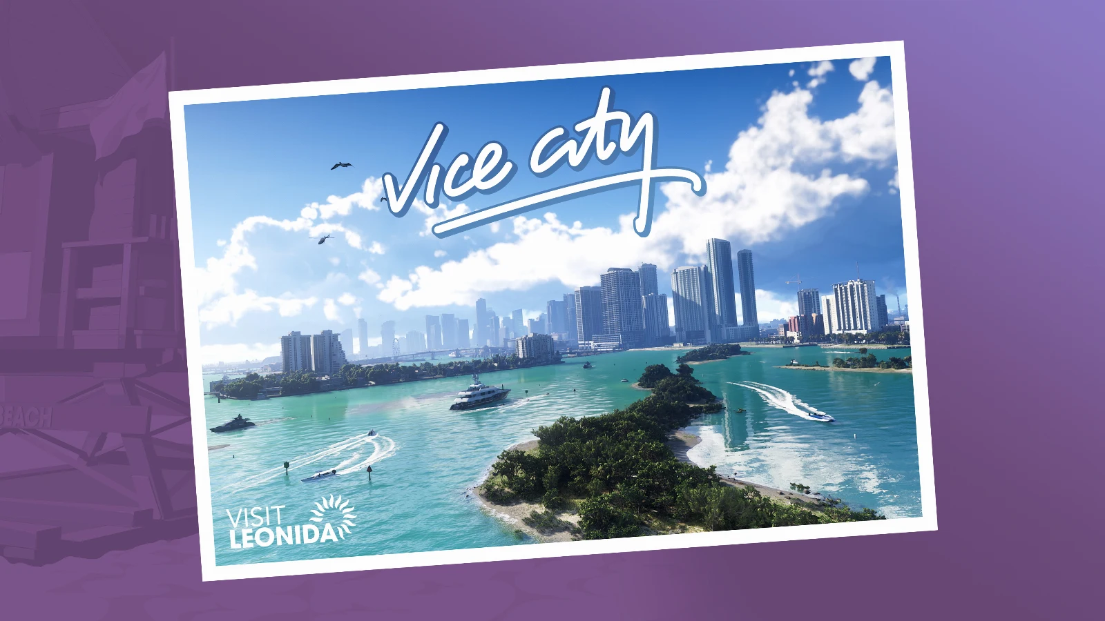
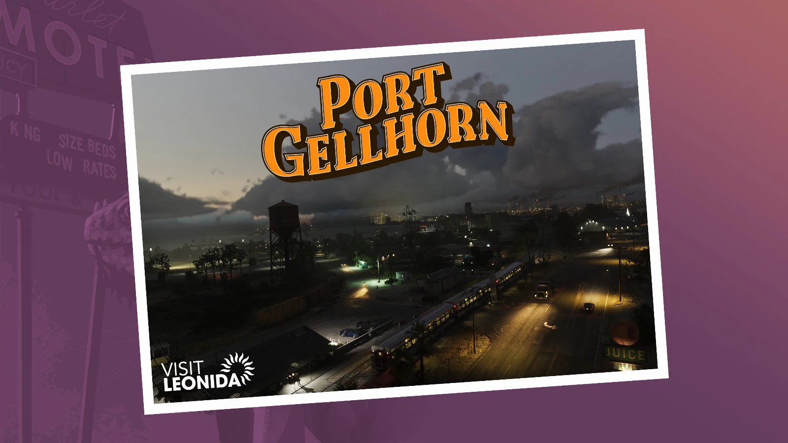
Different illustrations with the logo show Rockstar using the same word block over radically different backgrounds. In one it sits against a pale sky; elsewhere it rests on a darker scene. A title on a colourful poster must be visible immediately, which is why the outline and compact arrangement still work in 2026. The artwork can change with every campaign without forcing the audience to learn the identity again.
Design That Stands the Test of Time
For nearly 30 years, Rockstar has changed its cities, characters, colours and illustration styles. Yet some things have stayed remarkably consistent. Three lines of white lettering are still recognisable at a glance. The covers retain their familiar composition.
There is a lesson here for designers. A strong visual identity does not need a major overhaul every few years to stay relevant. It needs a distinct character, a recognisable foundation and enough room to evolve. Rockstar has demonstrated that across an entire series of games: each instalment has its own personality, yet clearly belongs to the same larger world.
Perhaps the most interesting thing about GTA design is not how it looks today. It is that decisions made more than twenty years ago still work.
The next time you open a blank file to create a new logo, think beyond how it will look in a client presentation. Ask yourself whether that mark could still be recognisable in ten, twenty or even thirty years.
Great design does not end with an attractive logo. Sometimes, that is where a story people will remember for decades begins.
Sources for further exploration: official GTA VI artwork; Ray Larabie's history of Pricedown; Stephen Bliss's portfolio; Stephen Bliss interview (2026); GameSpot's history of GTA covers.

No comments yet. Start the conversation.