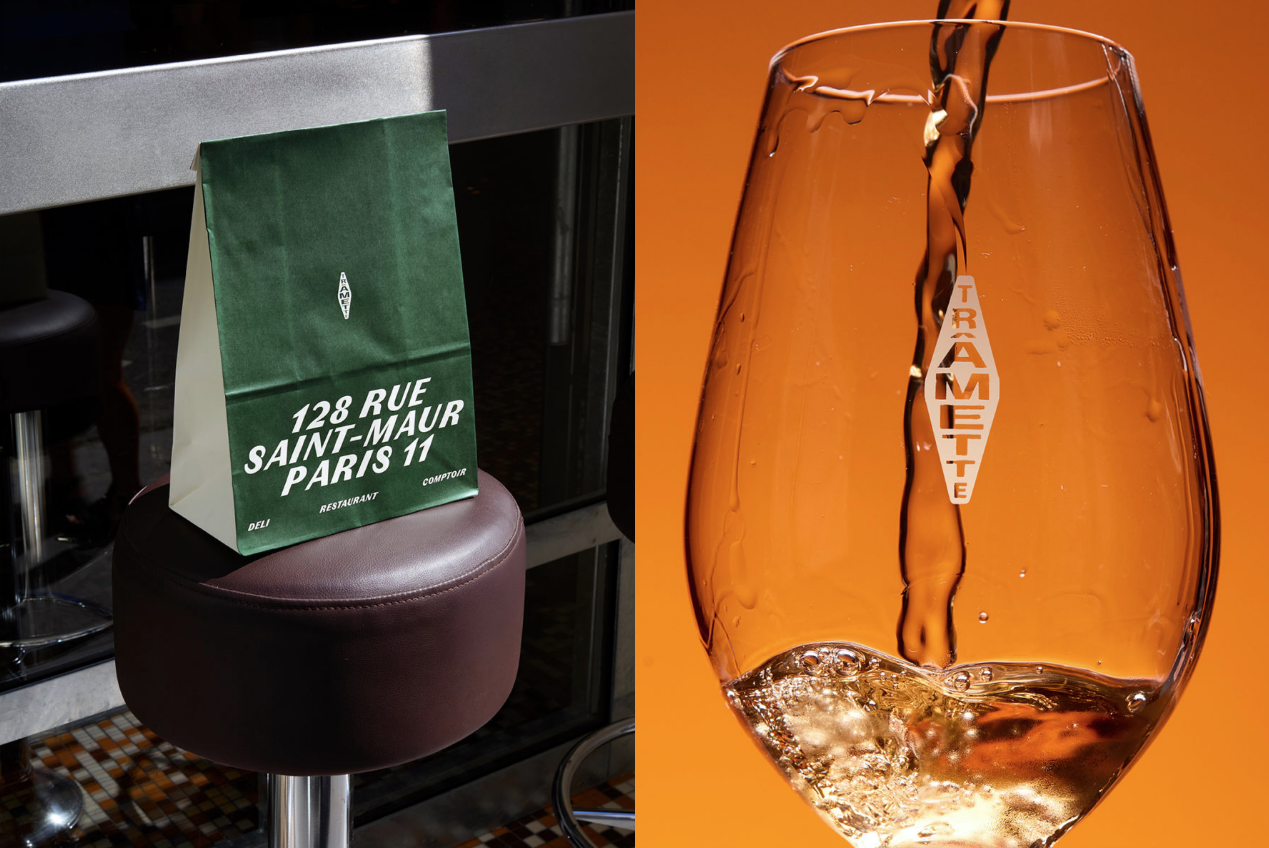
There is no fork, plate or wine glass in the logo of Paris restaurant Trâmette. Just a tall diamond with letters packed inside it. In France, that shape has a very different association: something similar hangs outside the country's tobacconists.
Studio Furious used that everyday street reference to build the restaurant's identity. I find the starting point more interesting than the usual hospitality symbols. The idea belongs to the city where the restaurant actually operates.
Where the diamond comes from
The carotte de tabac is a traditional French tobacconist sign. Originally a representation of rolled tobacco, it evolved into the distinctive elongated sign that people recognize on storefronts.
Trâmette keeps that narrow silhouette, then fits the restaurant's name inside it. The letters sit one above another and almost become a pattern of their own. At a distance, you read the outline. From closer up, you discover the word. That's a useful quality for a sign competing for attention on a busy street.
On the glass, you can see how neatly the letters sit inside the outline, without a separate wordmark alongside it.
Why the typography matters
Look at the letters on the Trâmette sign. The name runs down a narrow diamond instead of across a conventional wordmark. Some letters fill almost the whole width; others leave more space around them. The result is slightly odd, in a good way. You notice the outline before you work out the word.