Singapore introduced a refreshed international identity for Brand SG. Working with the country’s Ministry of Trade and Industry, design studio Anak rethought the familiar “Little Red Dot”, a nickname long associated with Singapore.
What actually changed
The recognisable SG mark remains. In 2017, Singapore introduced its “Passion Made Possible” brand. In 2026, Anak refreshed the international business-facing system with the SG sphere, warm gradients, motion and a new line, “When You’re Ready”. This is an evolution of the identity, not a wholesale logo replacement.
From a dot to a sphere
The new system centres on the SG sphere. It is intended to represent Singapore’s influence: radiating energy outwards while attracting people, ideas and partnerships. Anak has taken a familiar geographical reference and turned it into a broader statement about the country’s role in international business.
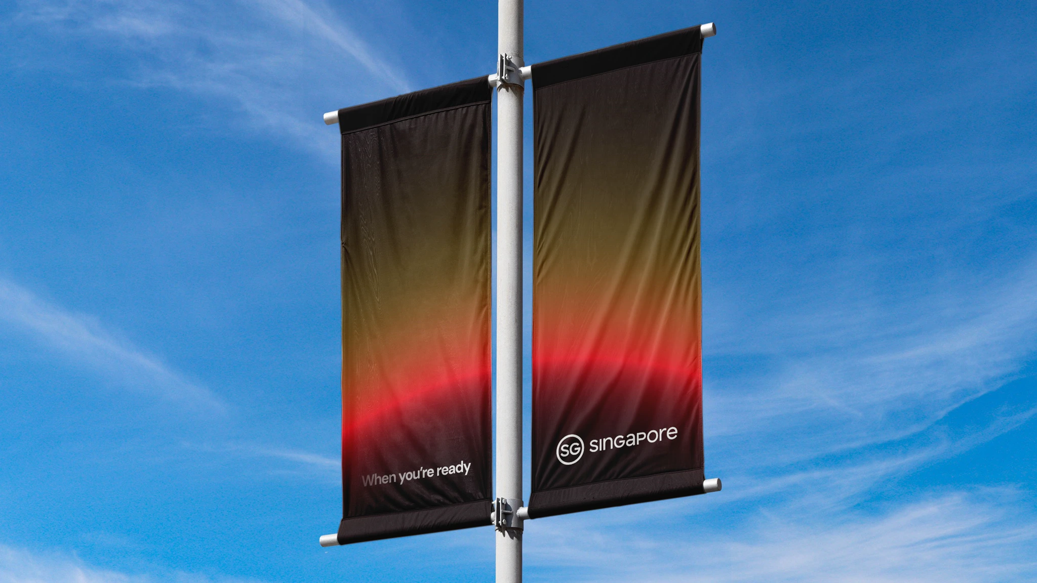
The brand’s central line is “When You’re Ready”. Rather than simply welcoming visitors, it addresses businesses and people preparing to build, invest or pursue new opportunities.
Colour, type and movement
A warm gradient moves from rich red into orange. According to the studio, this expresses a country in constant motion. Light and shadow also shape the motion identity, allowing the sphere to emerge, glow and recede across digital applications.