
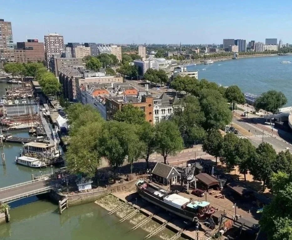
Historic boats are repaired beside Werf’s terrace. The bar and small restaurant sits within Stadswerf Koningspoort in Rotterdam’s old harbour. It is a working shipyard, a place where boats are built and repaired. Guests can eat by the water or take a seat inside a former timber shed adapted for visitors.
Werf means “shipyard” in Dutch. The look was created by andstudio, a design studio from Vilnius, Lithuania. Its team designed the logo, menus, posters and other items for the venue.
Where the 20° angle comes from
The logo idea came from the ramps used to lower boats into the water. The designers gave the logo a sloping top edge at 20°.
The studio also links the slope with the movement of raising a glass.
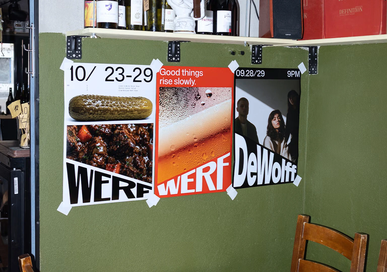
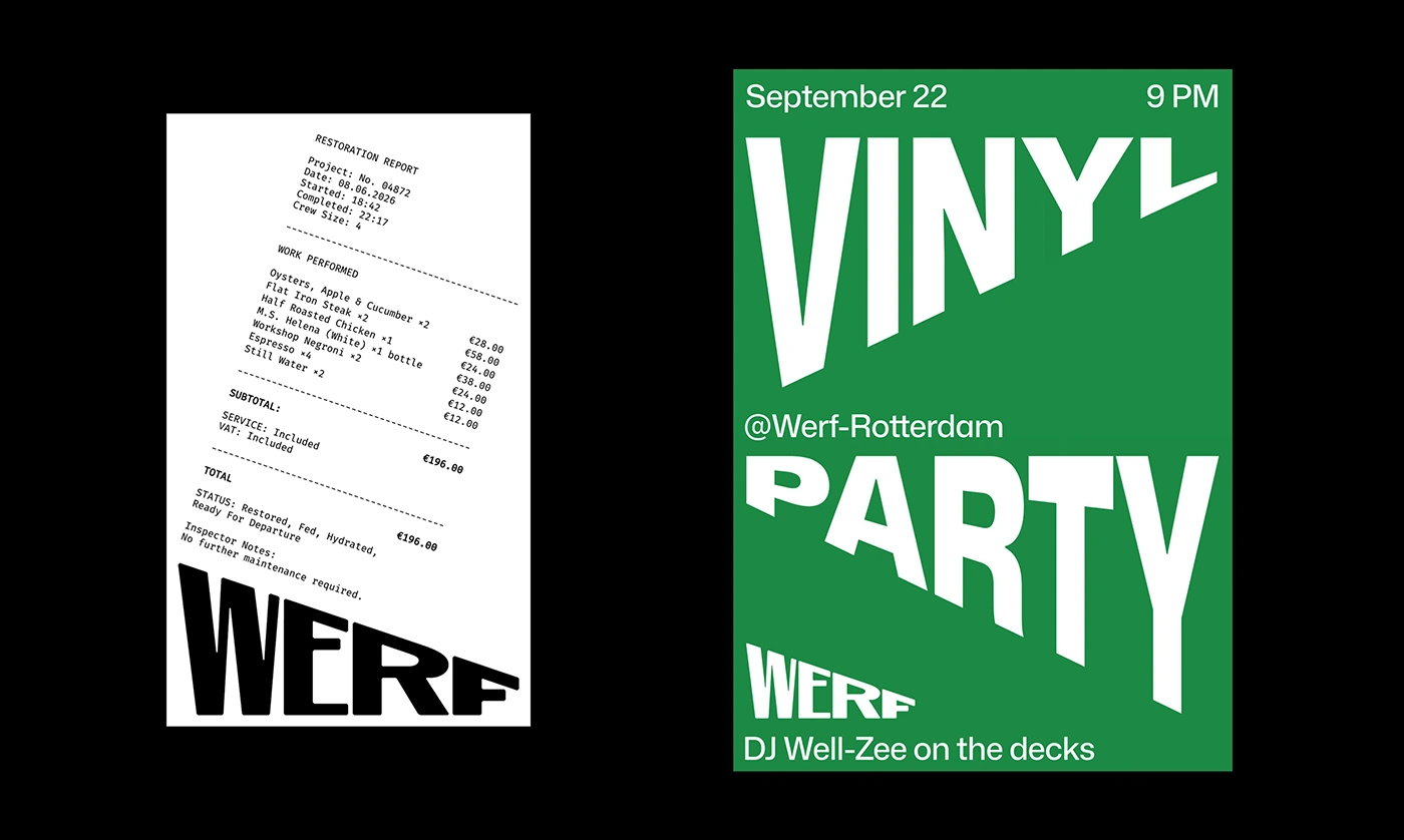
The same line continues through large headlines and other materials. It brings movement to the poster lettering, while the Werf name stretches almost across the full width of a receipt. Even this small everyday item has a distinctive detail.
A menu that picks up the colours of boats
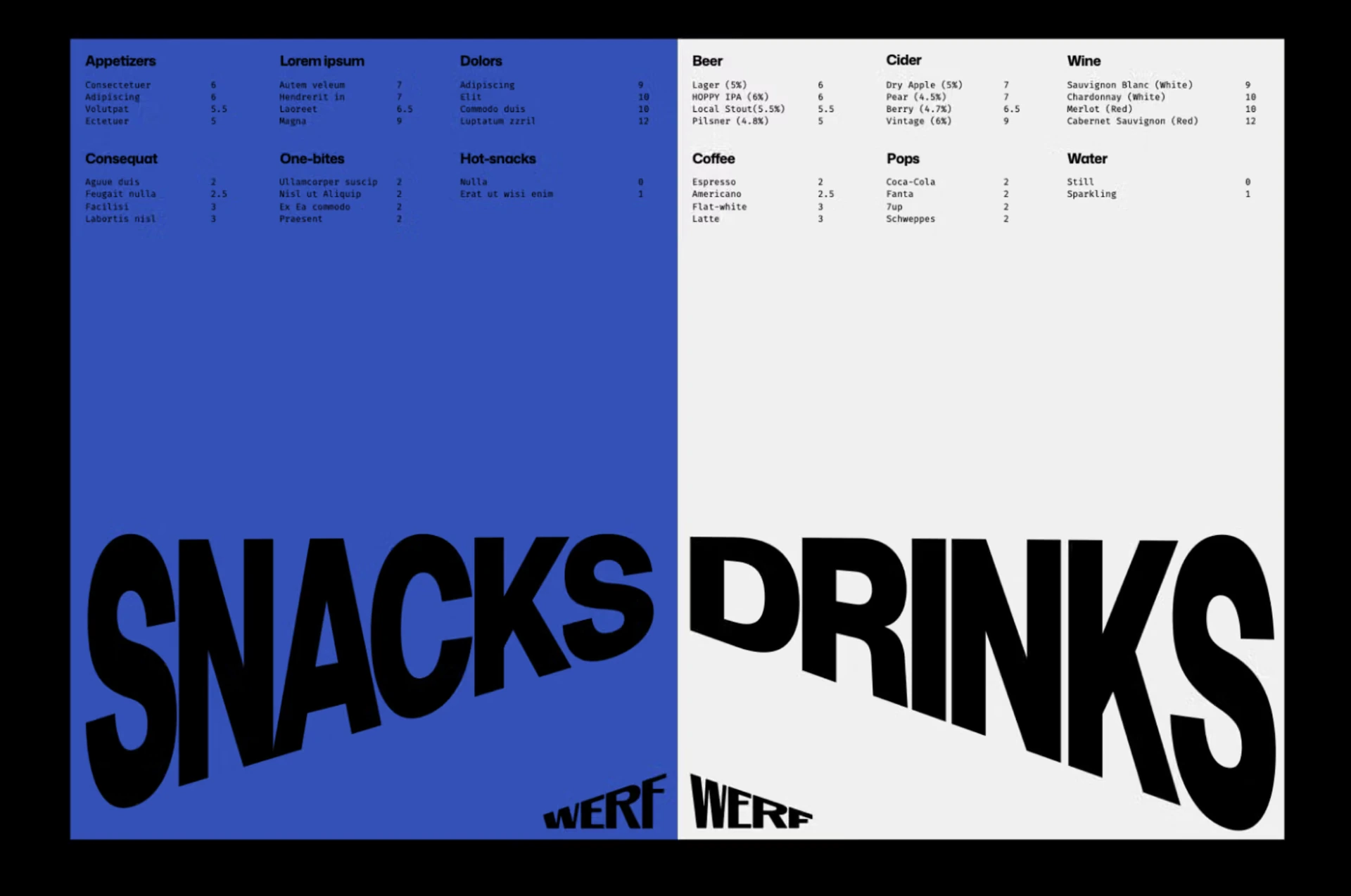
The most intriguing detail in the project concerns the menu. In andstudio’s approach, its seasonal colours follow the vessel docked at the shipyard at the time. The venue’s surroundings can keep influencing the identity after the initial launch.
The menu example pairs a blue page with a light one. Food and drinks are listed at the top, with oversized Snacks and Drinks headings below. The sloping lettering catches the eye before you start reading the smaller text.
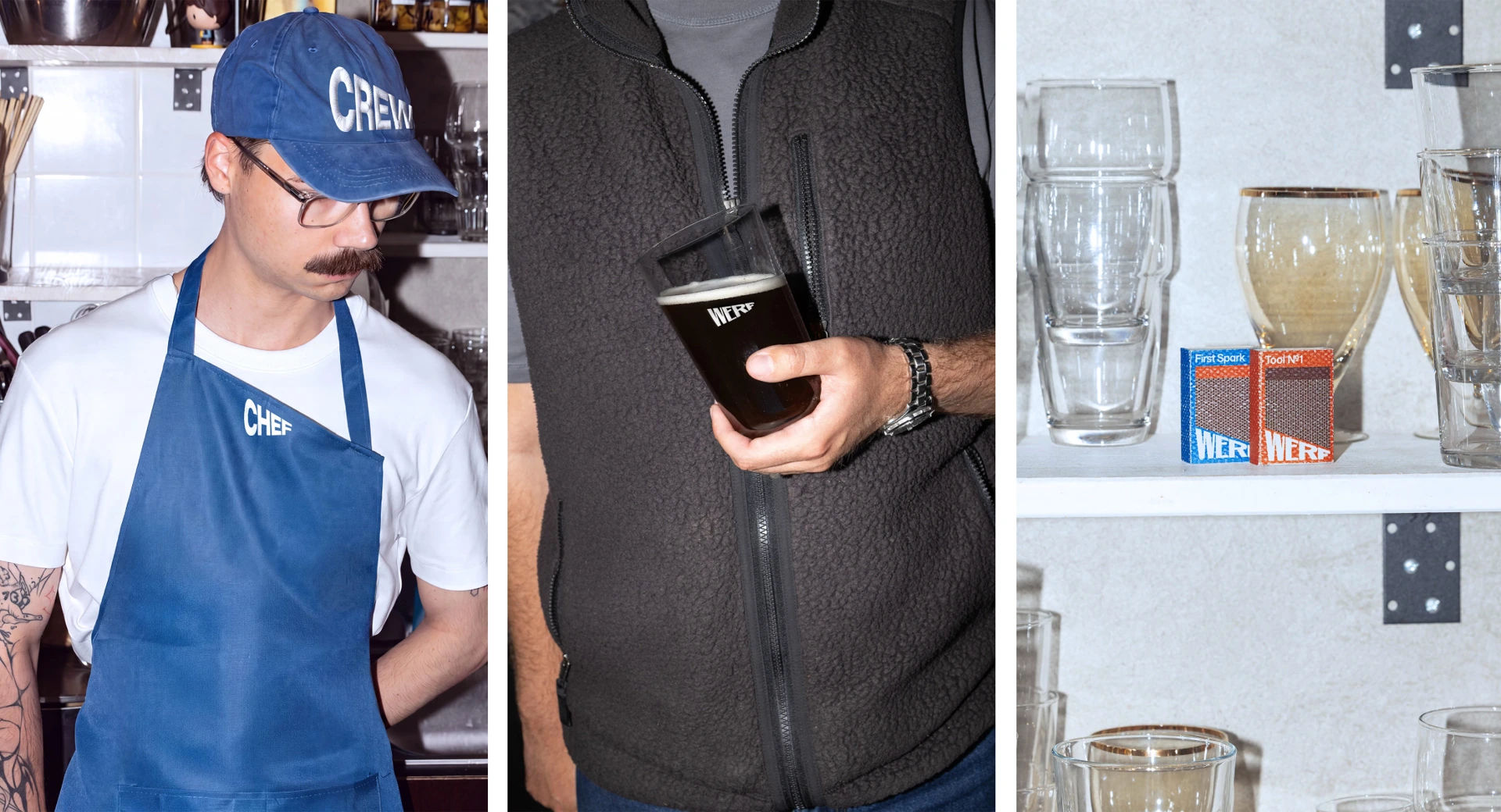
Caps, glasses and bottles
The project photographs show the identity in the bar’s everyday setting: blue caps and aprons, tableware and bottles on shelves. One particularly successful detail is the way a single idea connects such different objects.
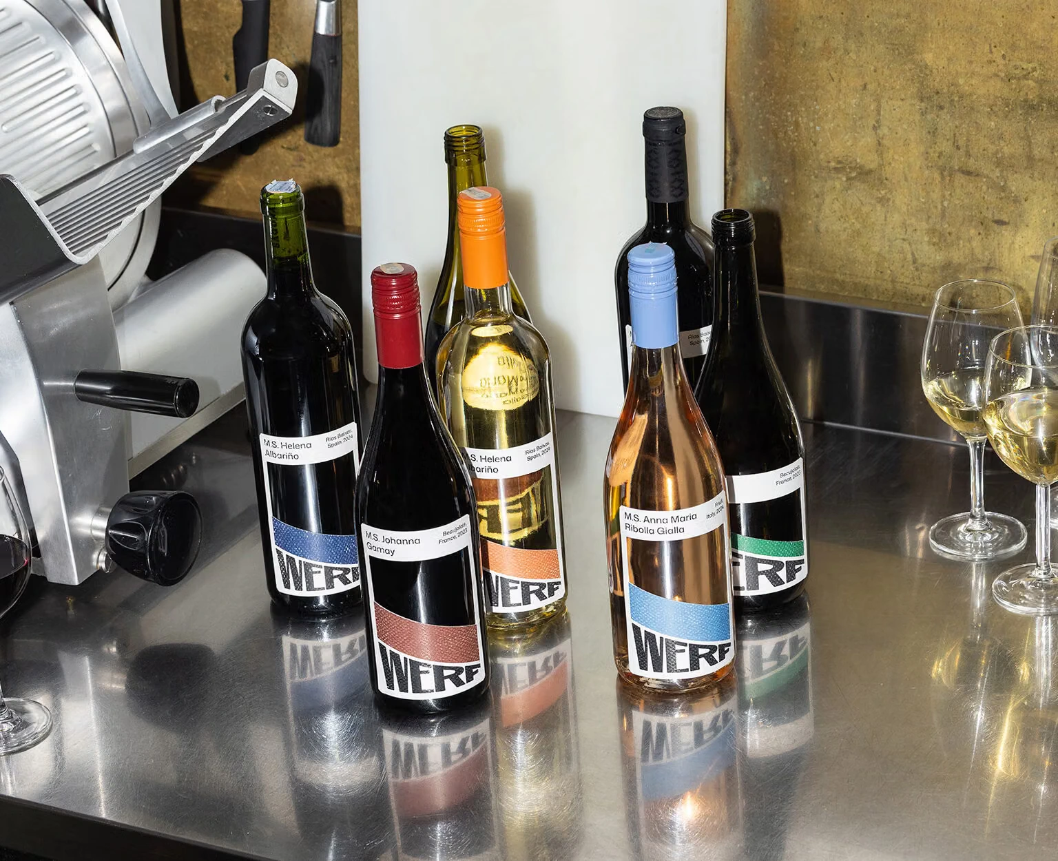
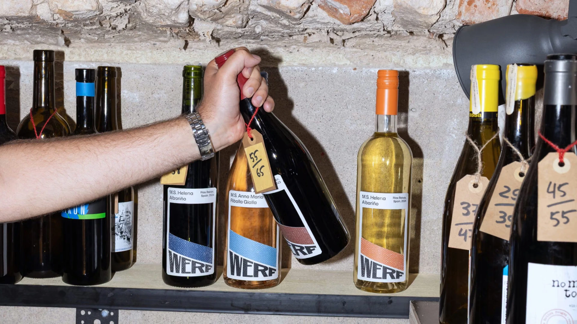
The bottles carry coloured labels with white bands and black Werf lettering. Around them are a reflective metal counter, ordinary shelves and glasses. These photographs make it easier to see how the graphics sit among the venue’s real objects.
On a wine glass, the name is kept small. The glass in the photograph is tilted too, making the designers’ idea easy to follow with little explanation. Alongside it, the selection shows a receipt on a plate and a menu with coloured inserts.
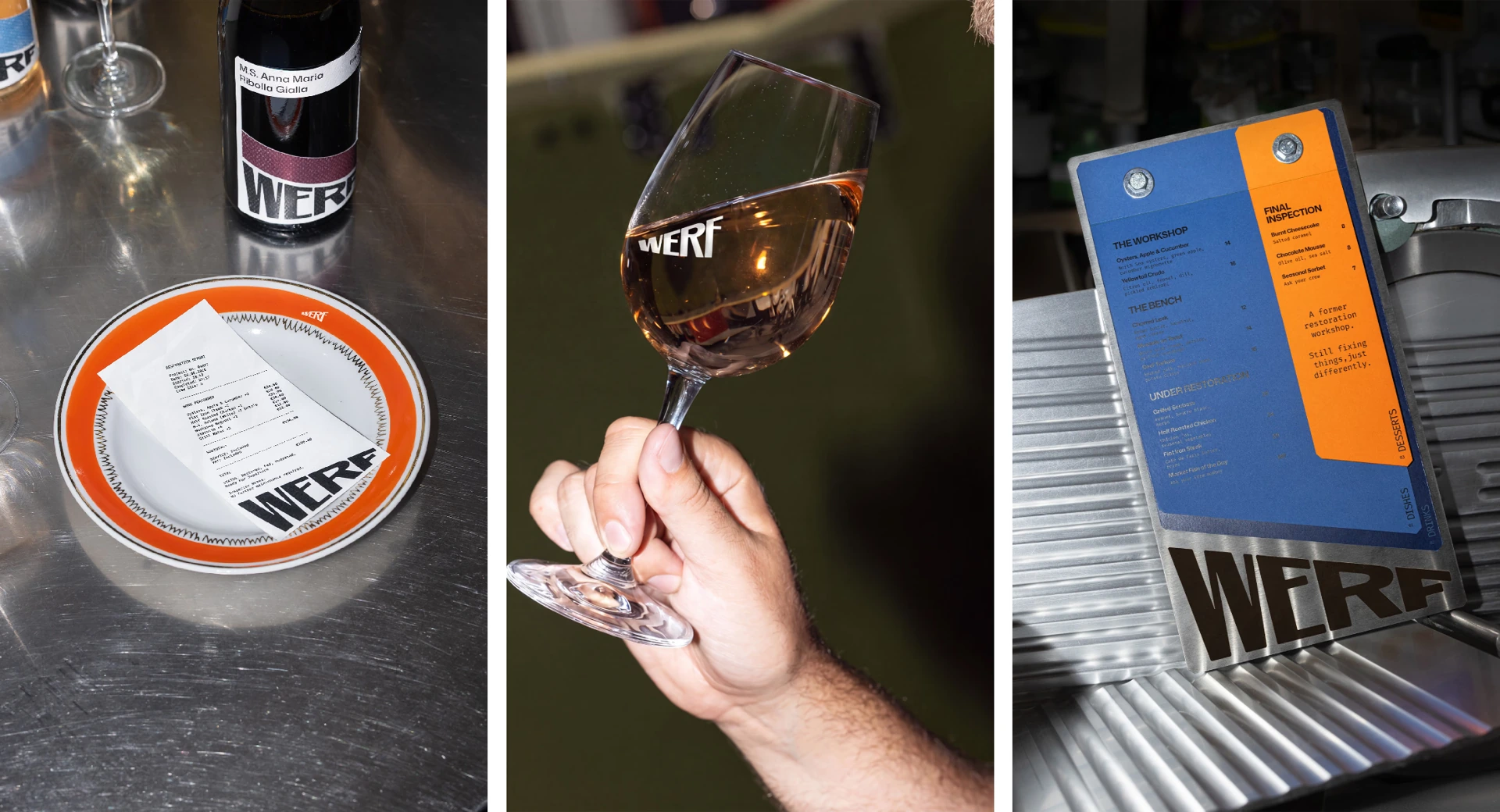
Project: andstudio, 2026. Photography credited in the studio’s case study: Vincas Cygas. Identity images via BP&O; the shipyard view comes from Werf’s website.
Sources: andstudio case study, Werf website, Stadswerf Koningspoort, BP&O.

No comments yet. Start the conversation.