
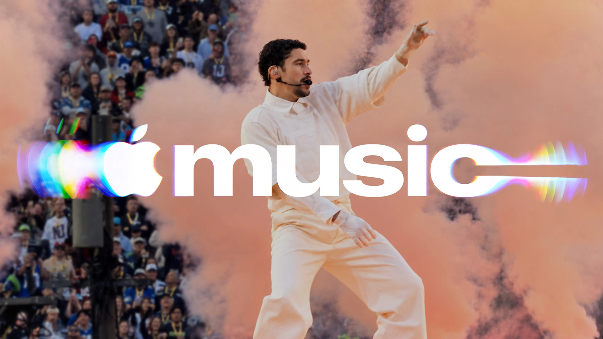
Apple wouldn’t be Apple if it simply unveiled a new logo and left it there. For Apple Music, the company turned the redesign into a story of its own: bringing in a musician, experimenting with sound and making a film about the process. At its heart is a straightforward idea: music can literally influence the way a brand looks.
TBWA\Media Arts Lab developed the identity with producer Fred again.. and NEST Acoustics. They called the project Made by Sound. The team used musical vibrations to produce the ripples and distortions seen in the animated logo.
How sound became an image
First, Fred again.. and NEST Acoustics created a short composition. Individual notes were then played through a device that converts sound into physical vibration. It set mineral oil in motion inside a shallow transparent tank.
Waves formed on the surface. As light passed through the moving liquid, the logo’s outlines distorted. A camera recorded the effect, and the footage became the basis of Apple Music’s moving graphics. Put simply, the team filmed a logo changing under the influence of music.
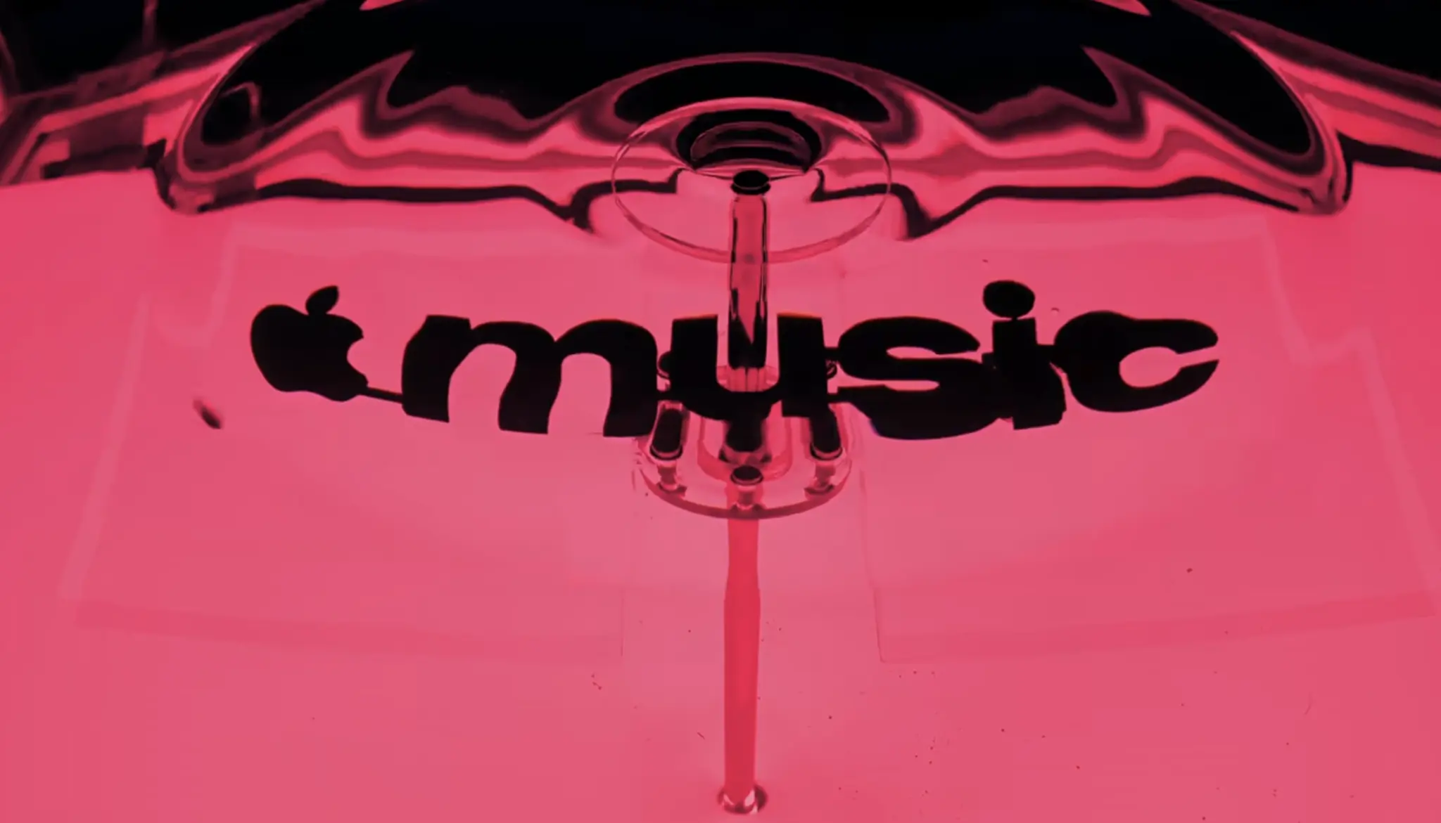
The experiments took several months. The notes had to produce a distinct movement while keeping the mark recognisable. Excessive vibration made the image unclear, so the team adjusted the sound, lighting and liquid movement together.
That is what makes the process interesting: the logo’s movement came from a real material filmed on camera. The project also involved familiar design work, including typography, vector construction and visual effects.
What changed in the Apple Music logo
The new wordmark keeps the familiar Apple symbol, with music set in bold lowercase letters. The lettering uses a customised version of SF Pro, Apple’s own typeface. It looks heavier and more prominent while retaining its connection with the company’s other products.
In promotional graphics, coloured reflections and ripples surround the lettering. The letters appear to stretch with the liquid’s movement. These effects connect with Liquid Glass, Apple’s visual direction built around transparent surfaces and refracted light.
The composition by Fred again.. and NEST Acoustics also became the service’s sonic logo, a short piece of music intended to identify the brand. Sound and image therefore share an origin: the music viewers hear is connected to the effects they see.
The updated wordmark had already appeared in materials for Apple Music Hall in London. It was also prepared for the service’s original content and events. On static formats, the lettering works on its own; in video, sound and movement join it.
Watch how the new identity was made
The Made by Sound film shows the filming rig, the experiments with liquid and the finished effects. This is a process best seen in action: an ordinary musical note changes the liquid’s surface and, with it, the image.
Sources and images: Creative Review, Creative Boom. Creative agency: TBWA\Media Arts Lab. Music: Fred again.. and NEST Acoustics. Type design consultation and vector logo reconstruction: Plau. Production: Optical Arts. Director: Joe Jackson. Visual effects: Time Based Arts.
No comments yet. Start the conversation.