
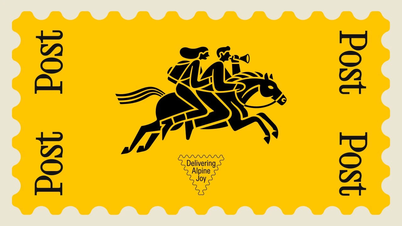
The hotel is in Bad Hofgastein. Its official history traces hospitality at the site back to 1421 and describes a former postal station becoming an inn. A generational handover in the family business prompted a new name, replacing Alte Post, and a refreshed visual identity.
From postal station to Post Post
The traditional postal rider becomes a pair of travellers heading for the Gastein Valley. Seasonal versions equip them with a backpack or skis. Daniel Triendl’s illustrations retain a strong black silhouette: the horse’s movement, the riders’ angled bodies and the flowing hair and tail stand out clearly against yellow.
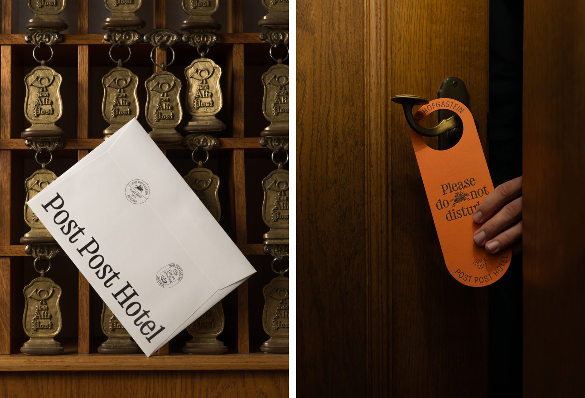
In one photograph, a white envelope bearing the new name sits among metal Alte Post key fobs. The old lettering and new typography share the same frame. On an orange door hanger, the familiar riders appear within a short request for privacy.
Type, stamps and paper
Studio Bruch created BR-Post for the project. According to the designers, its forms echo the contours of postage stamps. It is paired with ABC Diatype Condensed from Dinamo. The large serif gives headlines their character, while the narrow sans serif fits practical information and the small lettering inside postmarks.
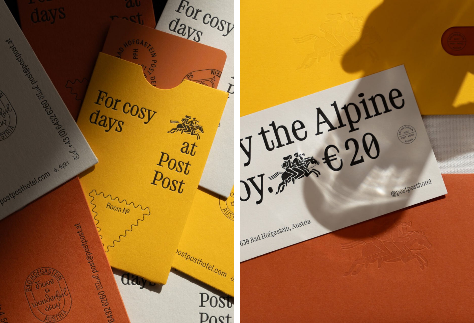
The postal theme also takes physical form. Embossed riders appear on yellow and orange envelopes, circular marks punctuate cards, and the frame for a room number resembles a triangular stamp. A semicircular cut-out makes the card easier to remove from its sleeve while echoing the surrounding shapes.
An identity in everyday details
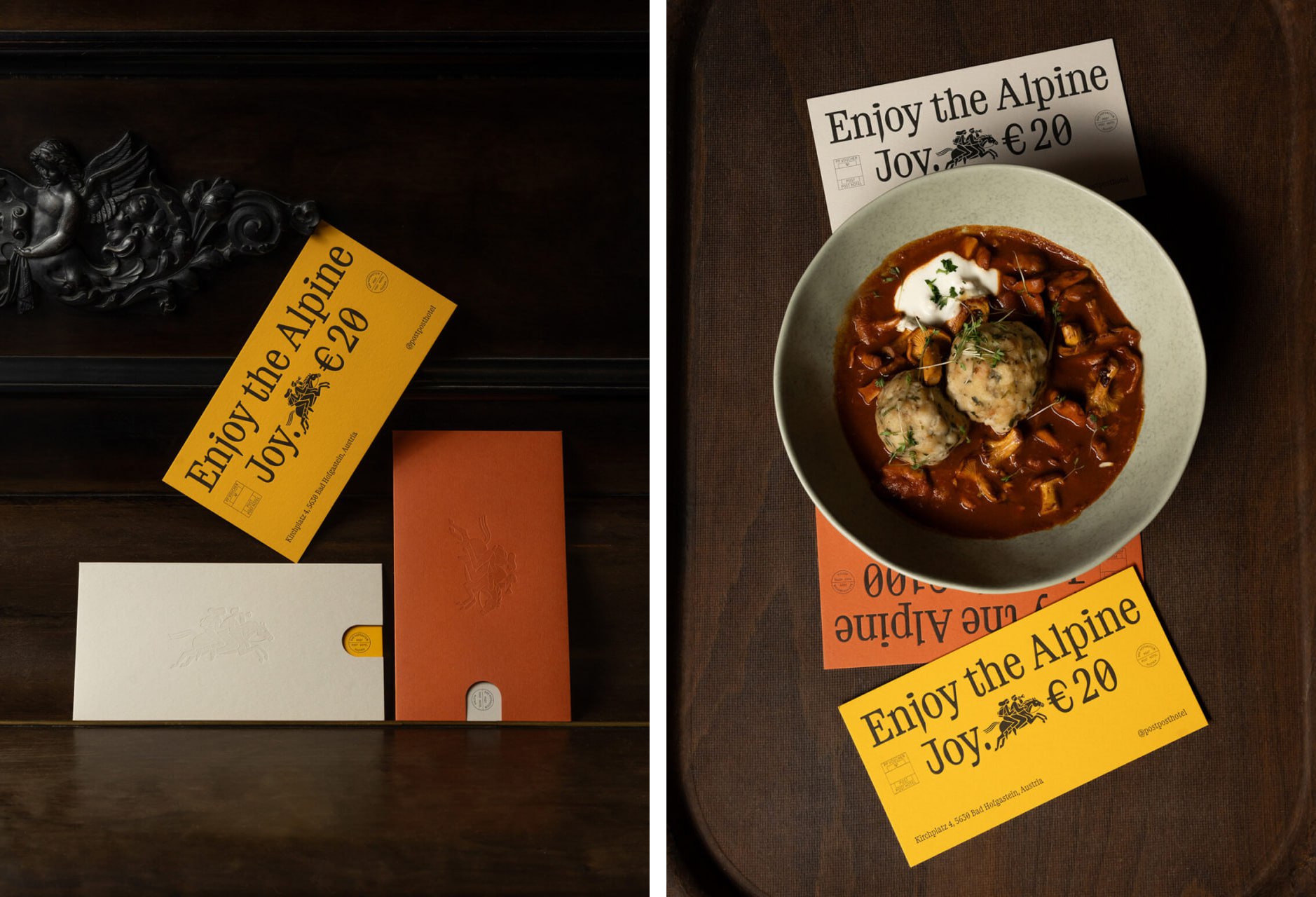
Yellow, orange and pale paper stand out against dark wood. Gift vouchers combine large lettering with a small illustration and their face value. Even in the photograph featuring a plate of food, enough colour and type remain visible to identify the hotel.
In the mobile website mockups, the same serif fills a substantial part of the screen. Photographs of food, rooms and mountains alternate with blocks of colour. Social media layouts add seasonal versions of the riders and an illustrated character for the Postler restaurant.
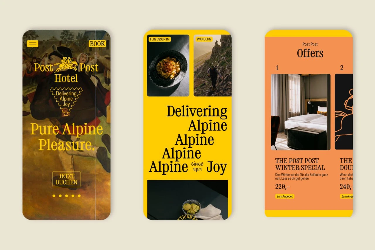
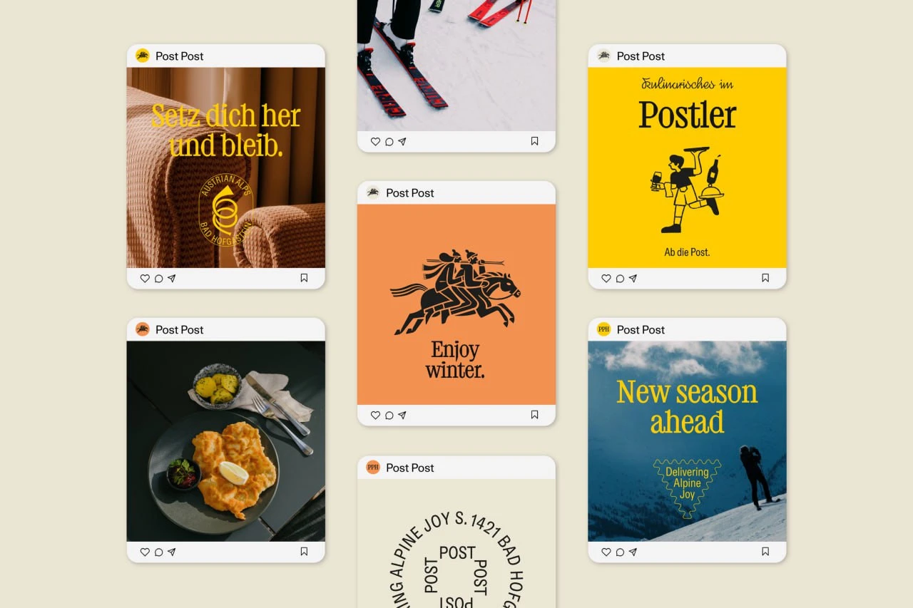
A few precise repetitions connect the applications: colour, type, postmarks and illustration. Even a small envelope or a post in a feed can be recognisable without a prominent logo.
Identity: Studio Bruch. Creative and art direction: Kurt Glänzer and Josef Heigl. Illustration: Daniel Triendl. The project credits name Julius Hirtzberger and Ina Weiss as photographers.
Sources: Post Post Hotel: Das Hotel · Studio Bruch: Post Post Hotel · International Creative Awards: POST POST Hotel · D&AD: Post Post Hotel


No comments yet. Start the conversation.