Skip to article

Enter Arkitektur’s Identity: Architecture in a Single Mark

Enter Arkitektur’s identity brings an E, an arrow and a house into one compact mark. Lundgren+Lindqvist created a system for the Swedish architectural practice that rewards a closer look, from the details of its logo to its use on paper, cloth and packaging.

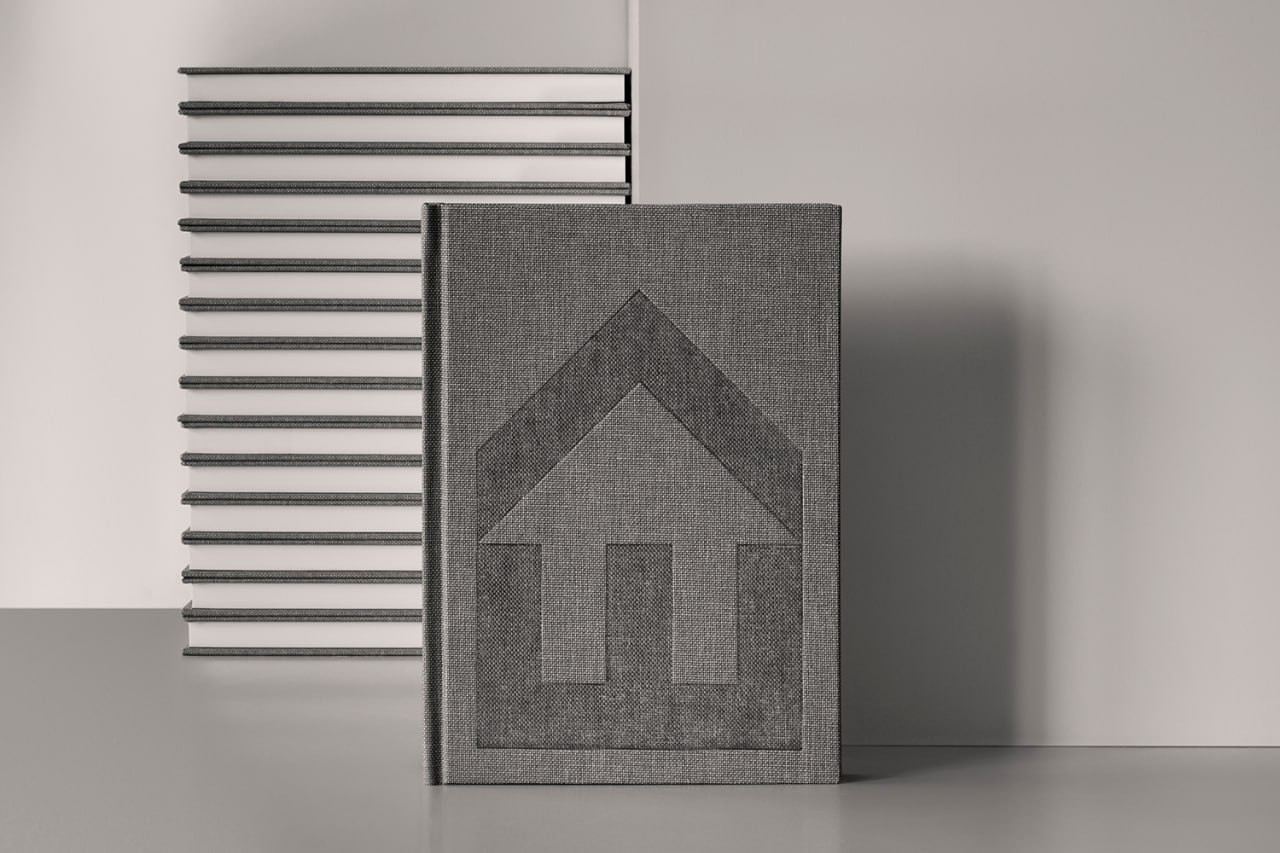
A grey cloth-covered notebook with a large embossed Enter Arkitektur mark, standing in front of stacked notebooks.

Enter Arkitektur works on residential and commercial projects. This identity dates to 2017: the practice announced the redesign that December and credited Lundgren+Lindqvist. The arrow was already part of its previous logo, providing a familiar element to carry forward.

A letter, an arrow and a house

Upright, the mark resembles a house with a pointed roof. Turning it sideways makes the E and the direction of the arrow easier to see. The white space inside forms another silhouette: the outline and the gaps between the black shapes are equally important.
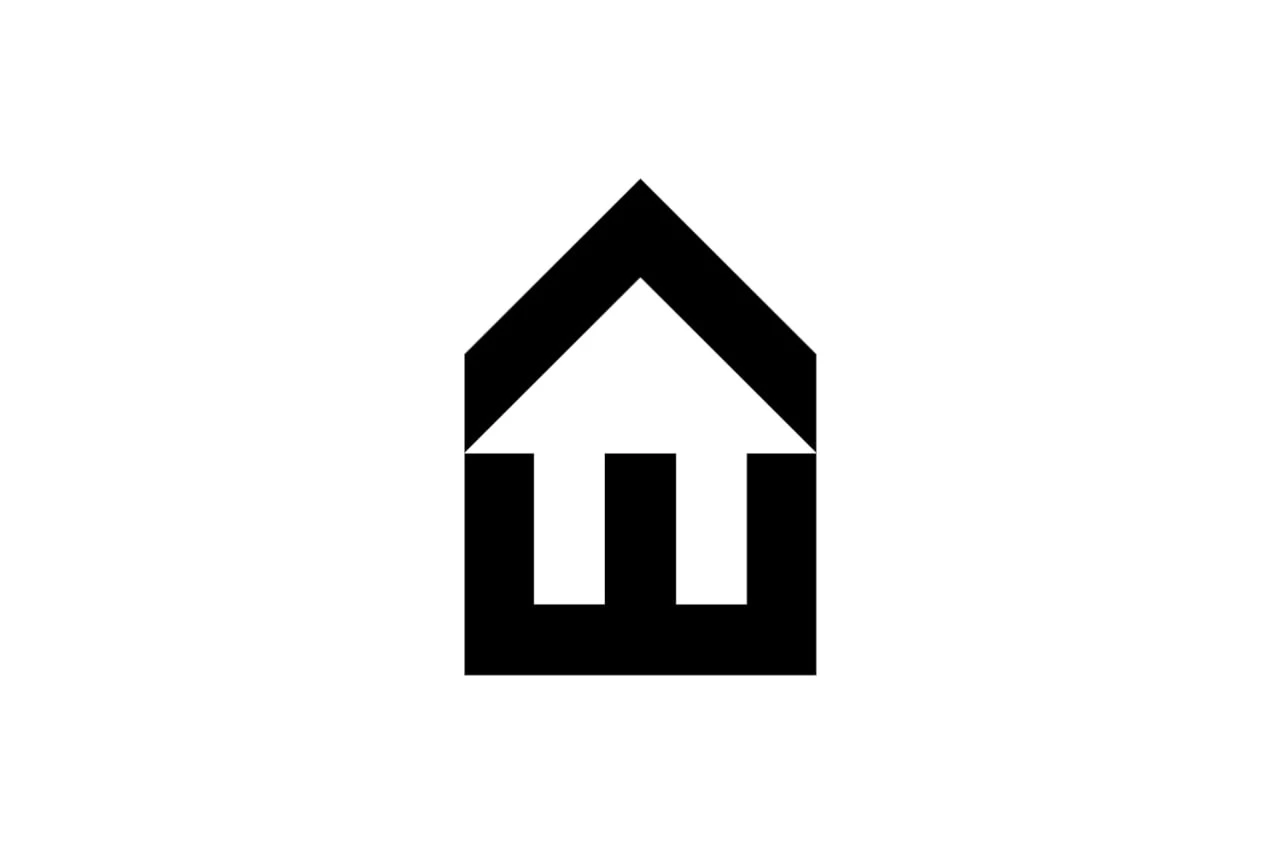
The black Enter Arkitektur mark on white, combining an E, an arrow and the silhouette of a house.
The Enter Arkitektur mark. Design: Lundgren+Lindqvist.

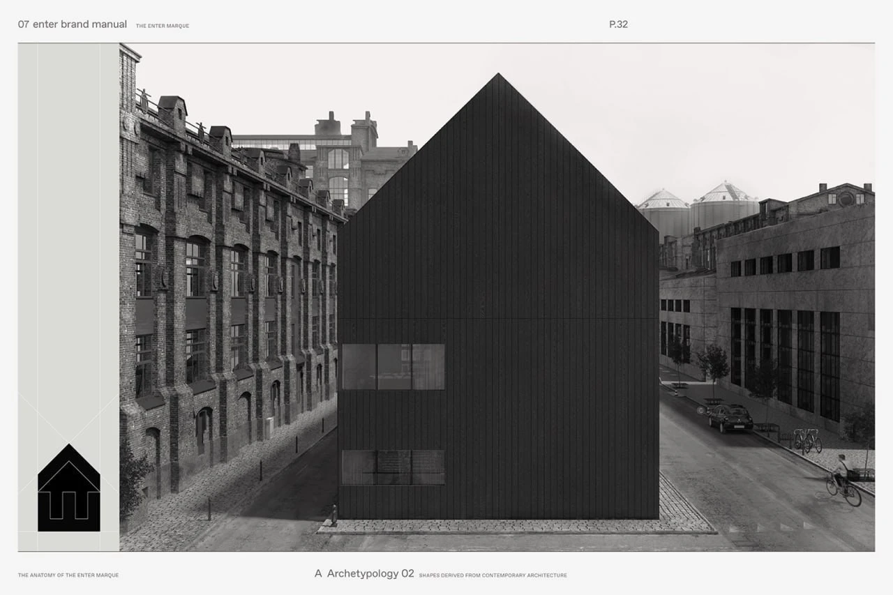
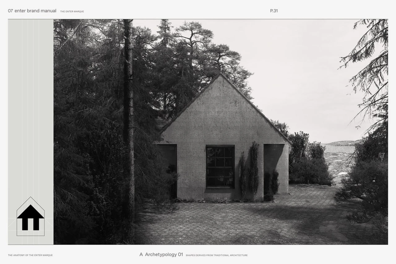
The brand manual explains this construction through architectural references. A traditional house and a contemporary building appear alongside the shapes they contribute to the mark. A separate diagram breaks it into elements, showing how a few simple forms come together.
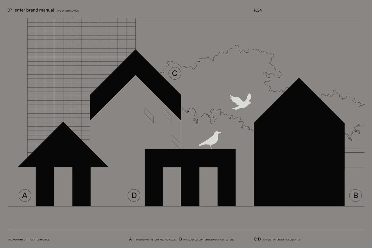
A page from Enter Arkitektur’s brand manual diagramming the houses, arrow and E that make up the mark.
A diagram of the mark’s construction from the brand manual. Graphic design: Lundgren+Lindqvist.
A brand manual page with a black-and-white photograph of a house among trees and a traditional architectural silhouette diagram at left.
Traditional architecture as a reference in the brand manual. Graphic design: Lundgren+Lindqvist.
A brand manual page showing a dark, gabled building in an urban setting, with a diagram of the mark at left.
Contemporary architecture as a reference in the brand manual. Graphic design: Lundgren+Lindqvist.

Texture as part of the identity

According to the studio, the palette draws on the changing shades of sunlight on a white wall. Fedrigoni Sirio Colour papers were selected for the stationery. Grey tones dominate the images shown here, bringing surface texture and the difference between print and embossing into focus.

On the business card, light and shadow reveal the small mark, while enter is set in lighter lettering. On the cloth-covered notebook, the logo occupies almost the entire surface. The change in scale keeps it recognisable and invites a closer look at its relief.
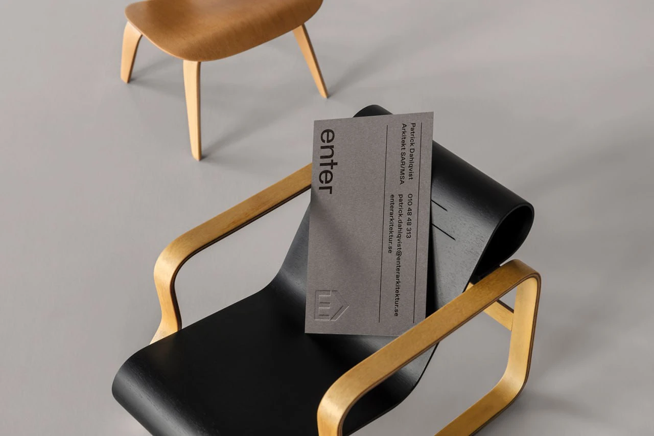
A grey Enter Arkitektur business card with black typography and an embossed mark, placed on a black chair with wooden armrests.
A business card with an embossed mark. Design: Lundgren+Lindqvist; printing and embossing: Göteborgstryckeriet.

The mark becomes a pattern

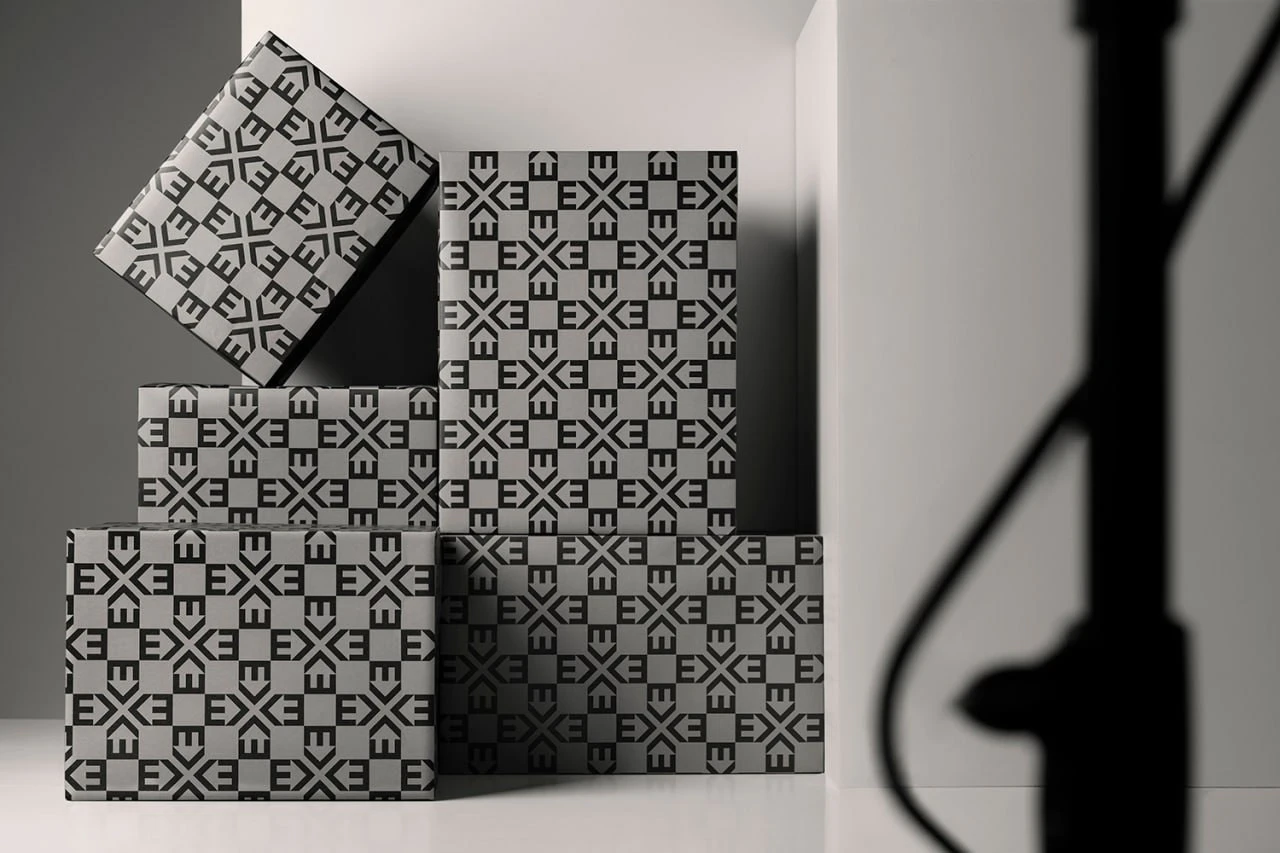
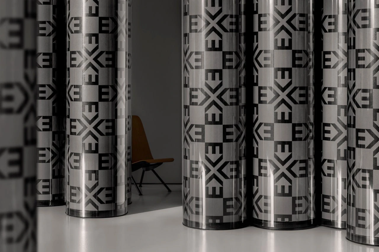
In the wrapping paper, the mark repeats in different orientations. Arrows point towards each other, creating cross-like shapes between them. Black and grey squares establish a rhythm that remains clear on both a flat sheet and wrapped boxes.
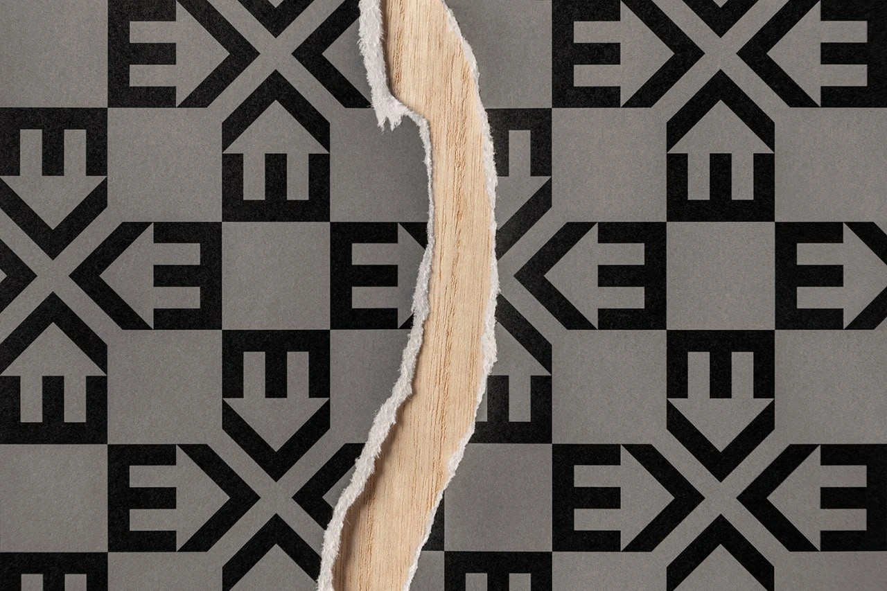
A black-and-grey pattern of rotated Enter Arkitektur marks on torn wrapping paper over a wooden surface.
Wrapping paper detail. Design: Lundgren+Lindqvist.
Upright rolls of wrapping paper with a geometric black-and-grey pattern made from Enter Arkitektur’s mark.
The pattern on rolls of wrapping paper. Design: Lundgren+Lindqvist.
A stack of boxes wrapped in a black-and-grey Enter Arkitektur pattern, lit from the side.
Wrapping built from the repeating mark. Design: Lundgren+Lindqvist.

On the knitted scarf, that geometry softens as its outlines pass through stitches and folds. The pattern, embossed mark and restrained business card show different ways of working with the same form. Each material gives it a distinct texture.
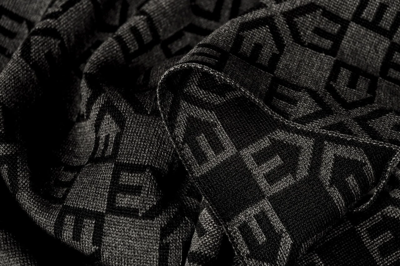
A close-up of a dark grey knitted scarf, its folds carrying a black pattern of Enter Arkitektur marks.
The pattern on a knitted scarf. Design: Lundgren+Lindqvist.

Design: Lundgren+Lindqvist. Stationery printing and embossing: Göteborgstryckeriet. Handmade notebooks: Flodstrands Bokbinderi.

Sources: Lundgren+Lindqvist: Enter Arkitektur · Enter Arkitektur: Ny grafisk identitet, 19 December 2017 · Enter Arkitektur: Om oss
Back to articles

Article image viewer

Esc closes. Arrow keys browse images. In actual-size mode, scroll the image or pan it with your finger.

Comments

0 comments

No comments yet. Start the conversation.