

The mark was designed by Vaughan Pratt, a Stanford professor of computer science. In a recollection dated 28 March 1994, he places the work in the first year of Sun Microsystems, which was founded in 1982. Pratt was then a consultant to the company, also working on a typeface and software for its computers.
How the ambigram works
The composition consists of eight u-shaped elements. Depending on their rotation, they read as u or n. Two neighbouring forms make the outline of an s, allowing the same detail to contribute to more than one letter. The name repeats four times around the composition, although the individual words are difficult to separate.
This is a rotational ambigram: turn it through 90° and the composition returns to the same arrangement. Heavy strokes, rounded bends and even spacing maintain its rhythm. In the black version on a white background, the gaps between the elements are particularly clear, separating the letters while connecting them into a single pattern.

From a flat mark to a physical sign
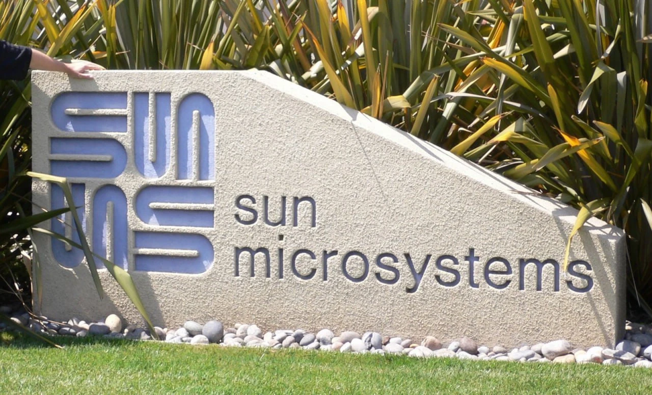
On the stone sign, the symbol sits upright with its outer edges forming a square. A simple lowercase sun microsystems wordmark appears alongside it. The stone’s texture and recessed shapes add depth, while the construction from repeated forms remains easy to see.
The blue-grey sign presents the same principle at a different angle: the square stands on a corner and reads as a diamond. The large, sloping Sun wordmark has serifs that contrast with the symbol’s even strokes. Together, these examples show how recognisable the geometry remains beside different lettering and in different materials.

The logo in Sun’s history
Sun Microsystems developed computer systems and software. Among its releases was Java, first launched in 1995. In April 2009, Oracle announced an agreement to acquire Sun in a transaction valued at approximately $7.4 billion. It announced the acquisition’s completion in January 2010.
From a design perspective, the mark’s economy is its most interesting quality. A small set of repeated forms holds a name, a distinctive silhouette and a visual puzzle. You can recognise the diamond first and discover the hidden s later. Both readings work together.
Sources: Stanford: Vaughan Pratt, The Matchbox PC, 24 May 2000 · Vaughan Pratt: The Founding of Sun Microsystems, 28 March 1994 · Java: What is Java technology? · Oracle Buys Sun, 20 April 2009 · Oracle Completes Acquisition of Sun, 27 January 2010


No comments yet. Start the conversation.