
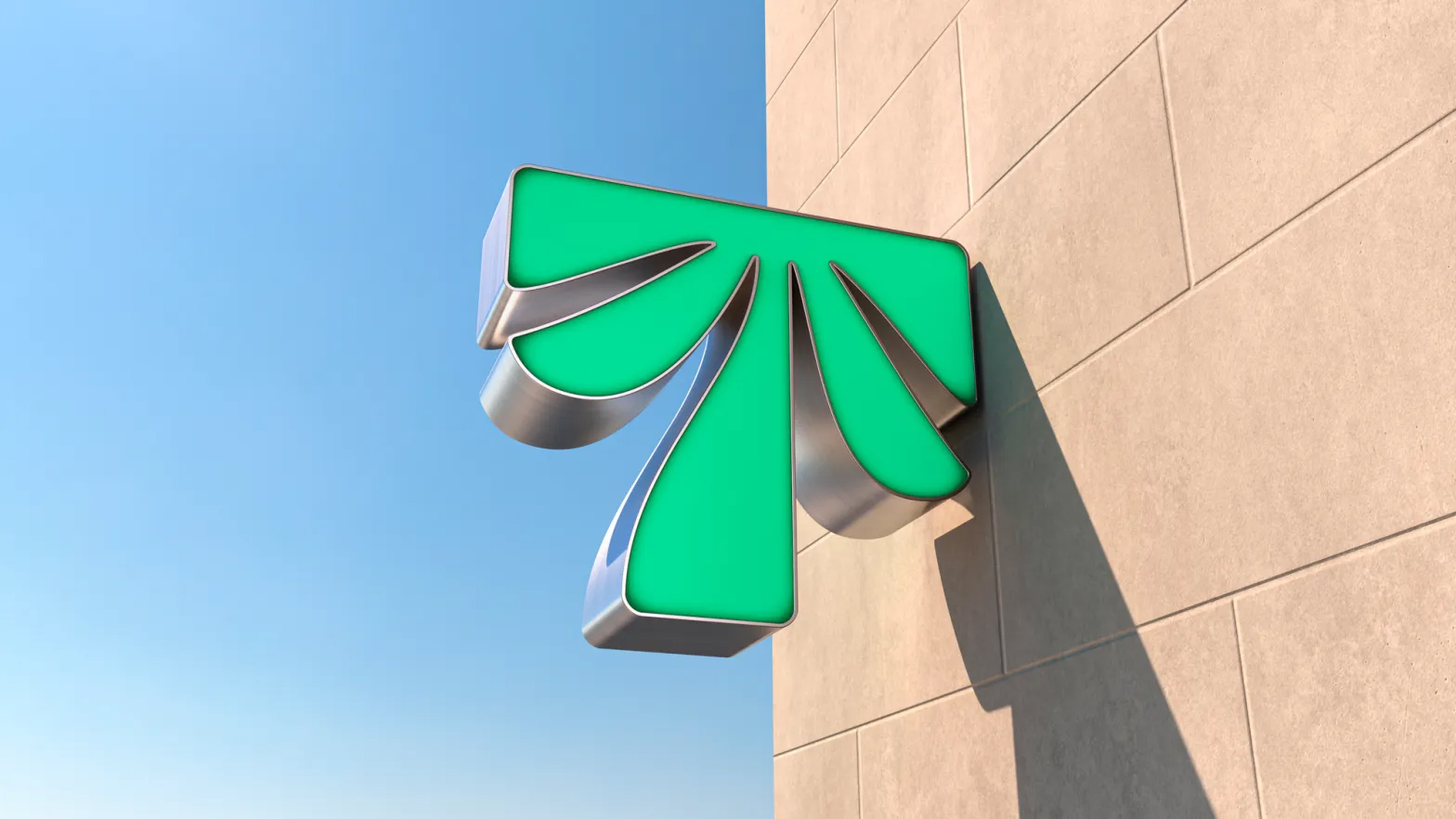
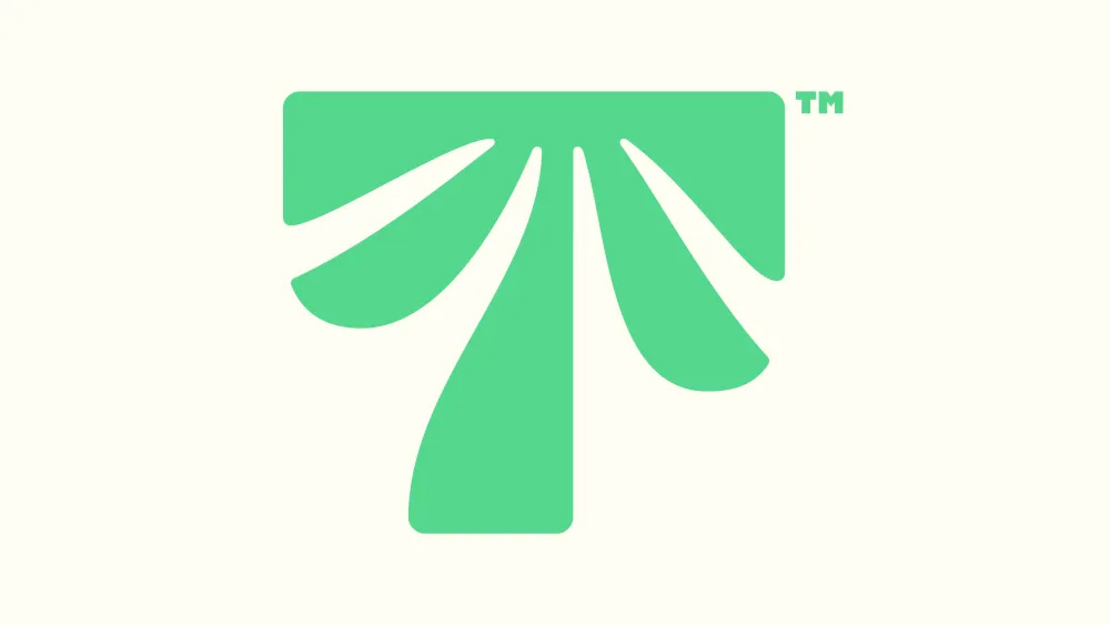
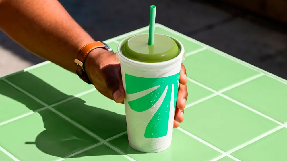
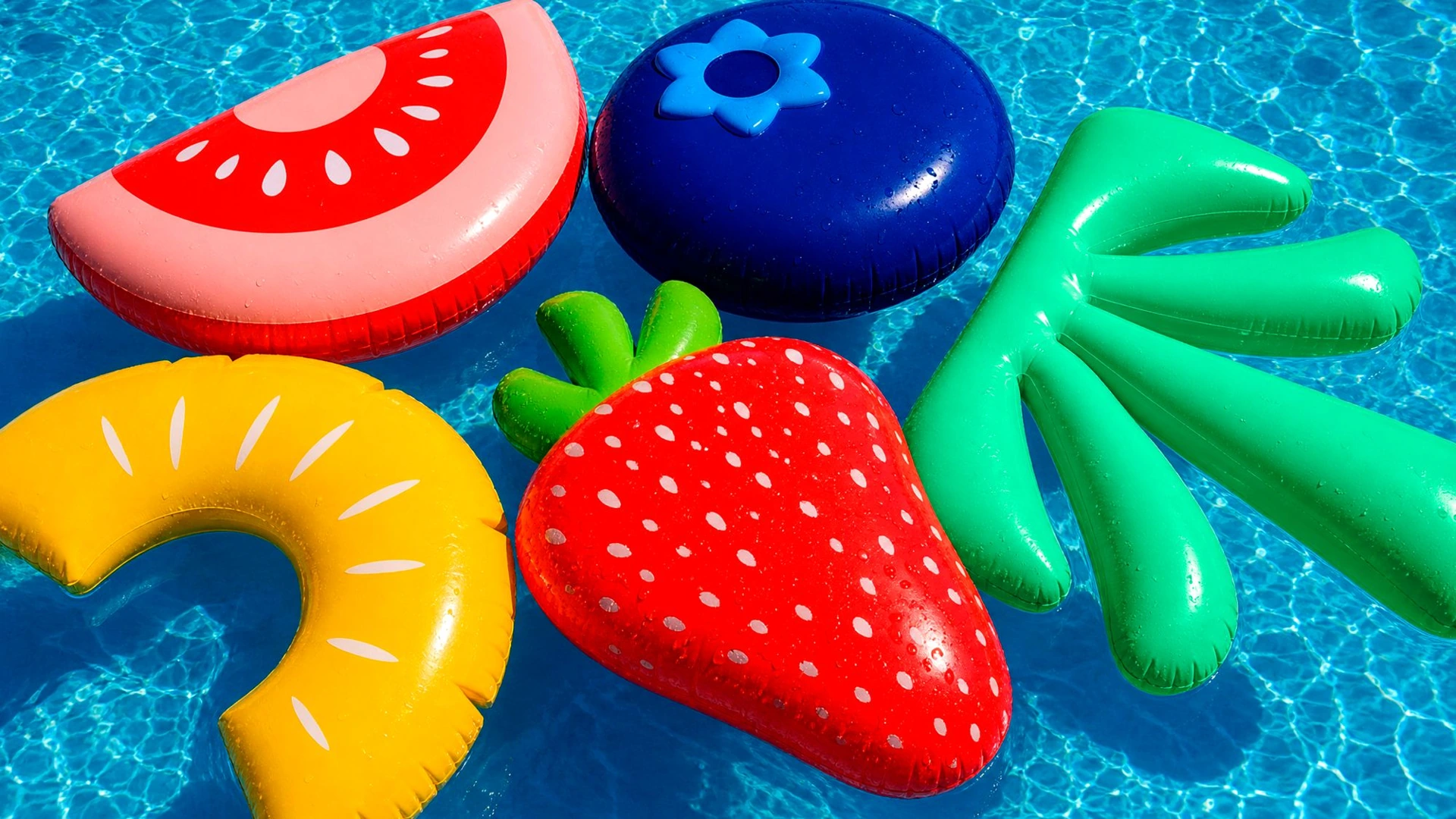
Tropical Smoothie Cafe’s green palm hides a T, the first letter of the chain’s name. The designers named it the Palm T and put it on cups, caps and signs. The project examples even include an inflatable version.
Behind the symbol is an American cafe chain serving smoothies and food to go. It introduced its new look by JKR in September 2026, when it had more than 1,700 locations. JKR (Jones Knowles Ritchie) is a global branding agency that designs logos, packaging and visual identities for companies.
The idea from JKR
The team wanted to bring a feeling of the tropics to an everyday trip for a smoothie. JB Hartford, Executive Creative Director at JKR, explains it this way:
“We saw a chance to treat ‘tropical’ less as a place and more as a feeling…”
They called the idea Tropical State of Mind. Green and orange sit alongside large lettering and fruit imagery. In the cafe design example, there is even a whole wall for them.
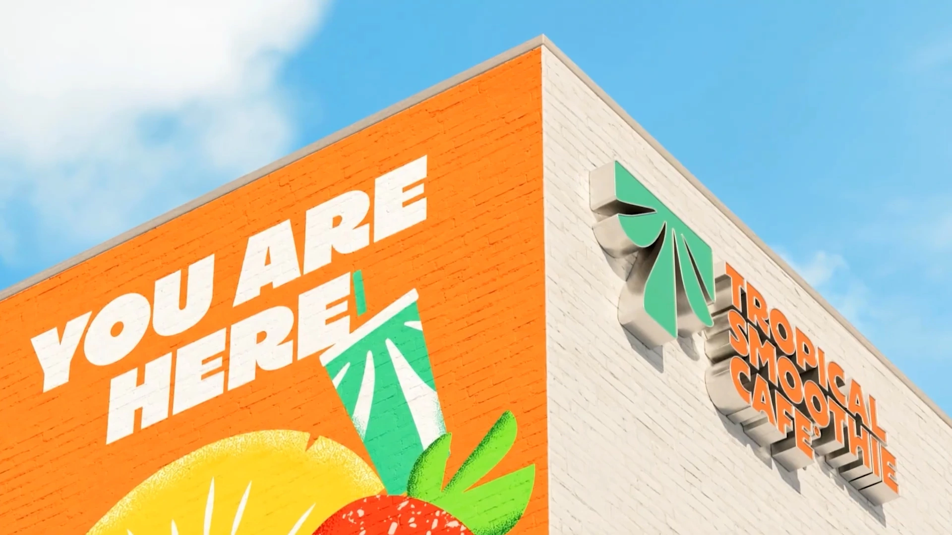
London-based Studio DRAMA helped refine the logo and created the Sway Display typeface. The designers took details from the palm fronds and carried them into the letters. You can see the lettering on the shirts and aprons in the project images.
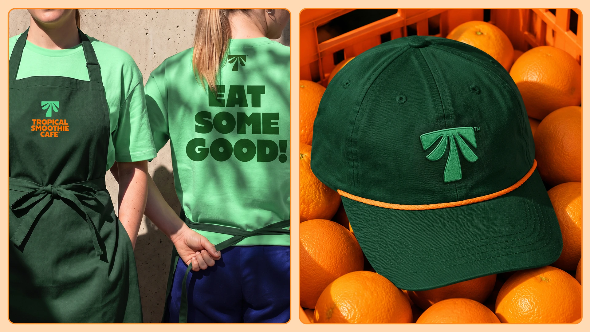
How it looks on everyday things
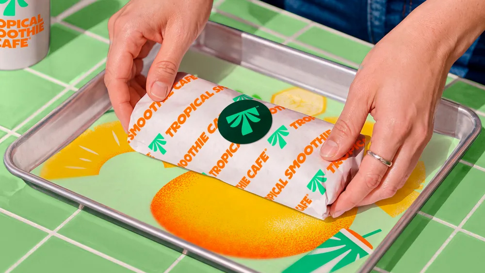
On the cup, the palm is large and easy to spot. On the food wrapper, it is smaller and repeats alongside the cafe name. Two main colours and a handful of simple elements were enough for the packaging.
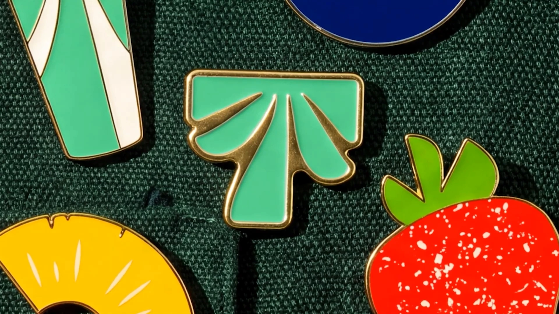
The collection also includes pins shaped like a palm, a strawberry and a pineapple. Alongside them are inflatable fruit and a huge green Palm T in a swimming pool. A familiar cafe symbol becomes an object worth a closer look.
Team: identity by JKR; logo refinement and typeface by Studio DRAMA. Project images via: Logo Design Love and BP&O.
Sources: Tropical Smoothie Cafe announcement, Studio DRAMA case study, Logo Design Love, BP&O.

No comments yet. Start the conversation.