
When Eclipse Space came to Omoi, the engineers, technology and business plan were already there. The company still needed a public face. Another black-and-blue space logo would have been easy. Instead, Omoi dug into the things Eclipse Space actually makes – and into the strange, beautiful machines that helped people first travel to the Moon.

Owning the satellites, not renting them
Eclipse Space builds satellite constellations for governments and telecom operators. Instead of paying to use somebody else's network, customers can own the infrastructure. That difference became the whole point of the branding. The line Designed by us. Owned by you. shows up everywhere, from the website to a massive outdoor display.

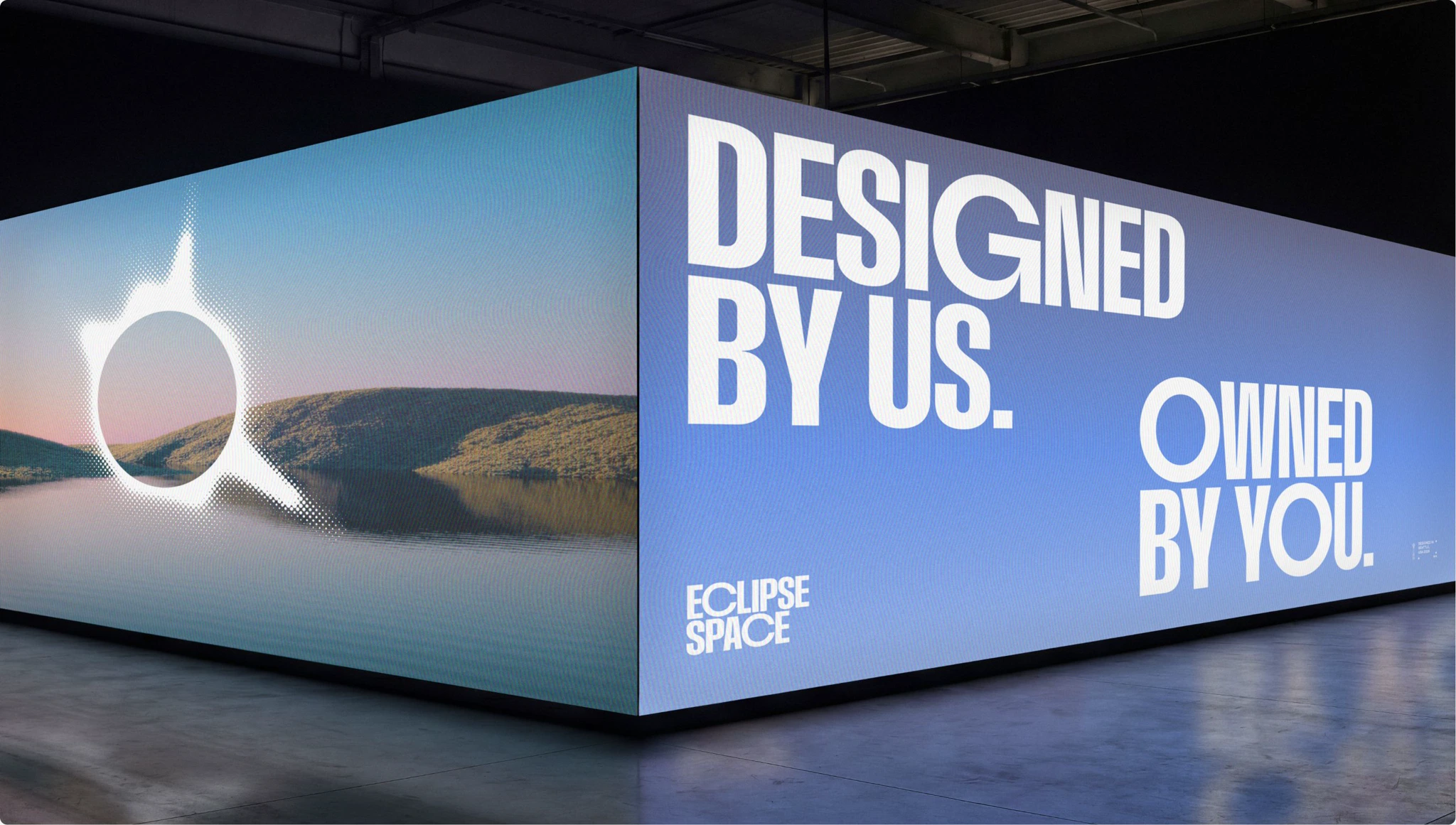
A logo that changes every time
See the pale, uneven ring? It's based on the solar corona – the light visible around the Sun during a total eclipse. Omoi didn't draw one perfect version and lock it away. The studio made a generator so the ring can stretch, shift and change. Every result is different, but it still belongs to the same family.