

Take a closer look at the first two letters of Gillette. The top of the “G” has a sloping cut; so does the underside of the dot over “i”. Gillette says those edges were drawn to suggest a razor blade. It is a tiny adjustment to the lettering, not a separate symbol.
On November 2, the brand shared the detail on Instagram with a caption that effectively said: once you notice it, you cannot unsee it. Perhaps you have already spotted the unusual shapes of the “G” and the dot over the “i”. Gillette has now spelled out what they are supposed to suggest.
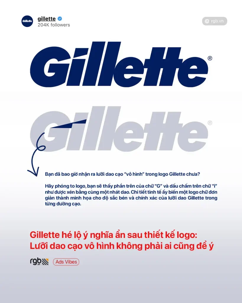
The blue Gillette logo and a diagram showing the cuts between “G” and “i”. Gillette’s original Instagram post.
Where the blade hides in the Gillette logo
Look closely at the upper edge of the capital “G” and the underside of the dot above the “i”. Both are sliced diagonally at almost the same angle. The empty gap between them suggests the sharp edge of a razor blade. Designers call this negative space: an image formed by the gaps between shapes rather than by adding another graphic.
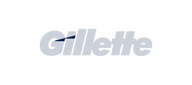
At ordinary size, you simply read Gillette. Enlarge the logo and the careful relationship between those two letters becomes more apparent. There is no realistic razor hidden in the lettering. Just a sharp-looking interruption, enough to connect the wordmark to the product it represents.
Designers noticed it long before this post
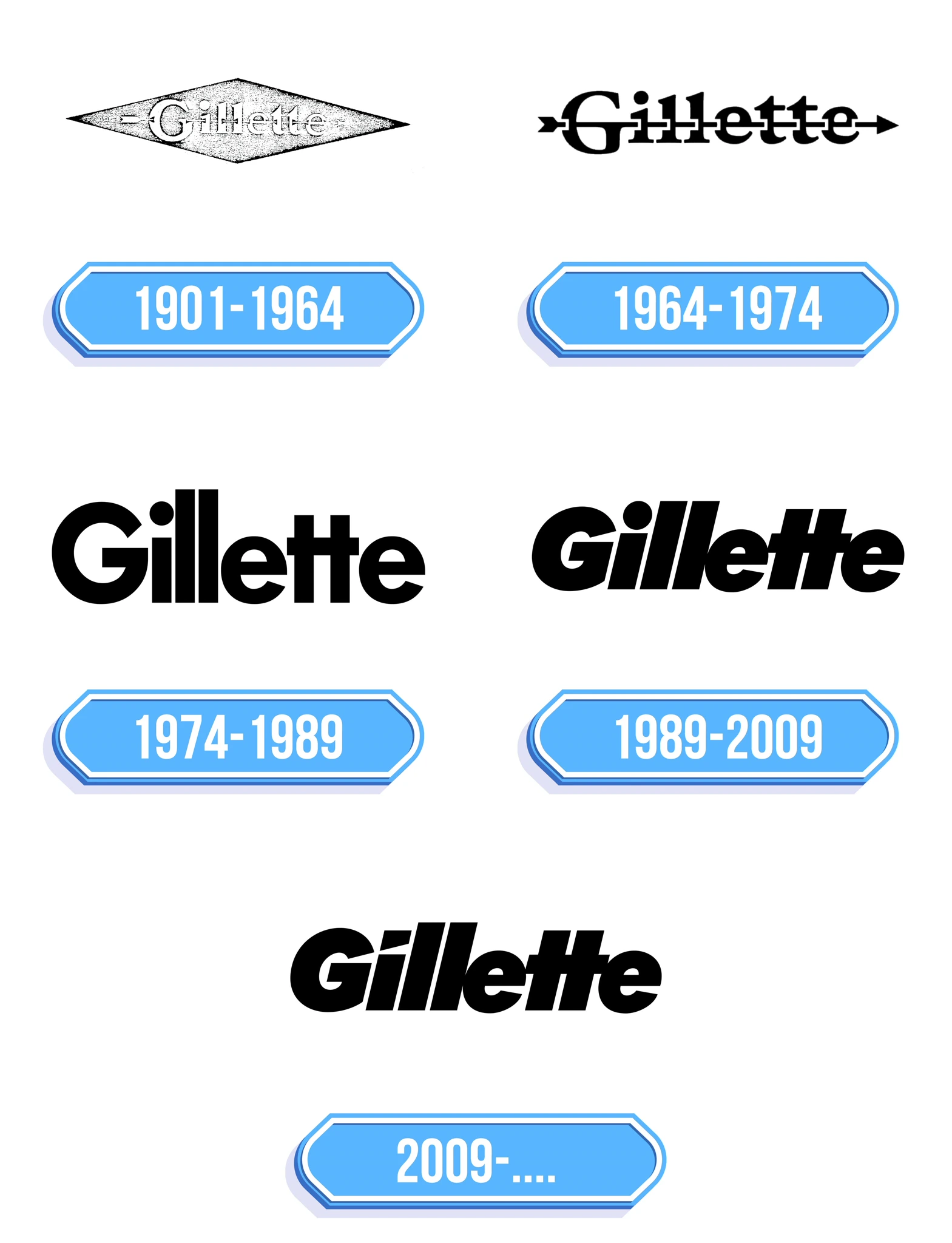
Place an older Gillette logo beside the current one and the difference is there to see. In the late-1980s version, the dot above the “i” was still round, and the top of the “G” had no matching slice. Both shapes changed around 2009. So the brand is pointing out a detail that has been there for roughly seventeen years, not unveiling a new mark.
This idea had been discussed well before November 2026. A diagram published in 2013 showed how the space between “G” and “i” could resemble two stacked blades. Designers continued to notice the detail in the following years. What makes Gillette’s latest post interesting is that the brand itself has now confirmed the meaning behind it.
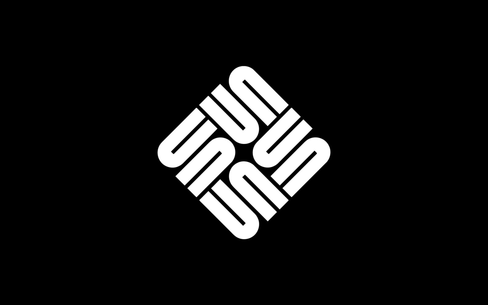
Some viewers also see blades in the two tall “l”s, which resemble narrow strips of metal. That is an interpretation, not something Gillette has confirmed. For a different example of lettering that changes how you see a logo, take a look at Sun Microsystems, where the same shapes can be read in more than one direction.
A company built around the replaceable blade
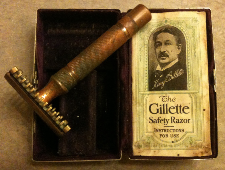
King Camp Gillette founded the business in 1901. With traditional straight razors, the same blade had to be sharpened over and over. His alternative was a reusable handle fitted with a thin, replaceable steel blade. The idea was patented in 1904. Buying a new blade was simpler than sharpening an old one.
In the photograph below, the instruction booklet next to an early metal razor carries Gillette's own portrait. His surname was also the name of the product. Much later, entirely different razors would appear under that name, including Sensor, Mach3 and Fusion. Yet the word Gillette remained on their packaging.
Before the hidden blade, there was an arrow
One of Gillette's earliest recognizable marks looked nothing like today's logo. The name sat inside a stretched diamond, pierced by an arrow. A trademark version was filed on May 27, 1908. There was no need to zoom in to find a pointed object in that design: it ran right through the lettering.
There is a particularly good story behind it. Writing in the April 1918 issue of the company's magazine, The Gillette Blade, drafting department employee F. E. Dorr recalled showing King Gillette several proposed marks. One involved a broom running through the “G”, a joke that failed to win the founder over. The diamond and arrow, however, made him stop and take a closer look.
Dorr said the arrow was meant to represent the company moving forward. That matters because it would be tempting to assume he intended it as a razor blade. His own explanation was different. Compare that with the tiny modern cuts, which Gillette explicitly connects to shaving. The early mark and the 1918 magazine can still be viewed in archives.
How the Gillette wordmark changed
Over the decades, the design grew simpler. By the 1960s the diamond had disappeared, although an arrow still ran through the name. In the 1970s the arrow went, too, leaving heavier, more legible lettering. By the late 1980s the wordmark had gained its familiar forward slant, with the letters drawn closer together. The dot above the “i” was still round.
Around 2009, the round dot became a slanted shape and the “G” gained a matching cut. That created the detail at the centre of Gillette's November 2026 post. The adjustment was small enough to preserve the recognizable outline of the name.
Gillette also had a very different corporate logo
There is another chapter to this story. The mark for The Gillette Company was not always the same as the name printed on its razors. After acquiring Braun in 1967, Gillette needed a visual identity that could work across several categories of business.
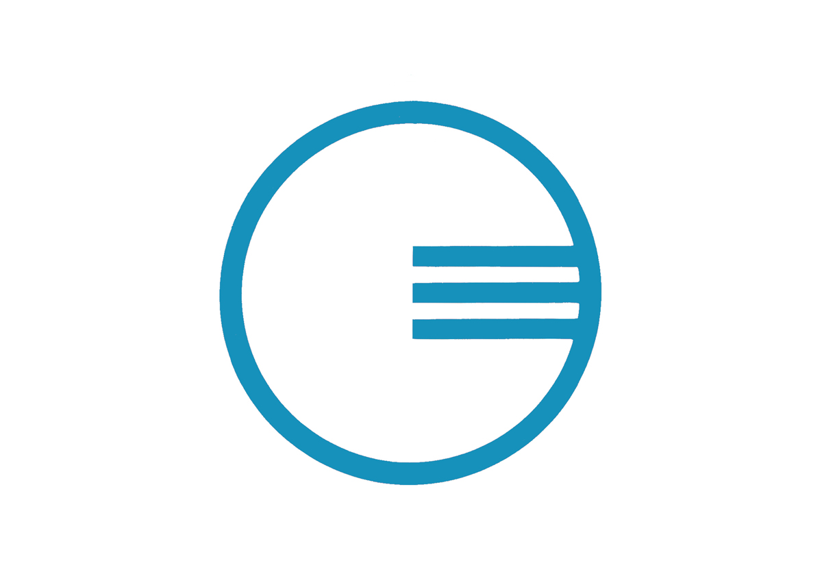
In 1970, Braun designers Fritz Eichler and Stefan May worked on a corporate identity built around a geometric “G” with three horizontal bars. The symbol represented the company as a whole, while Gillette razors continued to use the familiar consumer wordmark.
The brand launched its The Best a Man Can Get slogan in 1989 and became part of Procter & Gamble in 2005. Products and advertising have changed considerably since then, but the name itself has stayed familiar. And now two tiny cuts are giving people a reason to look at that name again.
Sources: Gillette's official Instagram; Gillette company history; the 1908 trademark; The Gillette Blade, 1918.


No comments yet. Start the conversation.