
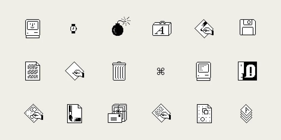
A smiling Macintosh, a bin for unwanted files, a deck of Solitaire cards, and the ⌘ key. Many familiar details of digital life lead back to Susan Kare, the American artist and graphic designer who helped give the original Macintosh its personality. In the early 1980s, her small images explained actions while her typefaces brought a considered typographic voice to the screen.
Her work is worth studying beyond the history of Apple. It shows how to give a complicated function a clear visual form when space is scarce and every detail has a job to do.
From sculpture to graph paper
Kare entered computer design through art. She held a PhD in fine arts from New York University and had worked in sculpture. In 1982, Andy Hertzfeld, a friend from high school and a member of the Macintosh team, invited her to try making graphics for the new computer. Her first ideas could be drawn on graph paper.
The work began as consulting. Kare joined Apple full time in January 1983. That sequence explains the two dates often found in accounts of her career: 1982 marks the early collaboration, while 1983 marks her move into the team.

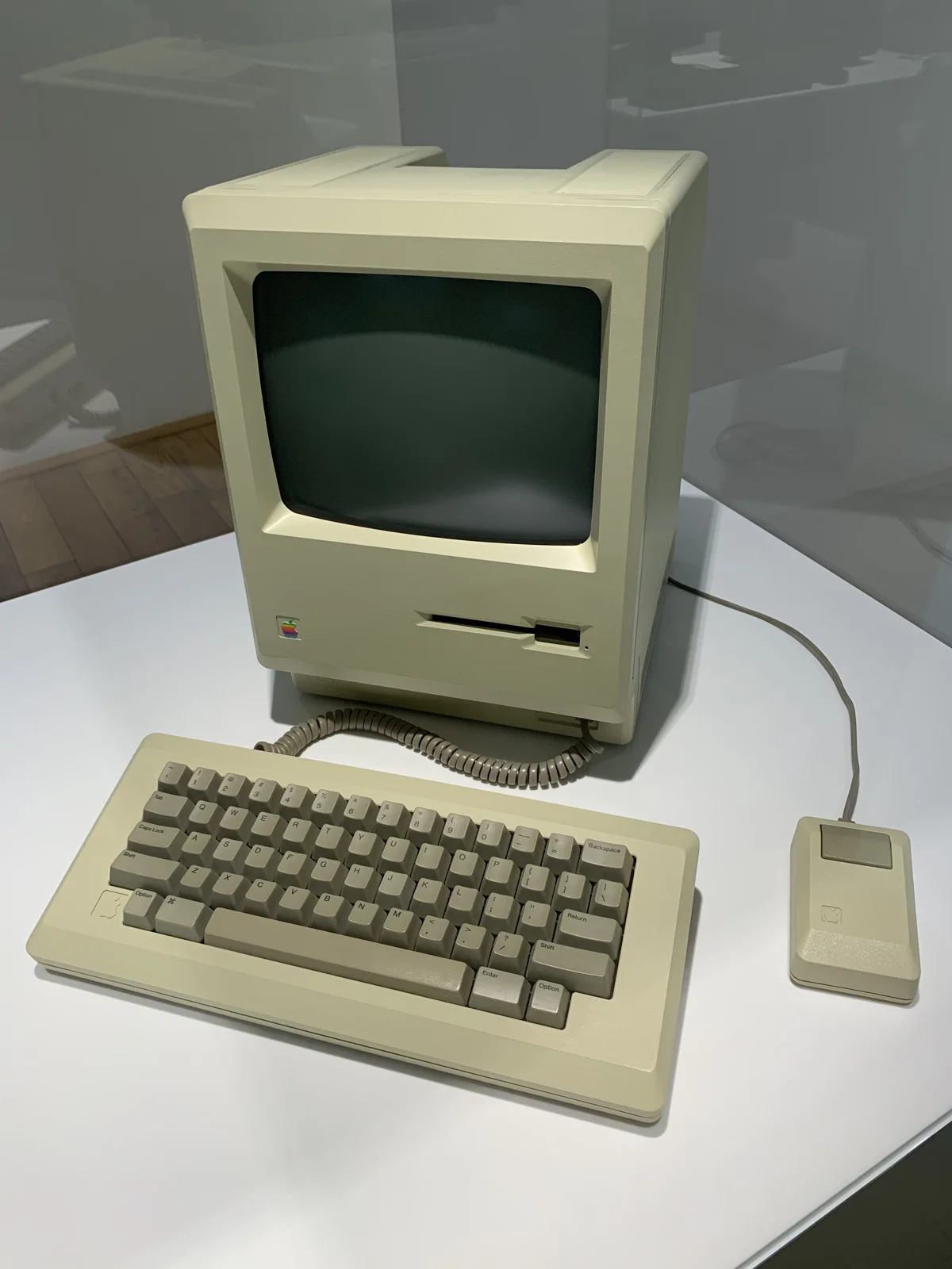
An idea in 1,024 pixels
For many early icons, the working area was a 32 × 32 grid: just 1,024 positions, in black and white. On paper, one square represented one pixel. It was a process with an affinity to mosaics or needlework, in which a larger image emerges from small, deliberately placed units.
Hertzfeld later built an editor with an eight-times-enlarged grid and a separate actual-size preview. The principle remains useful: test a symbol at the scale at which people will use it.
A bin suggested where unwanted files could go; scissors represented cutting. Happy Mac added a smile to startup. Kare worked within an existing tradition of graphical interfaces, developing some imagery already used on Apple's Lisa. Her contribution lay in the precision, consistency, and personality of the individual designs.
How a Swedish sign became the Command key
The story of ⌘ begins with another symbol: menu commands originally carried an Apple logo. Steve Jobs felt the logo appeared too often on screen, so the team needed an alternative. Looking through a symbol dictionary, Kare found a sign used in Sweden to mark a place of interest.
She adapted the sign for the interface. In Hertzfeld's account, its bitmap version fit into 16 × 16 pixels. The precise credit is that Kare selected and brought the symbol into this computing context. The sign itself existed long before the Macintosh.
There is a useful design lesson here: a strong solution can begin with close attention to the visual culture around us. The next step is to test whether that form works in its new setting.

Chicago was originally called Elefont
Kare designed screen typefaces as well as icons. In her own account, the first bold system font had the working name Elefont. She and Hertzfeld began naming other fonts after suburban railway stops near Philadelphia: Overbrook, Merion, Ardmore, and Rosemont.
Jobs suggested using the names of major, widely known cities. Elefont became Chicago, and New York, Geneva, and other geographic names appeared in the menu. Behind the naming anecdote was a more consequential change: proportional letters, in which a narrow i and a wide m occupy different amounts of space, gave on-screen text a more expressive typographic rhythm.
A pixel portrait became a team tradition
Kare also used the editor to experiment. Her 32 × 32 portrait of Steve Jobs impressed colleagues, and Bill Atkinson, the creator of MacPaint, requested his own. It appeared in the program's About box.
The story reveals another aspect of Kare's practice: alongside function, her images left room for humor and individuality. A limited palette could still carry a distinct personality.
After Macintosh: Solitaire, virtual gifts, and jewelry
Kare moved to NeXT in 1986 and later established her own studio. Her work includes the card deck for Solitaire in Windows 3.0, released in 1990. It is a revealing example of the same craft in another setting: suits, numbers, and face cards had to remain distinguishable on a screen with limited resolution and colors.
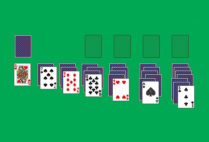
She also created virtual gifts for Facebook in 2008–2010, worked at Pinterest from 2015 to 2021, and joined Niantic in 2021. Her practice spans different generations of digital products, retaining an interest in small, understandable images.
In the Esc Keys collaboration with Asprey Studio, that visual language took physical form. The collection includes 32 new icons realized as keycaps and pendants. Meanwhile, her early sketchbook entered a collection jointly owned by MoMA and SFMOMA. Ordinary working sketches became a record of how everyday digital culture took shape.
What designers can take from her approach
In an interview with Cooper Hewitt, Kare was asked for three adjectives that define good design. Her answer was brief:
Meaningful. Memorable. Clear.
Turn those qualities into a practical interface review and a simple checklist emerges. These are editorial takeaways from her work that you can apply to your own project:
- Define the action first. Before drawing a symbol, explain in one sentence what a person needs to understand.
- Check the actual size. Review the icon inside the button, toolbar, or list where it will appear.
- Compare the whole set. Weight, proportions, and visual density should distinguish functions while making the set feel coherent.
- Test the metaphor with people. An object familiar to its designer may be unfamiliar to another audience. A label often helps.
- Leave room for personality. A few carefully chosen details can make an interface feel more welcoming.
Kare's work rewards a close look, but its central test happens at everyday scale: can someone understand what they are looking at and what to do next? That question keeps her experience useful well beyond the aesthetics of pixel art.
Sources: About Susan Kare | Kare Prints · MacPaint and QuickDraw oral history, p. 47 | Computer History Museum · Susan Kare. Sketches for Graphic User Interface Icons. 1982–83 | MoMA · Susan Kare, Iconic Designer | Smithsonian Lemelson Center · Apple Macintosh OS icon sketchbook, 1982 | MoMA · Susan Kare on the Command symbol | MoMA · Swedish Campground | Folklore.org · World Class Cities | Folklore.org · Steve Icon | Folklore.org · Microsoft Solitaire cards | Susan Kare on Behance · NDA 20 YRS | Q&A with Susan Kare | Cooper Hewitt, Smithsonian Design Museum · Esc Keys by Susan Kare | Asprey Studio

_Macintosh_128K_(1984)_-_1.jpg)
No comments yet. Start the conversation.